 design-infra
Component catalog
Find components by type and feeling. Explore live examples, shortlist your options, and copy your picks to your agent.
Filter by feeling, motion, usage or library
2371 total results · 1485 with visual previews · 886 on source sites
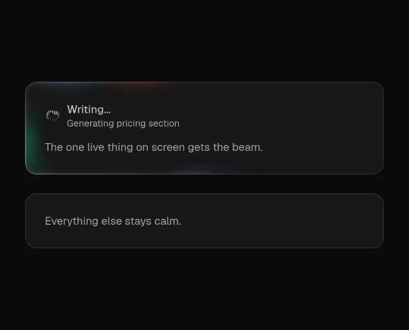 loop — medium
 scroll — subtle
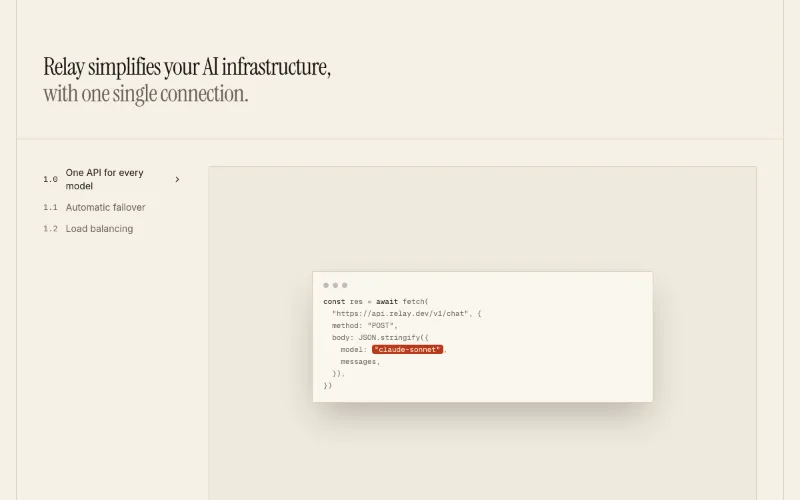
♥ Free recreation of the Aceternity multi-level features block Owen loves — default pick for feature walkthroughs on landing pages.
 loop · cursor · state — medium
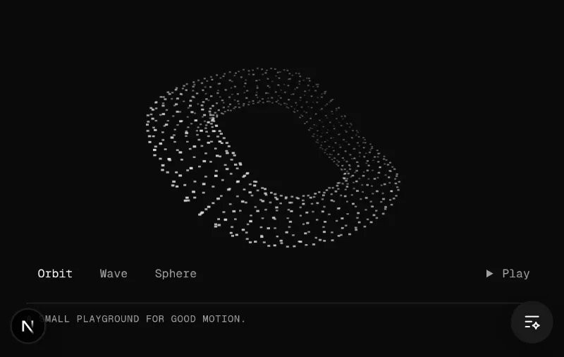
♥ The user explicitly asked to keep Kinetic Field in the homepage examples. Retain its pointer-responsive particle forms and controls.
 loop · state — subtle
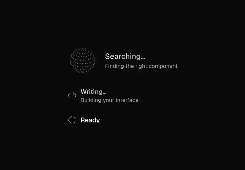
Inline or avatar-size agent activity indicator: libraries.dev thinking-orbs + shimmering verb + detail line.
 state — subtle
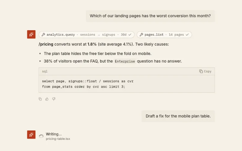
AI conversation view: user bubbles, assistant turns with markdown-ish text + code blocks, tool-call chips, copy/vote/regenerate actions, @oc/agent-status while pending. Auto-sticks to bottom.
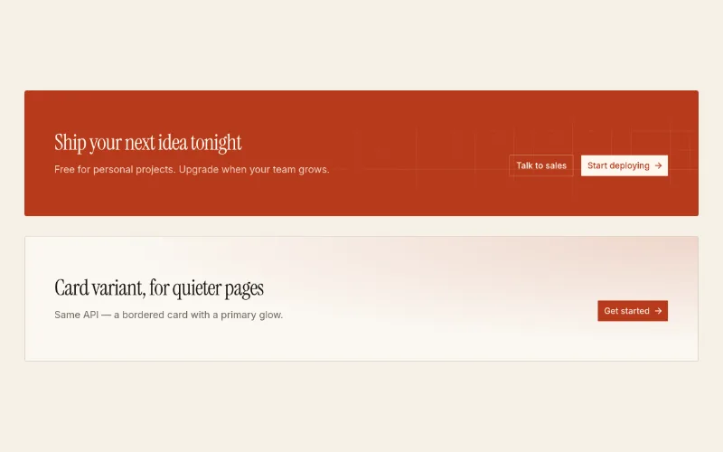
Closing call-to-action panel. `primary` = full --primary fill with inverted buttons (works on acid-yellow, rust, indigo); `card` = quiet bordered card with a glow.
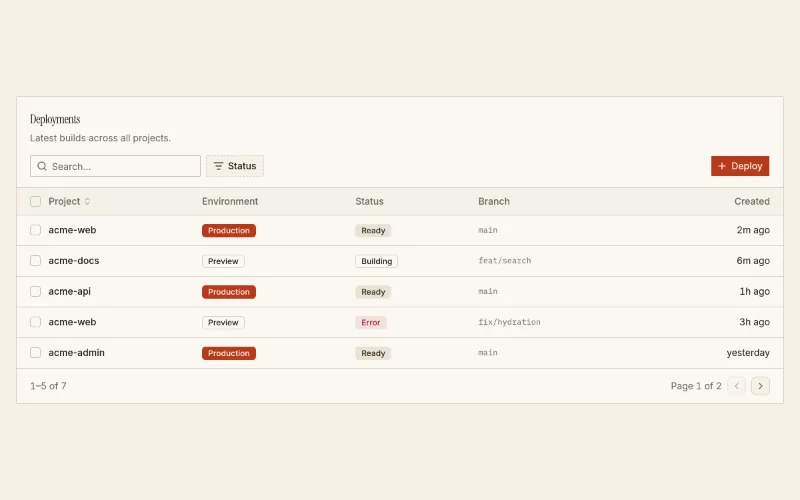
shadcn table in a card with toolbar: search, faceted filter, actions slot, sortable columns, row selection and pagination. Badge columns are server-safe; `cell` renderers need a client page.
- Interactive demo · switch to Live view
Temporary page an agent installs in a consumer project to render candidate variants of the user's own component side by side, with their theme and content: <DesignLab title> + <LabOption id label notes chosen>. Lands at app/design-lab/page.tsx + components/design-lab.tsx; the user says which option they want, the agent applies it and removes both files.
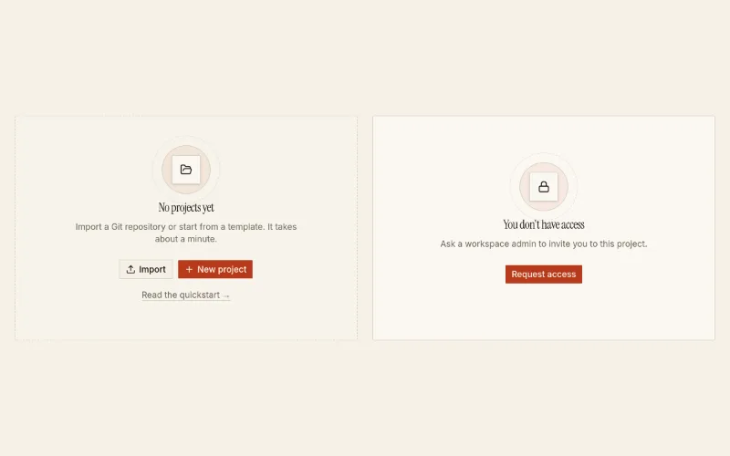
Zero-data / first-run placeholder: layered icon, title, one primary next step, optional secondary + help link. Dashed drop-zone or plain.
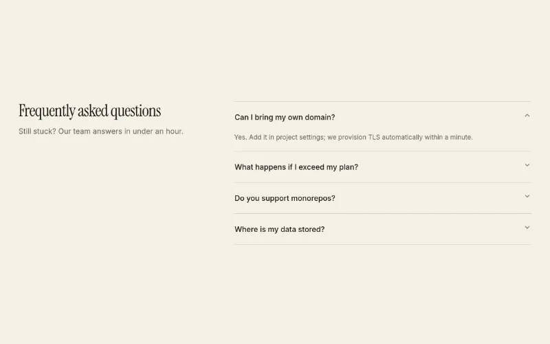
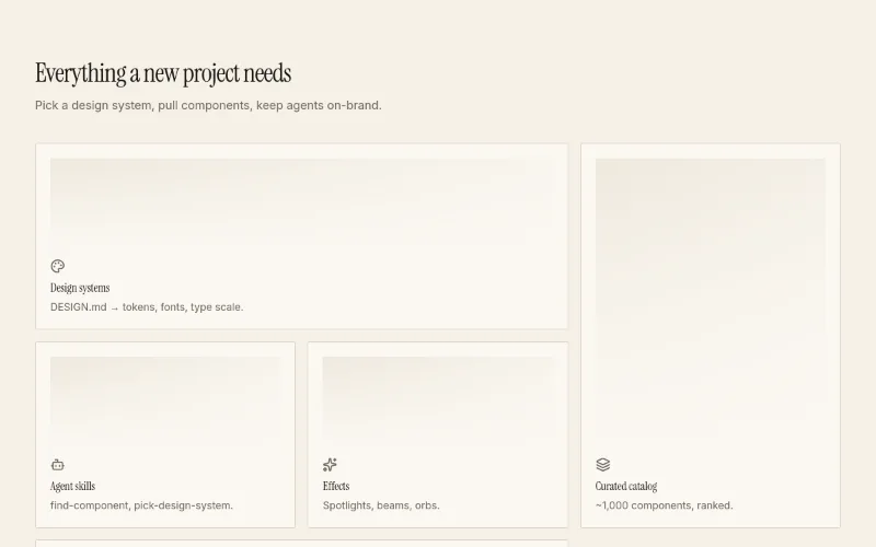 hover — subtle
Theme-aware bento grid for feature sections. Tiles span 1, 2 or a full row; hover glow uses --primary.
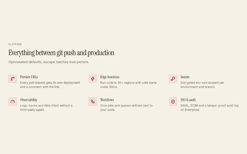
Icon + title + text feature rows in a 2- or 3-column grid, or heading-left/list-right with columns={1}. Calmer alternative to feature-bento.
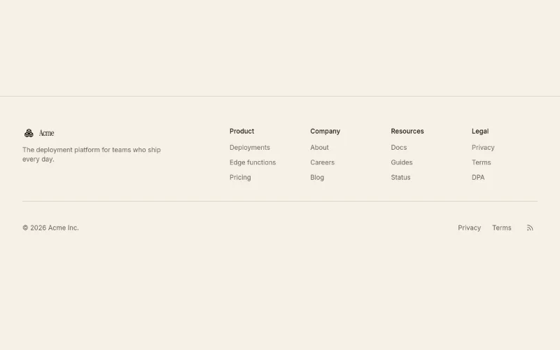
Site footer: brand + blurb, 2-5 link columns, bottom bar with copyright, legal links and social icons.
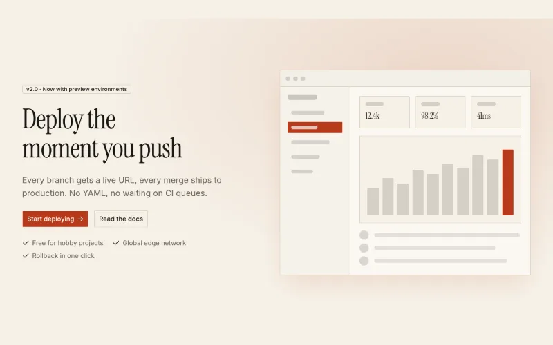
Two-column hero: headline, copy, actions and proof bullets on the left; framed product media on the right (themed mock by default). `reverse` flips sides.
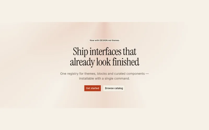
Centered marketing hero with an original static CSS light treatment using the active theme tokens. No animation or proprietary code.
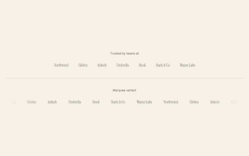 loop · hover — subtle
'Trusted by' strip. Static wrapping row or infinite marquee with faded edges (pauses on hover, respects reduced motion). Text wordmarks when no SVG is given.
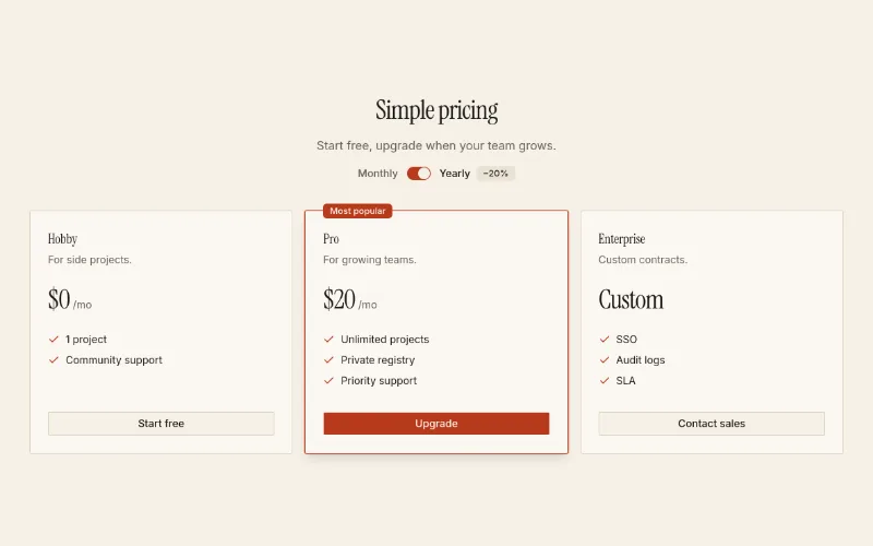
2–3 tier pricing with monthly/yearly switch and a featured tier. Pure shadcn primitives + tokens.
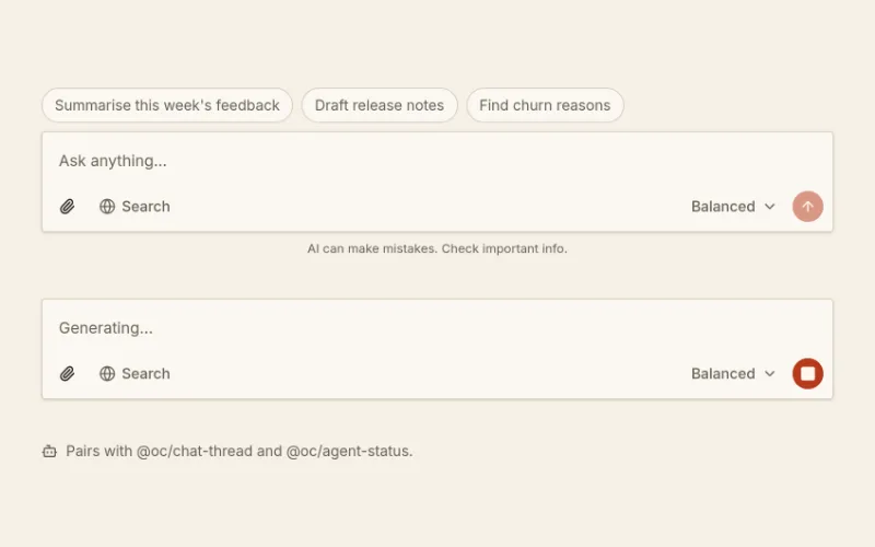
Chat input: auto-growing textarea, file attachment chips, model picker, web-search toggle, send/stop; Enter sends, Shift+Enter newline; optional suggestion chips.
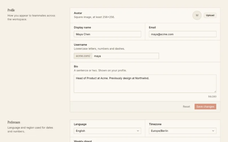
Account settings page (profile, preferences, notifications, danger zone) plus the SettingsSection / SettingsRow primitives to compose your own.
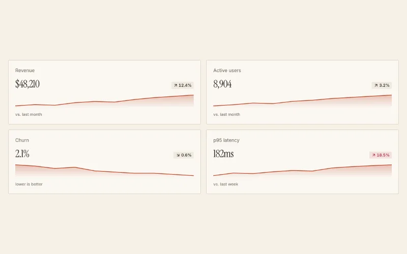
Dashboard KPI tiles: label, big value, delta chip (invertible for churn/latency) and an SVG sparkline in --chart-1.
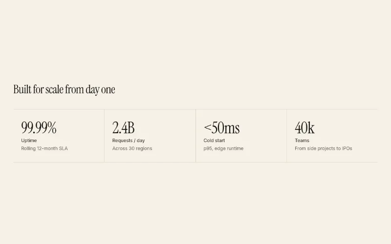
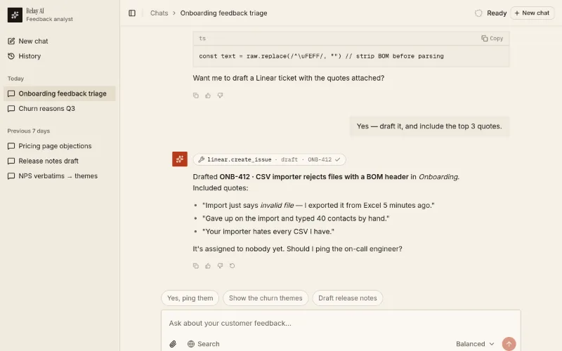 loop · state — subtle
Starter page → app/chat/page.tsx. Use existing compatible tokens, or install a theme only when requested; it pulls in 4 @oc blocks. Preview: /templates/template-ai-chat.
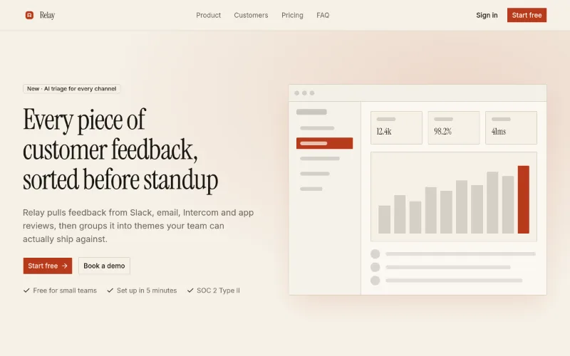 loop — subtle
Starter page → app/page.tsx. Use existing compatible tokens, or install a theme only when requested; it pulls in 10 @oc blocks. Preview: /templates/template-landing.
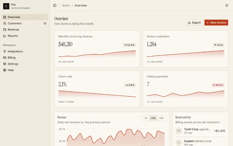
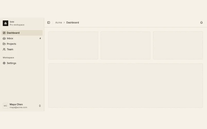
Starter page → app/dashboard/page.tsx. Use existing compatible tokens, or install a theme only when requested; it pulls in 3 @oc blocks. Preview: /templates/template-saas-dashboard.
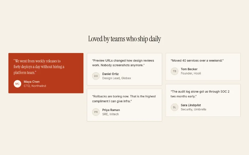
Masonry grid of customer quotes with avatars; one `featured` quote renders on a --primary fill in larger heading type.
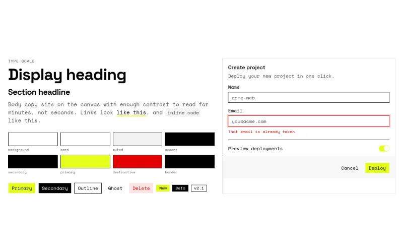
Writes DESIGN.md to the project root + theme tokens + fonts. Read design-systems/brutalist-mono/DESIGN.md first.
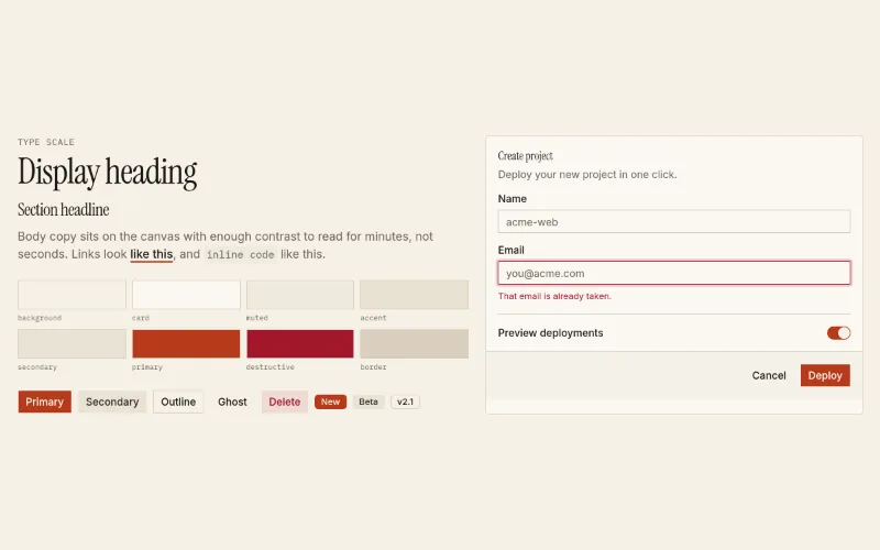
Writes DESIGN.md to the project root + theme tokens + fonts. Read design-systems/editorial/DESIGN.md first.
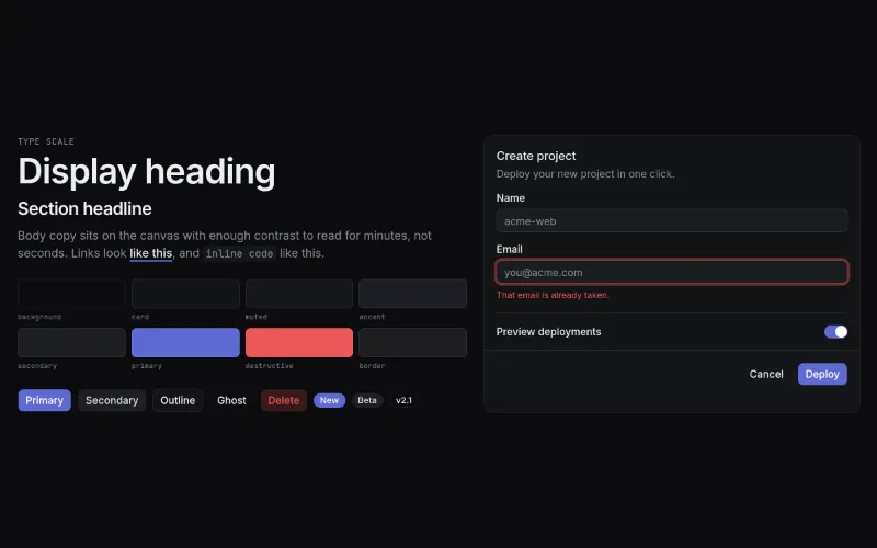
Writes DESIGN.md to the project root + theme tokens + fonts. Read design-systems/linear-dark/DESIGN.md first.
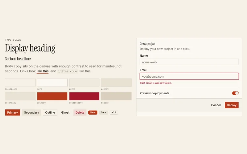
Kitchen-sink of the installed theme (swatches, type, buttons, form card). Install after a theme to eyeball it.
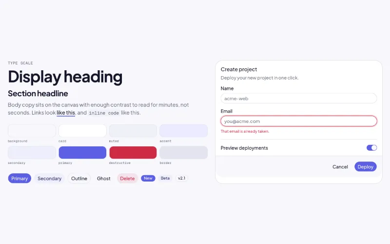
Writes DESIGN.md to the project root + theme tokens + fonts. Read design-systems/soft-glass/DESIGN.md first.
 enter — medium
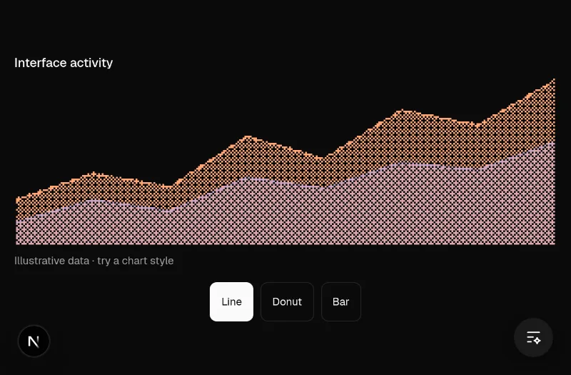
♥ The user singled out the dither chart as an interesting component to feature on the homepage. Use the real pixelated data visualization with selectable chart styles and clearly labeled sample data. — Pixelated Canvas charts with line, donut, bar and other data shapes. Good for distinctive dashboards and product illustrations; keep its data text alternative, label demo data and provide controls outside the canvas. Hosted local demo preserves the upstream component and install command.
 enter — subtle
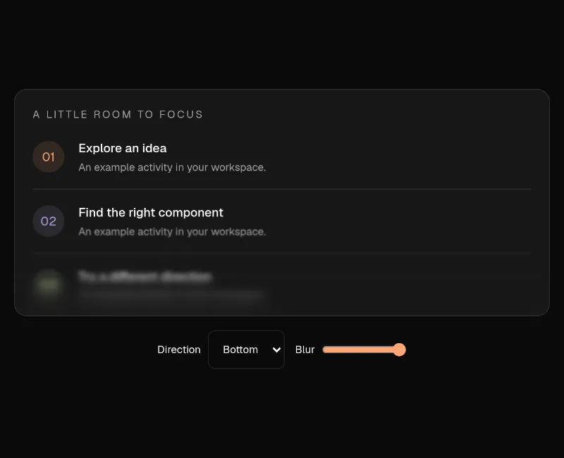
♥ The user wants more interesting live homepage examples and shared this surface effect. Show it over a scrollable UI with readable controls outside the blur; it is a static surface effect, not a loading animation. — Layered CSS backdrop blur for fading scroll-container edges and decorative surfaces. It is not a loader or a continuous animation. Keep text, focus targets and controls outside the strongest blur; the decorative overlay must not intercept interaction. Hosted demo includes a real scroll container and blur controls.
 state — subtle
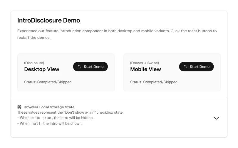
Feature-announcement/onboarding modal with media steps, 'don't show again' and responsive dialog↔drawer. Tokens throughout (black only on the media frame). Pulls 6 shadcn primitives.
Compound multi-step onboarding (StepIndicator, ChoiceGroup, FeatureCarousel, TipsList; controllable state). Fully token-based — the safest Cult UI pick for app UI.
 state — subtle
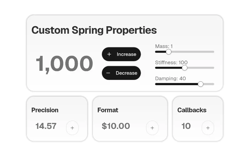
Small rolling-digit number (motion). Inherits colour.
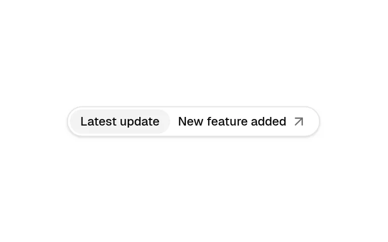
'New feature →' pill above a hero headline (compound badge). Token-based.
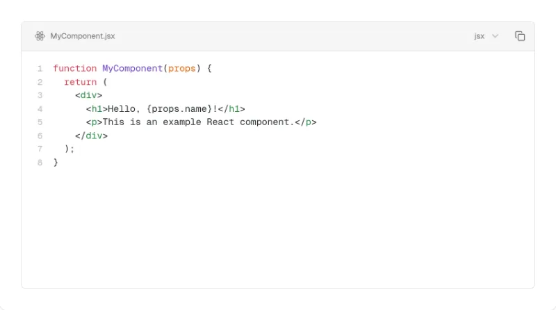
Shiki code block with tabs, line numbers, highlight/diff/focus transformers and copy. Theme-aware chrome; diff colours are semantic emerald/rose. Heavy: shiki + react-icons.
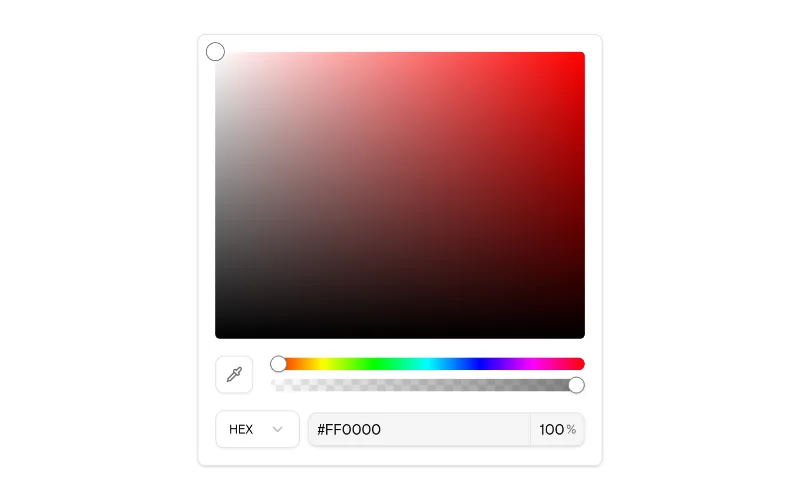
Figma-style colour picker (saturation/hue/alpha/eyedropper/format). Surfaces use tokens; the colour gradients are intrinsic.
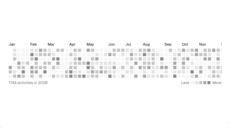
GitHub-style contribution heatmap; levels use fill-muted-foreground/N, so it inherits the theme.
 drag — subtle
 drag — subtle
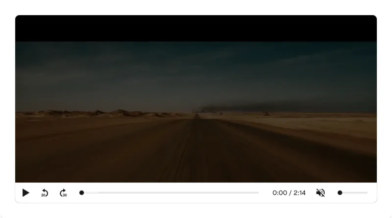
media-chrome video player styled with Tailwind. Colourless controls inherit theme.
 enter — subtle
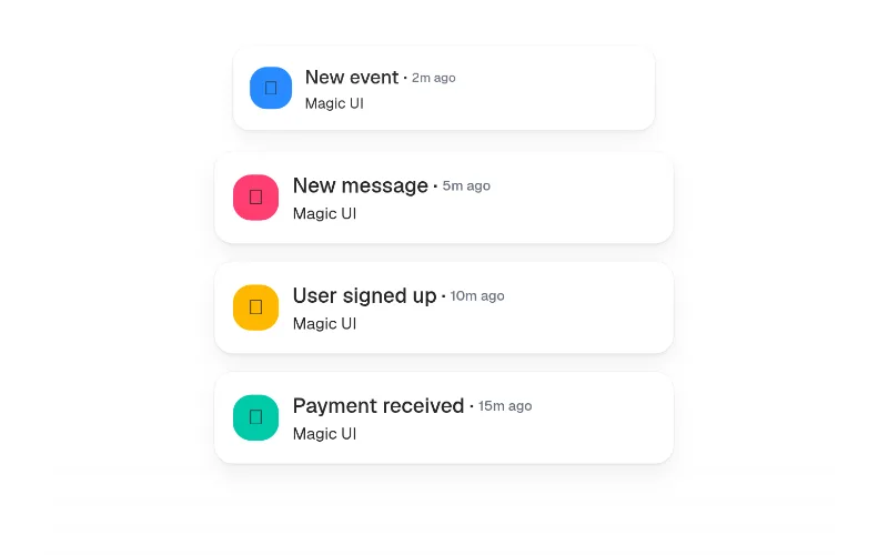
Notifications/events appearing one by one — great 'activity feed' hero visual. Unstyled; you style the items with bg-card etc. Imports motion/react.
 press · state — medium
Light/dark toggle with a View Transitions clip-path reveal. Colourless (icons use currentColor). Uncontrolled it toggles <html class=dark> + localStorage itself; with next-themes pass theme/onThemeChange instead.
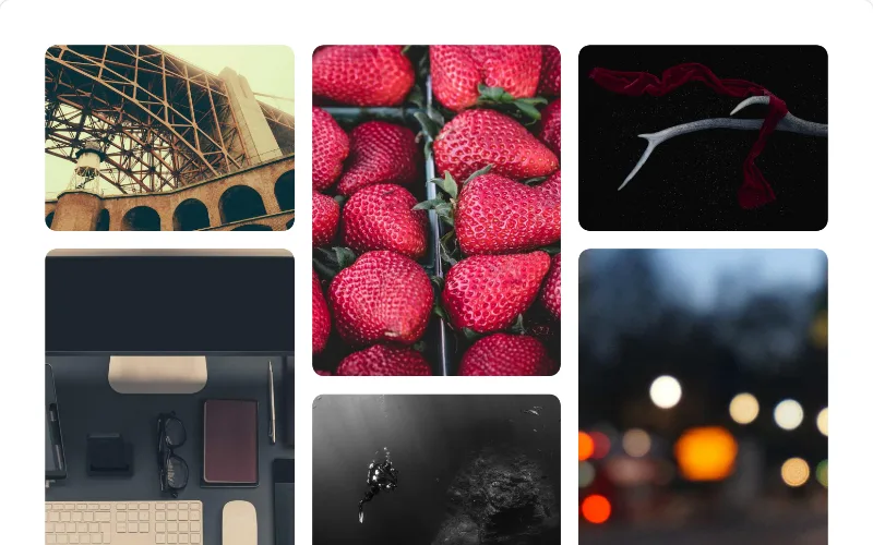 enter — subtle
 hover — subtle
Pill button whose label slides out for an arrow + primary fill on hover. Uses bg-primary/text-primary-foreground — one of the few fully token-based Magic UI pieces.
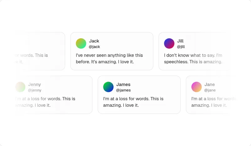 loop — medium
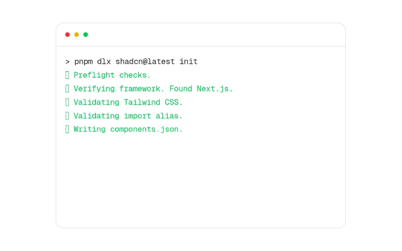 enter — subtle
 enter — subtle
Per-word/char/line text entrance with ~10 presets (blurIn, slideUp, scaleUp…). Inherits colour — good default for hero headlines over Aceternity's text effects.
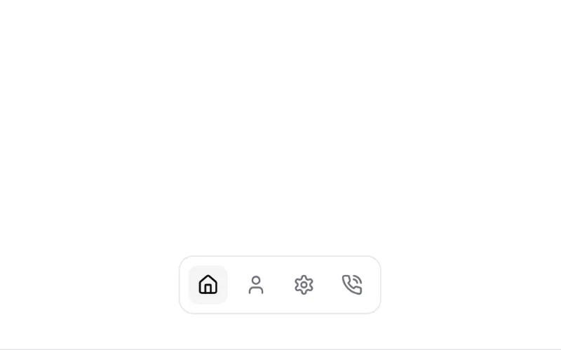 hover · state — subtle
Sliding highlight behind the hovered/active item (tabs, nav, segmented controls). You pass the bg class (e.g. bg-muted), so it follows the theme.
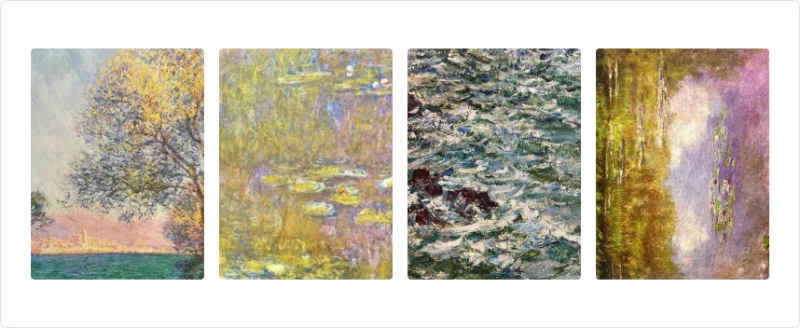 enter — subtle
Stagger a group of children with presets (fade, blur, slide, zoom…). Colourless; good for feature lists and logo rows.
 enter — subtle
 loop · hover — medium
Infinite marquee with speedOnHover and vertical mode; alternative to magicui/marquee using motion + react-use-measure.
 press · state — medium
Card that morphs into a dialog (shared layout) — the signature motion-primitives piece for galleries/case studies. Only the backdrop has colour (white/black 40%); you style the card with tokens.