design-infraGitHub

Component catalog

Find components by type and feeling. Explore live examples, shortlist your options, and copy your picks to your agent.

Try:
Show
Filter by feeling, motion, usage or library · 1 active
Feel
Motion
Use as
Source

207 total results · 162 with visual previews · 45 on source sites
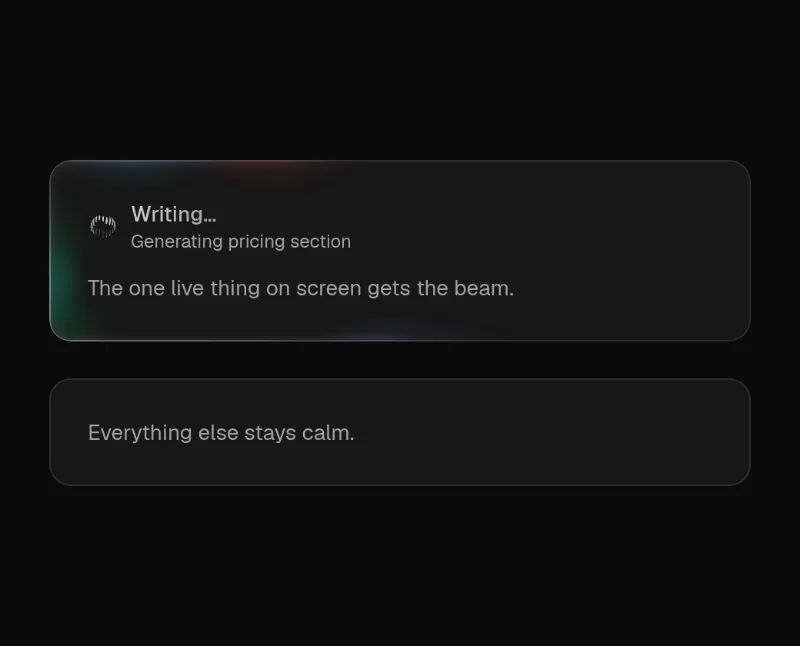
  • Beam card previewloop — medium
    Beam card

    ♥ The user explicitly asked to keep Beam Card in the homepage examples while replacing the underwhelming loader. Retain its subtle beam emphasis.

    ocFuturisticPlayfulSource
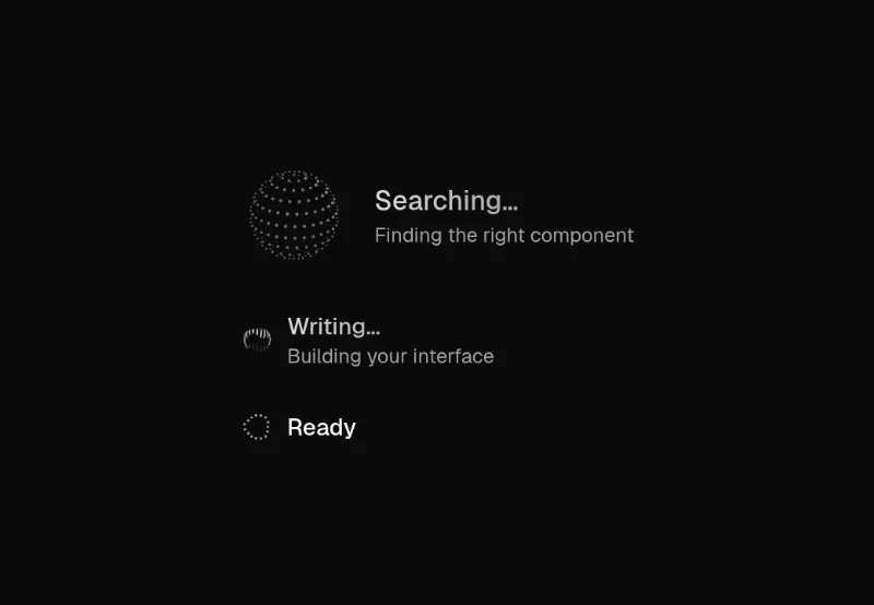
  • Agent status previewloop · state — subtle
    Agent status

    Inline or avatar-size agent activity indicator: libraries.dev thinking-orbs + shimmering verb + detail line.
    ocRefinedFuturisticCalmSource
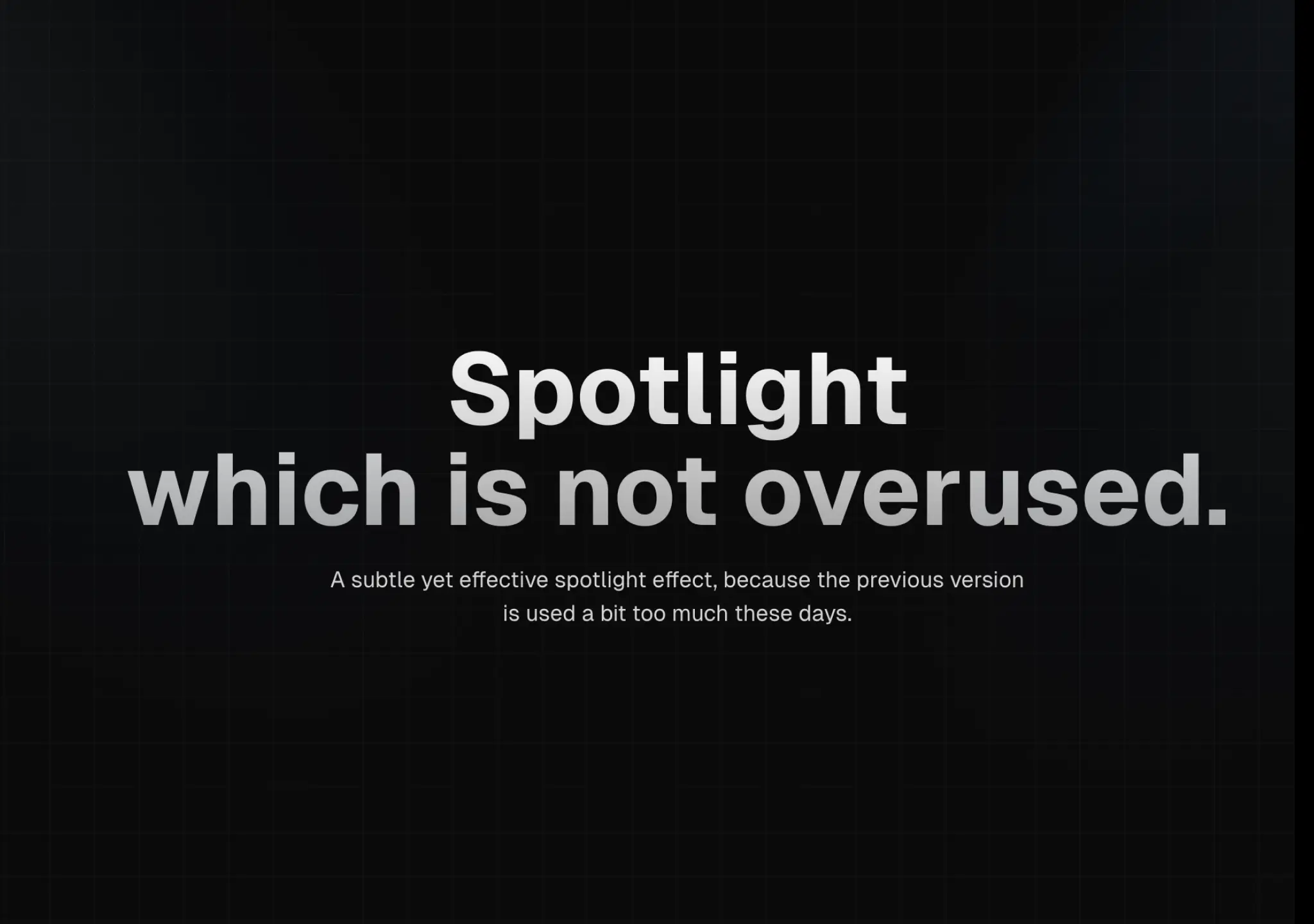
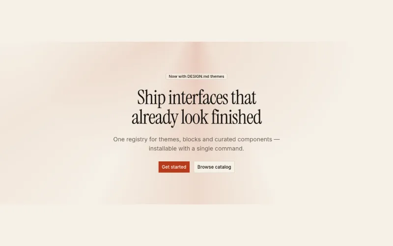
  • Hero · Spotlight preview

    Centered marketing hero with an original static CSS light treatment using the active theme tokens. No animation or proprietary code.
    ocPremiumFuturisticRefinedSource
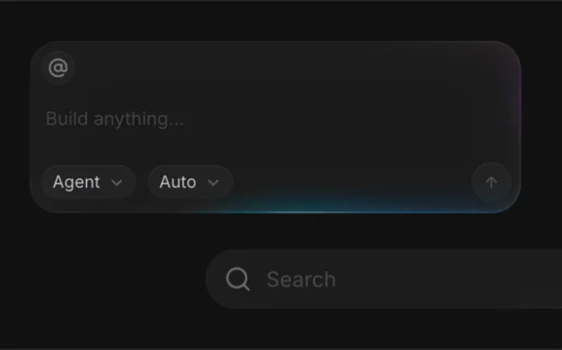
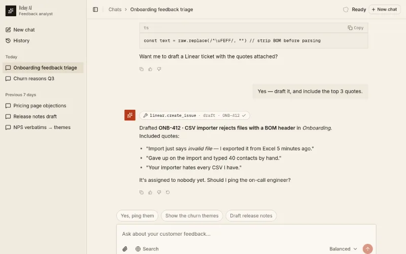
  • Template · AI chat previewloop · state — subtle

    Starter page → app/chat/page.tsx. Use existing compatible tokens, or install a theme only when requested; it pulls in 4 @oc blocks. Preview: /templates/template-ai-chat.
    ocCalmRefinedFuturisticSource
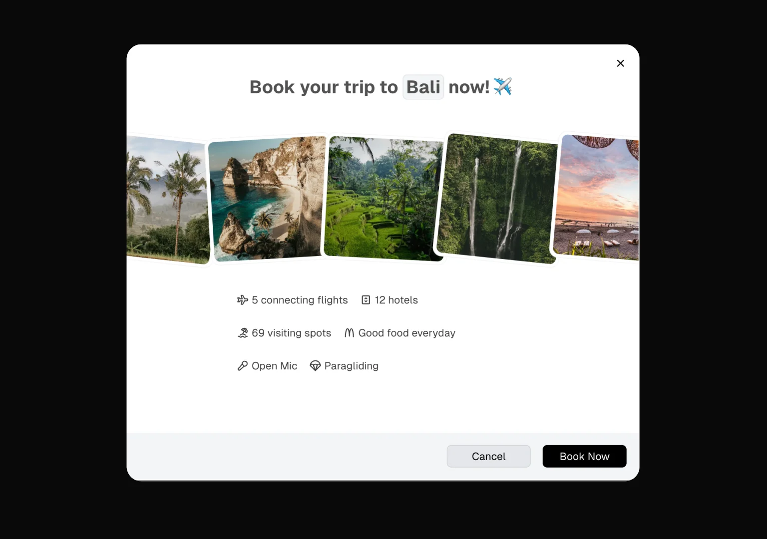
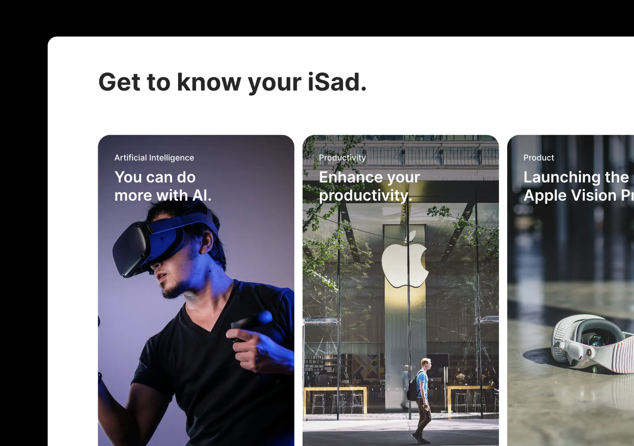
  • Animated Modal previewstate — medium

    Compound modal with motion. For app dialogs prefer shadcn Dialog (accessible, themed).
    aceternityPremiumFuturisticSource
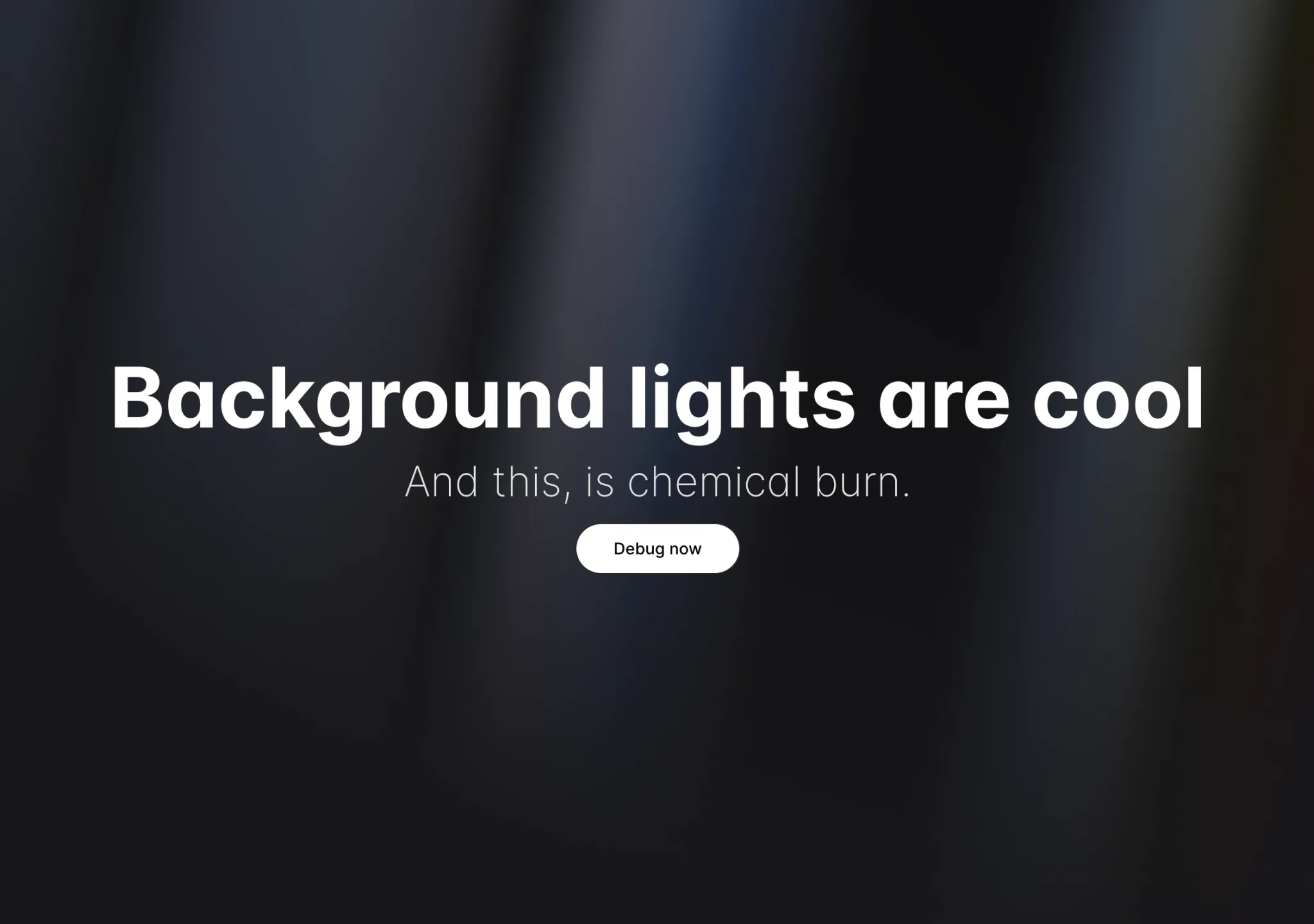
  • Apple Cards Carousel previewpress · state — medium

    Apple-style card carousel that expands into a detail view.
    aceternityMinimalPremiumFuturisticSource
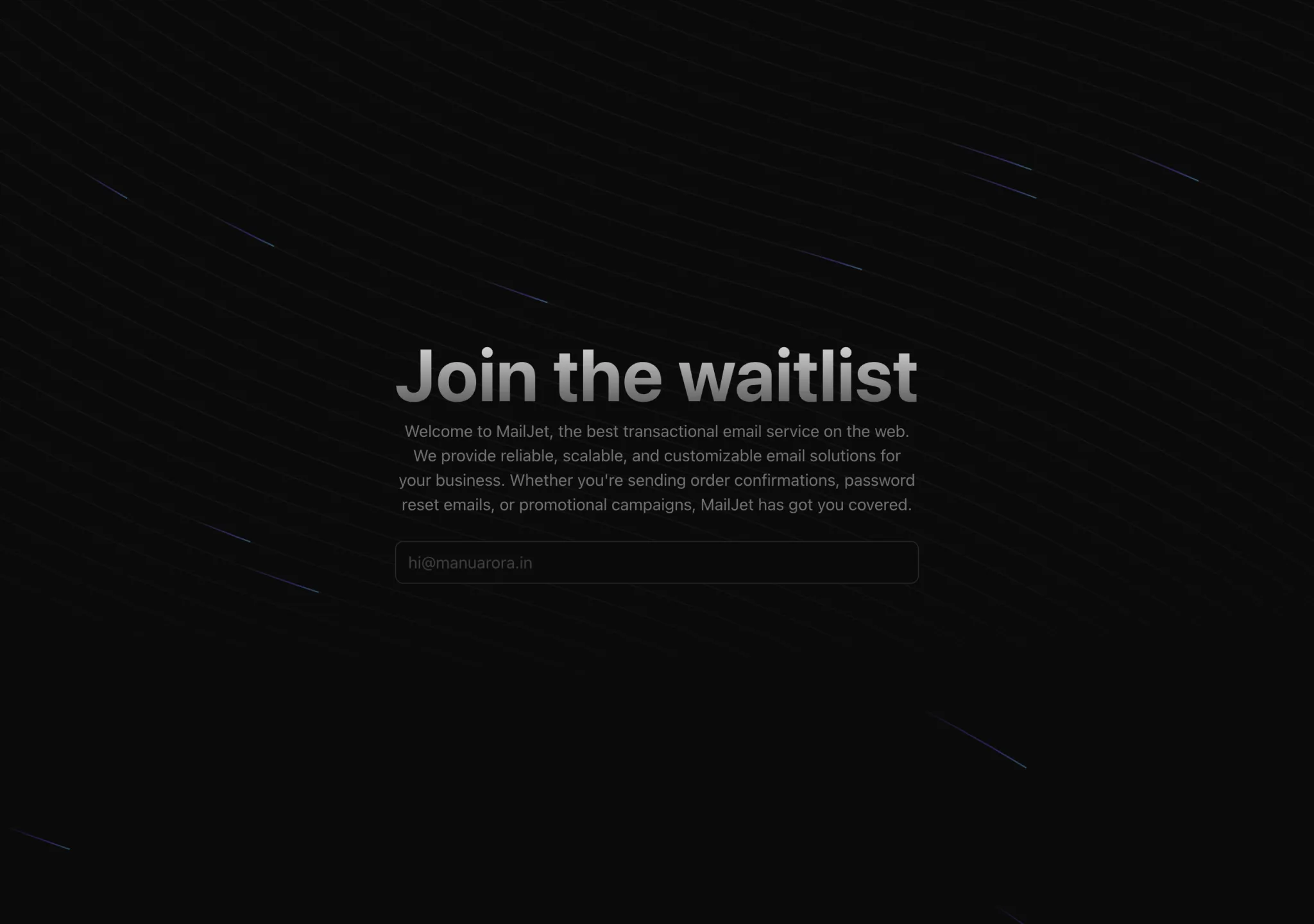
  • Aurora Background previewloop — subtle

    Soft aurora wash for AI/consumer heroes (pairs with soft-glass). Uses its own CSS vars — tune colours to your primary.
    aceternityFuturisticRefinedPremiumSource
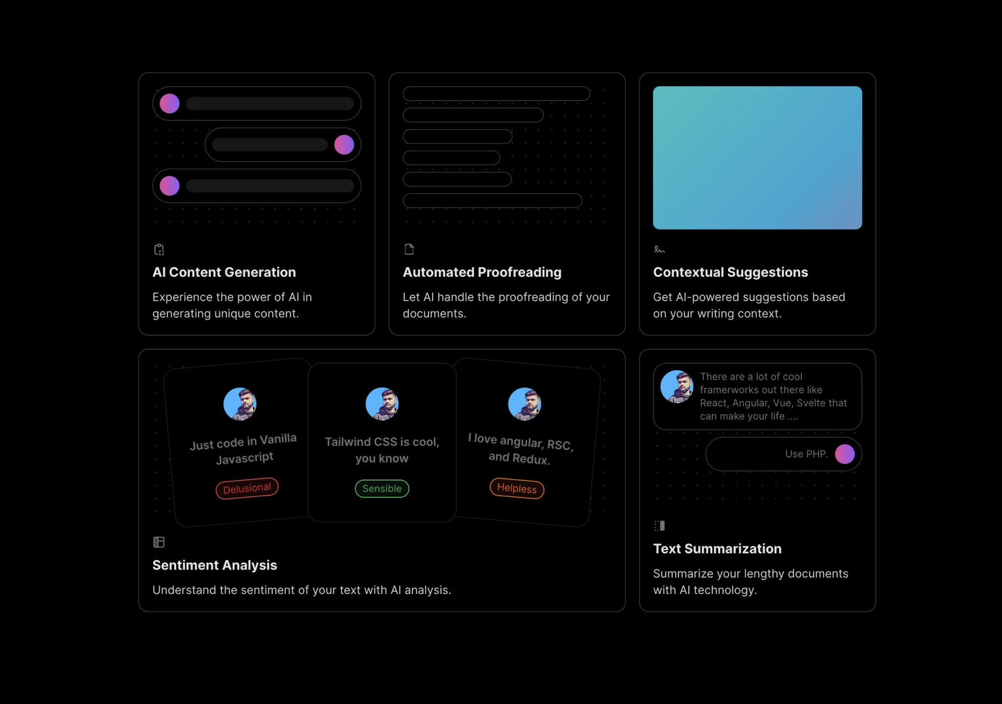
  • Background Beams previewloop — subtle

    Subtle animated SVG beams behind a hero. Looks best on near-black backgrounds; keep copy short on top.
    aceternityFuturisticPremiumSource
  • Bento Grid previewhover — subtle
    Bento Grid

    Simple bento layout. Colours are hard-coded neutral-200/white/black — prefer @oc/feature-bento for theme-aware tiles, or swap classes to bg-card/border.

    aceternityRefinedPremiumFuturisticSource
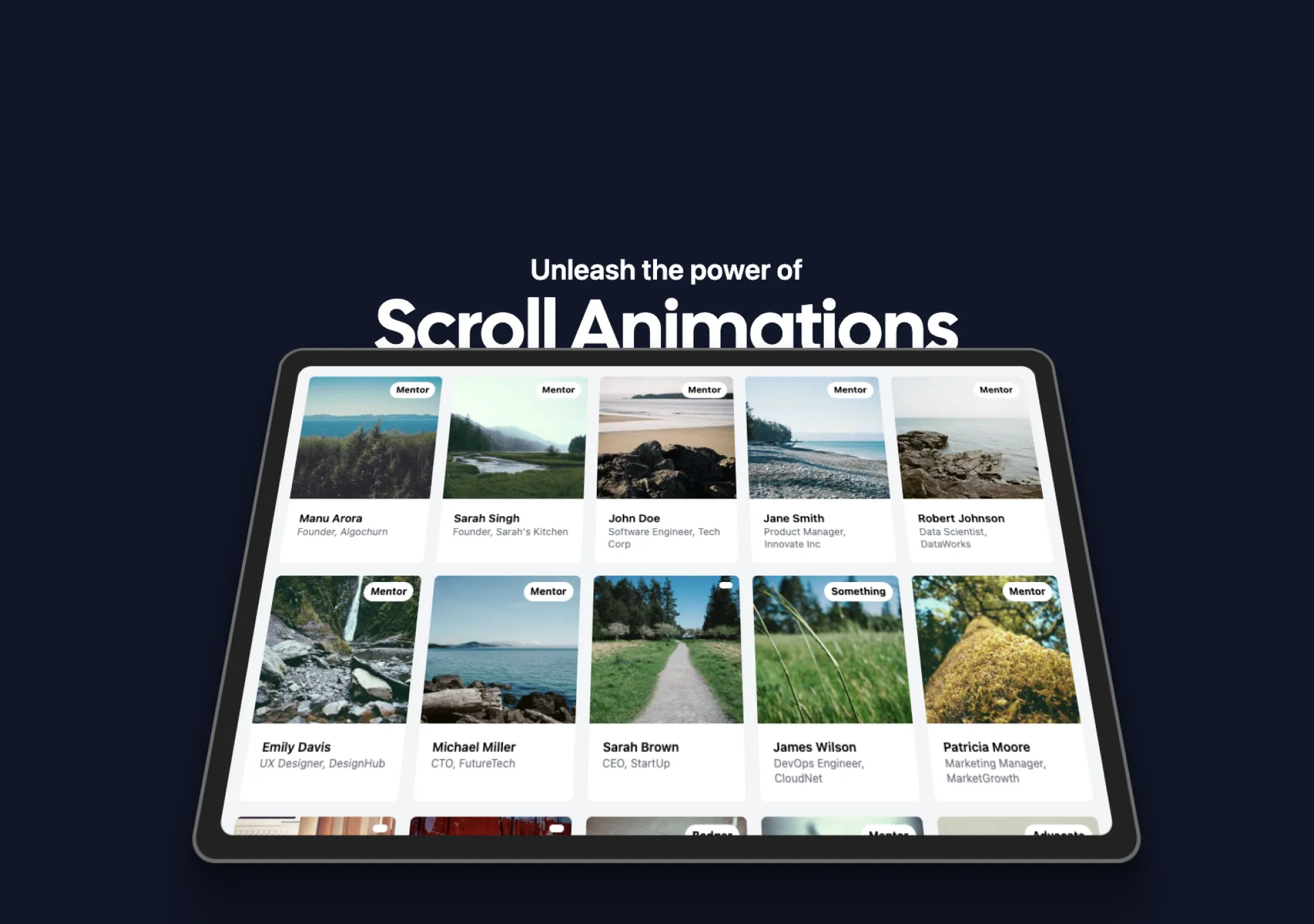
  • Code Block preview
    Code Block

    Syntax-highlighted block with tabs (react-syntax-highlighter).
    aceternityTechnicalPremiumFuturisticSource
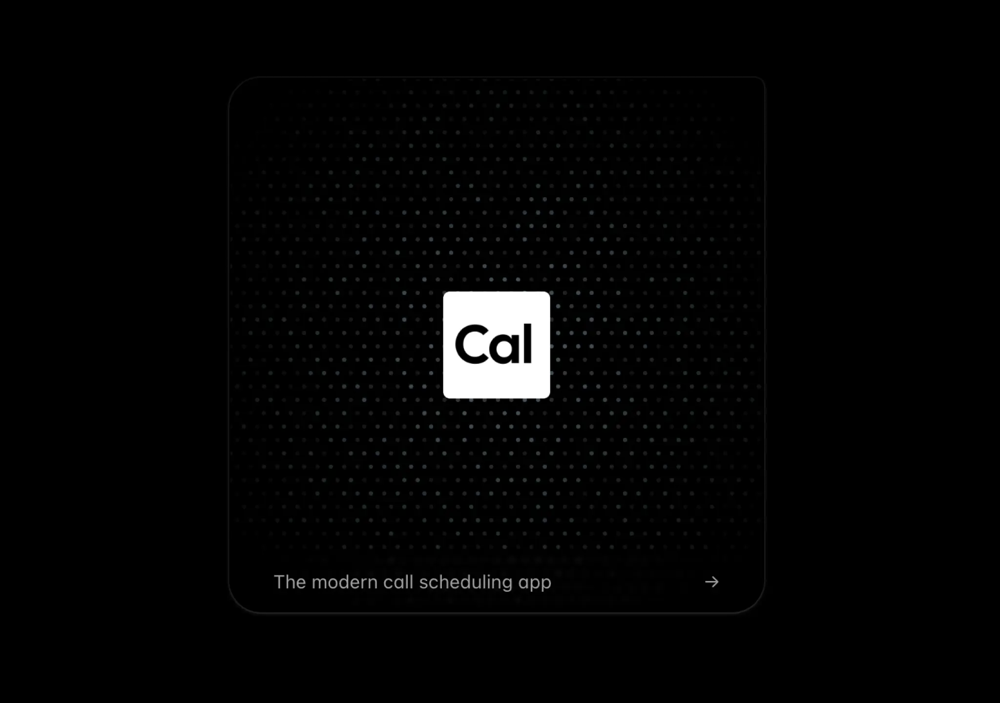
  • Container Scroll Animation previewscroll — expressive

    Product screenshot that tilts into place on scroll — classic SaaS hero follow-up.
    aceternityPremiumFuturisticSource
  • Dotted Glow Background previewloop — subtle

    Quiet dotted grid with glow; good behind dashboards/empty states where beams would be too loud.

    aceternityFuturisticPremiumSource
  • Flip Words previewloop — medium
    Flip Words

    Rotating keyword in a headline ("Build ___ faster"). Keep to 3–5 words.
    aceternityPremiumFuturisticSource
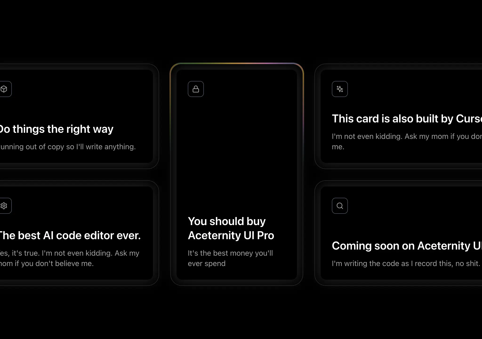
  • Floating Dock previewhover · cursor — medium
    Floating Dock

    macOS-style dock nav. Great for portfolios/side projects; overkill for SaaS nav. Needs @tabler/icons-react.
    aceternityPremiumFuturisticSource
  • Glowing Effect previewcursor · hover — subtle

    Cursor-style border glow that follows the pointer. Works on any card.
    aceternityFuturisticPremiumSource
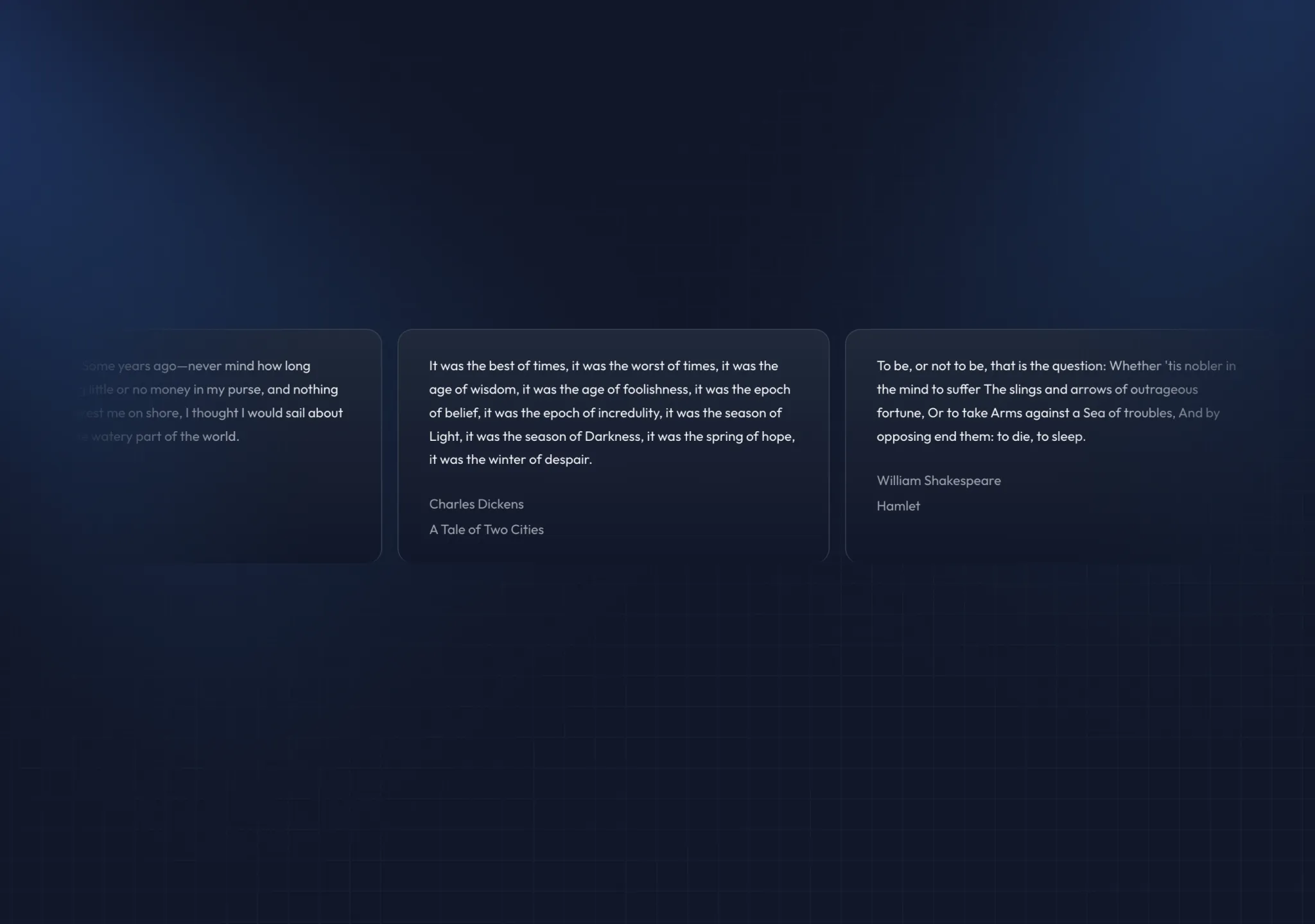
  • Hover Border Gradient previewhover · loop — medium

    Gradient border that sweeps on hover — for a single standout CTA button.
    aceternityPremiumFuturisticSource
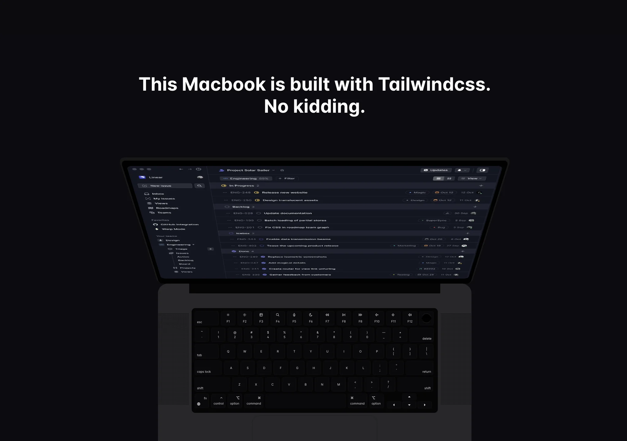
  • Infinite Moving Cards previewloop · hover — medium

    Marquee of testimonial/logo cards. Pause-on-hover is built in.
    aceternityPremiumFuturisticSource
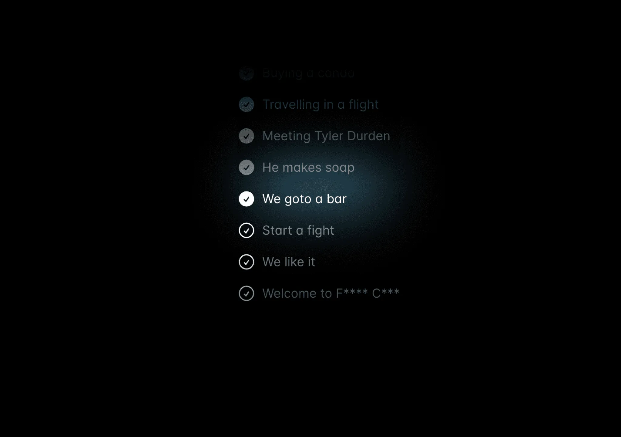
  • Fey.com Macbook Scroll previewscroll — expressive

    Fey-style laptop reveal. Heavy; one per page max.
    aceternityPremiumFuturisticSource
  • Multi Step Loader previewstate · loop — medium

    Full-screen step loader for long operations (generation, onboarding).
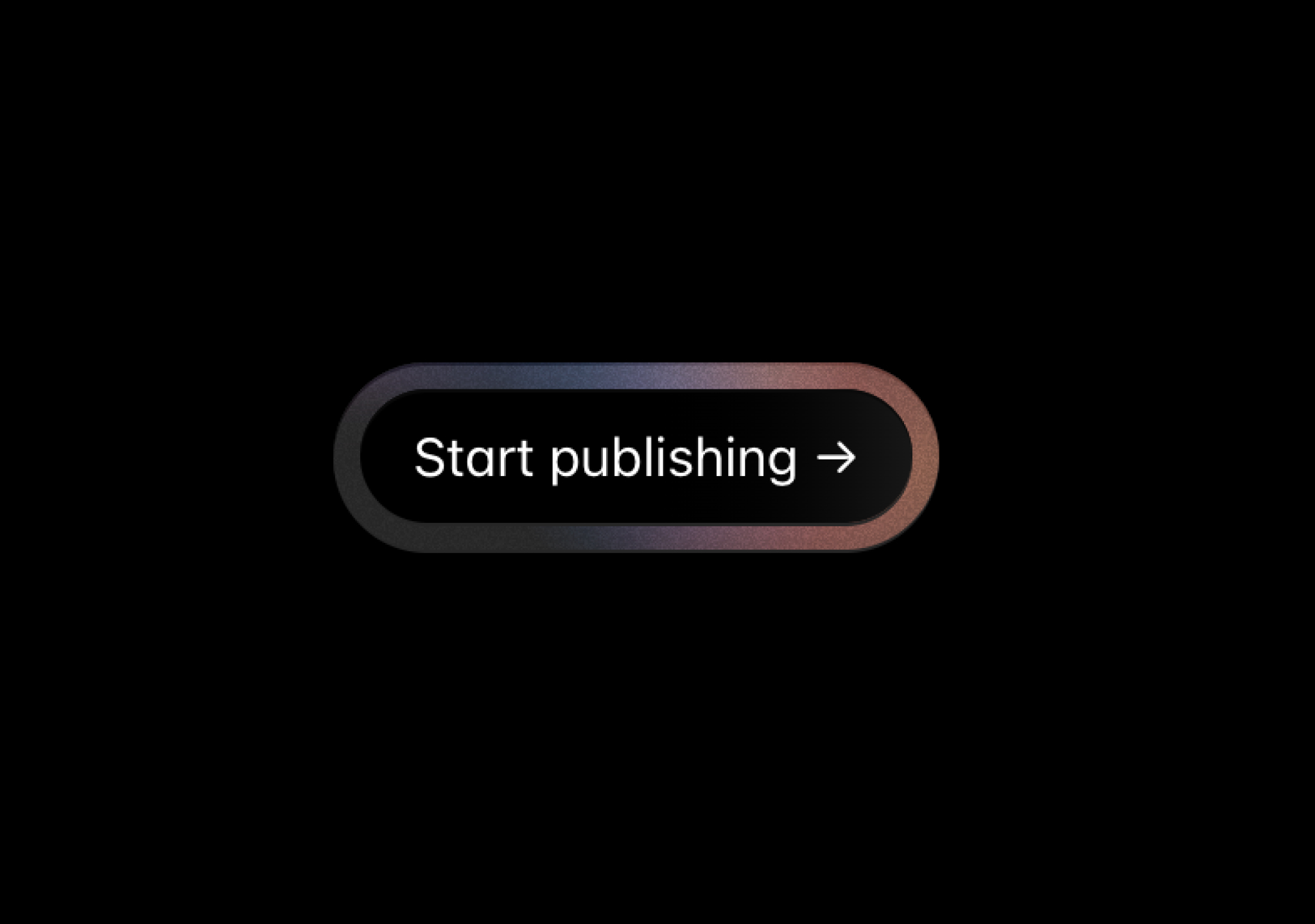
    aceternityPremiumFuturisticSource
  • Noise Background previewloop — subtle

    Animated gradient + noise texture. Works for editorial/brutalist when toned down.
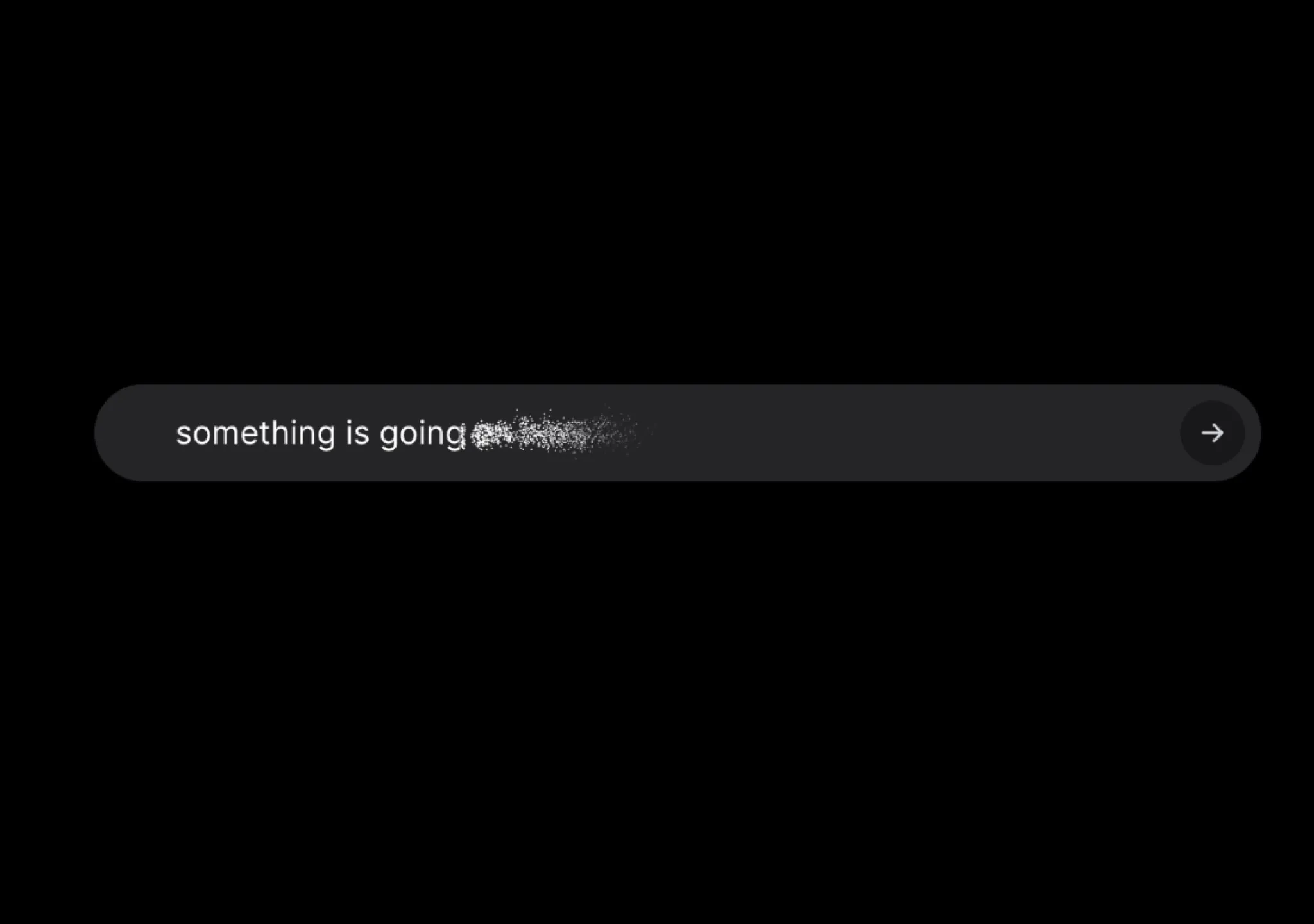
    aceternityPremiumFuturisticSource
  • Placeholders And Vanish Input previewloop · state · press — medium

    Hero search/prompt input with cycling placeholders and vanish-on-submit. Great for AI products.
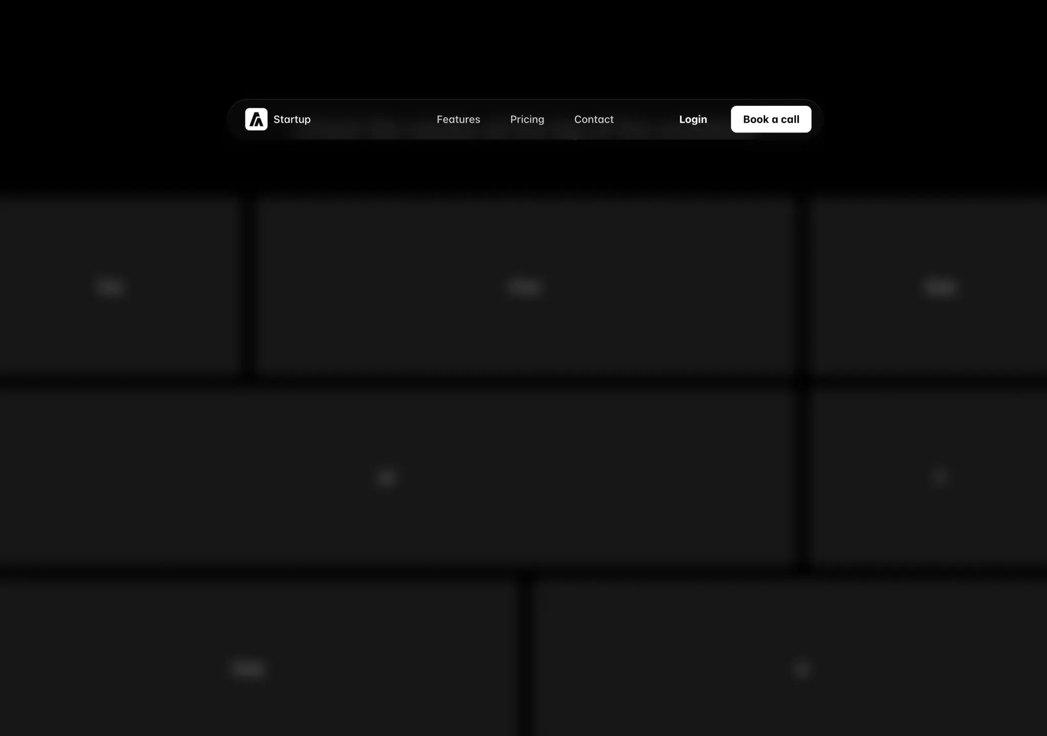
    aceternityPremiumFuturisticSource
  • Resizable Navbar previewscroll — medium

    Navbar that shrinks into a pill on scroll — the standard 'modern landing page' nav.
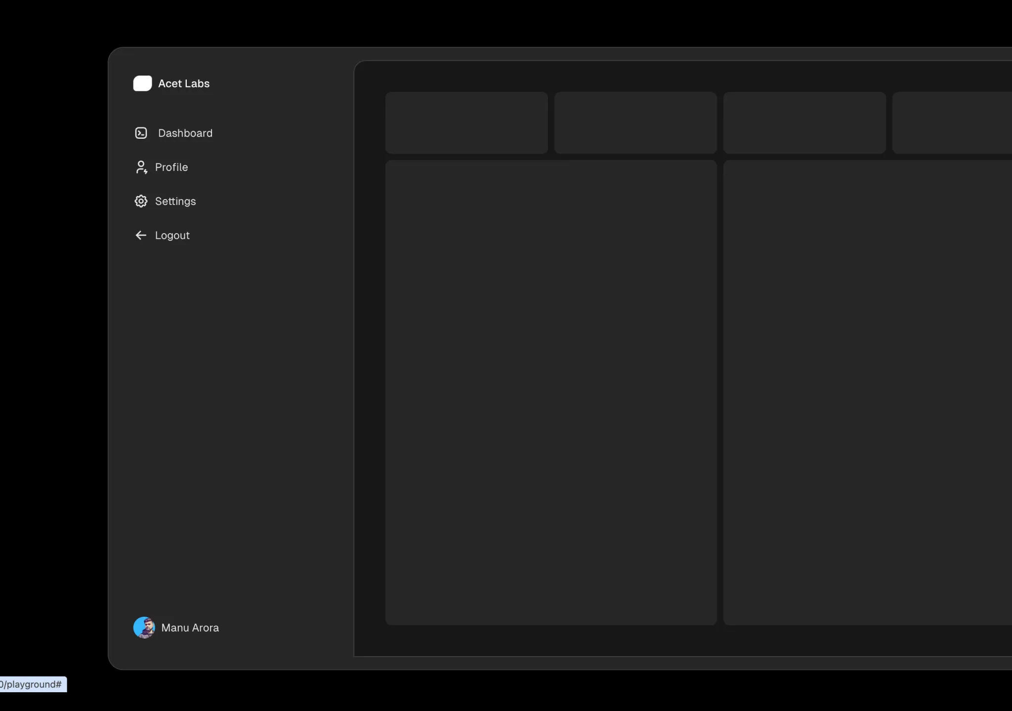
    aceternityRefinedPremiumFuturisticSource
  • Sidebar previewhover · state — subtle
    Sidebar

    Hover-expand app sidebar. For full app shells prefer shadcn Sidebar.

    aceternityPremiumFuturisticSource
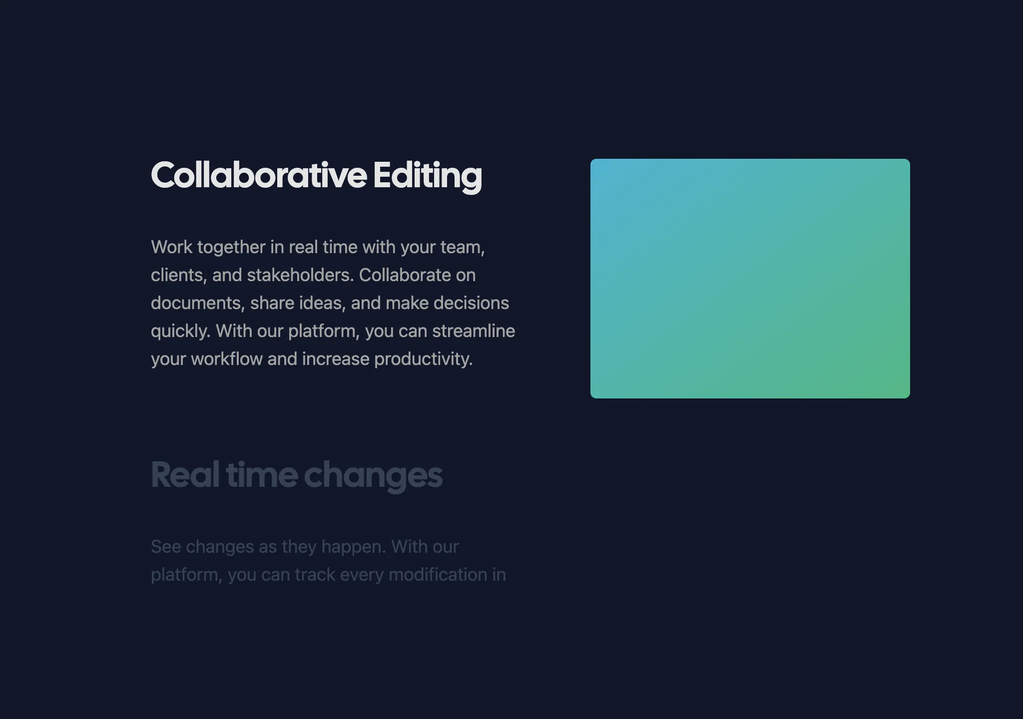
  • Spotlight New previewloop — medium
    Spotlight New

    Best 'premium dark' hero backdrop. Hard-codes a blue hsla gradient — pass gradientFirst/Second/Third or use @oc/hero-spotlight, which tints it from --primary.
    aceternityFuturisticPremiumSource
  • Sticky Scroll Reveal previewscroll — medium

    Sticky visual + scrolling text sections for feature walkthroughs.

    aceternityRefinedPremiumFuturisticSource
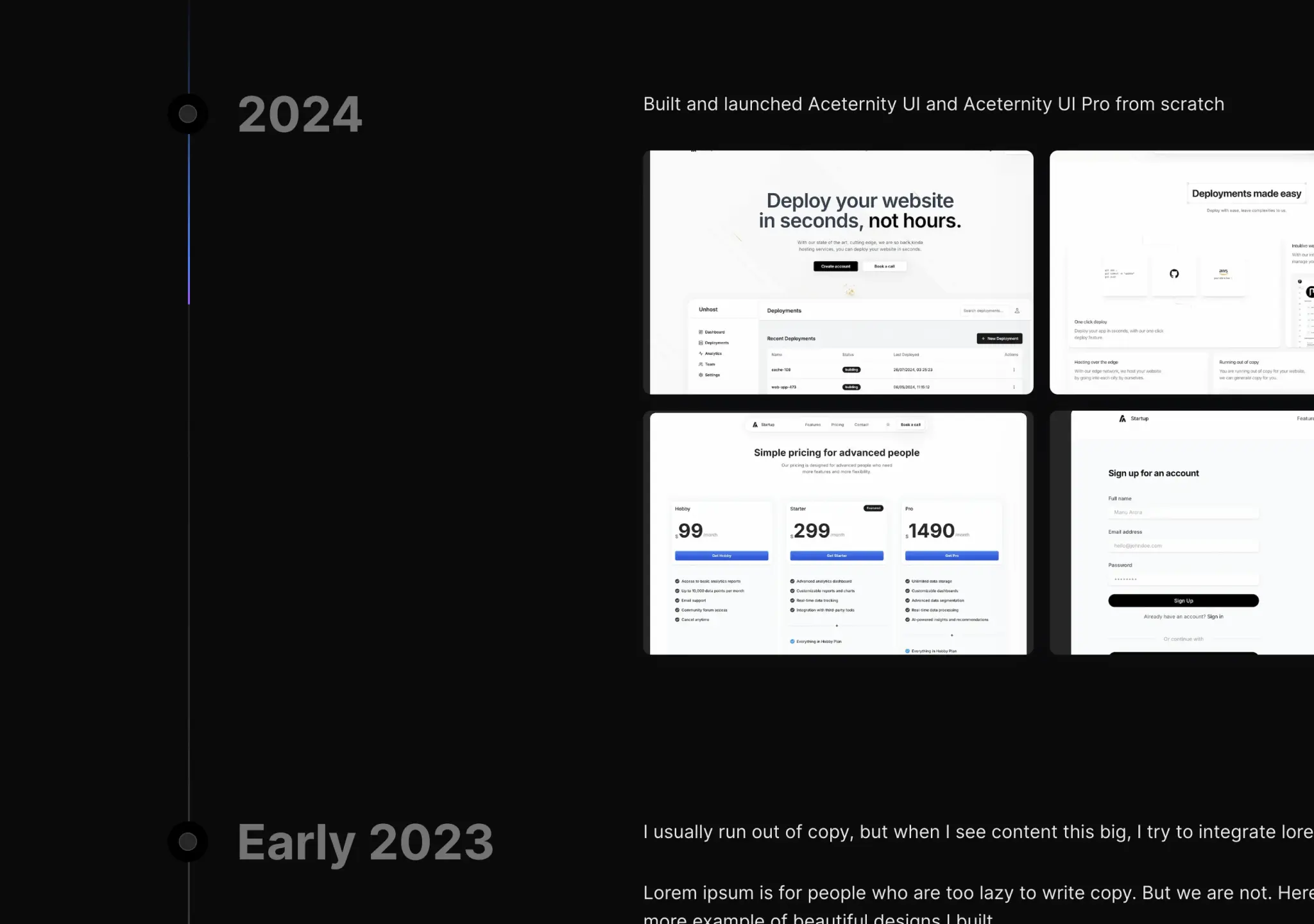
  • Text Generate Effect previewenter — subtle

    Word-by-word fade-in for one hero line or an AI answer. Don't use on long paragraphs.
    aceternityRefinedPremiumFuturisticSource
  • Timeline previewscroll — medium
    Timeline

    Sticky-header timeline with scroll beam. Changelogs and company history.

    aceternityFuturisticPremiumSource
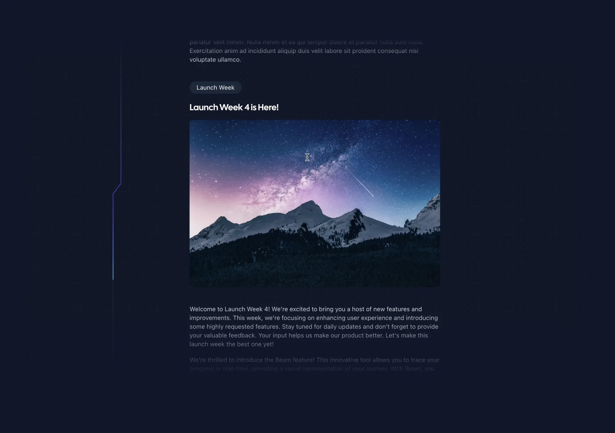
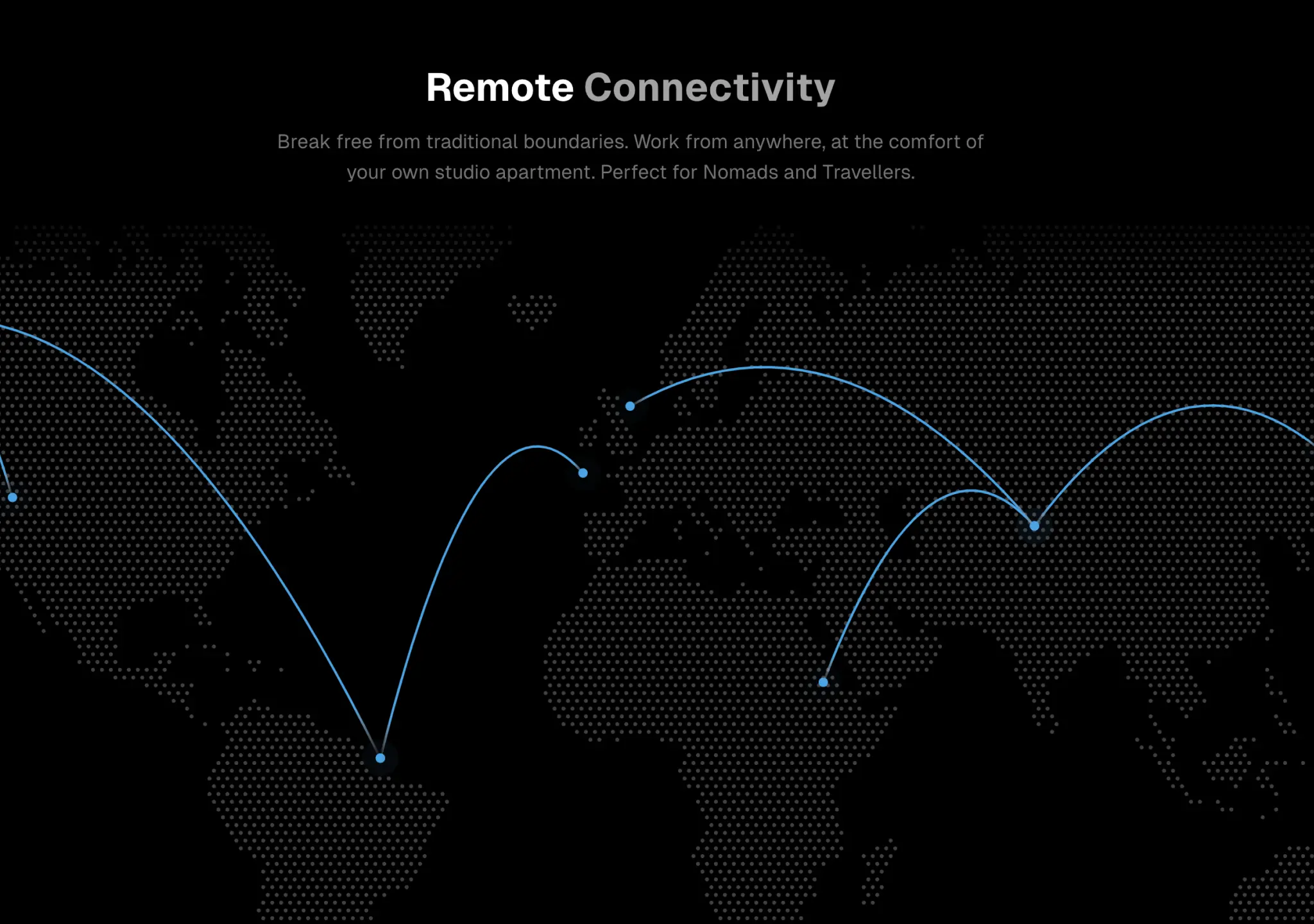
  • Tracing Beam previewscroll — subtle
    Tracing Beam

    Scroll-linked beam down the left of long content (changelogs, docs, case studies).
    aceternityFuturisticPremiumSource
  • World Map previewenter — medium
    World Map

    Animated connection lines on a dotted world map (needs dotted-map).

    aceternityPremiumFuturisticSource
  • Border Beam previewloop — medium
    Border Beam

    Use on ONE live element per screen. Wrapped by @oc/beam-card. theme prop defaults to dark — set theme='light' on light surfaces.
    librariesdevFuturisticPlayfulSource
  • Image FX previewloop · state — expressive
    Image FX

    Placeholder while an image model is generating.

    librariesdevExperimentalPlayfulFuturisticSource
  • Metal FX previewloop · cursor — expressive
    Metal FX

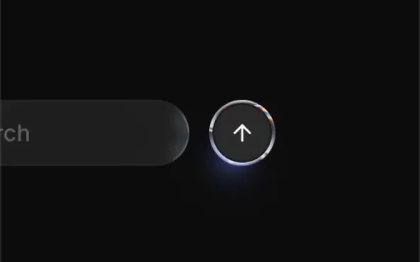
    Premium hero CTA or badge. Shader cost — one or two per page.

    librariesdevExperimentalPlayfulFuturisticSource
  • Voice Glow previewstate · loop — medium
    Voice Glow

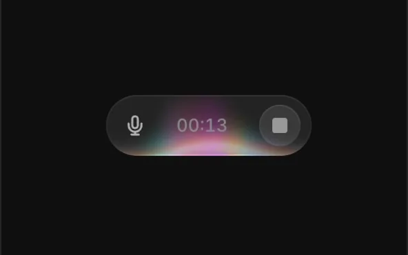
    Voice-mode UIs: pair with a mic level stream.

    librariesdevFuturisticPlayfulSource
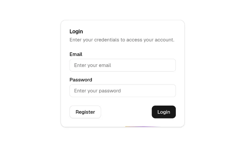
  • Animated Beam previewloop — medium
    Animated Beam

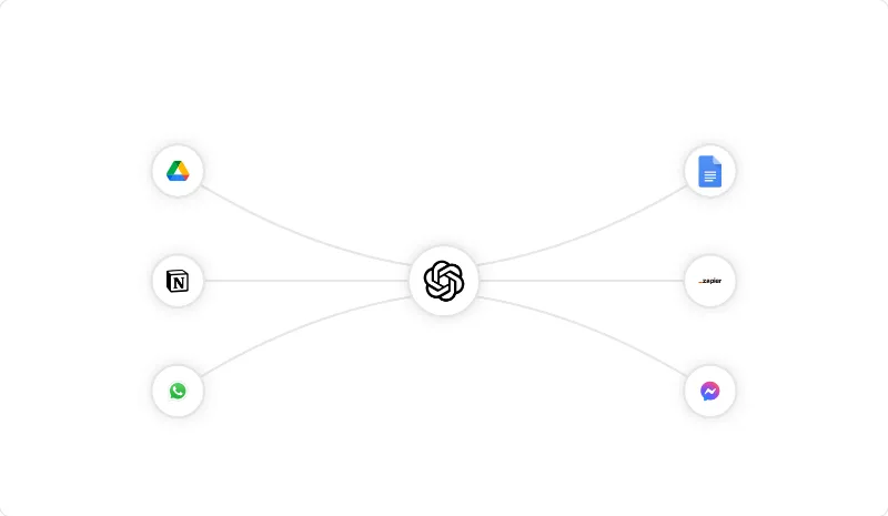
    SVG beams flowing between refs — the 'integrations' diagram (your app in the middle, tools around it). Default gradient is orange→purple: set gradientStartColor/StopColor to var(--primary).
    magicuiFuturisticRefinedPlayfulSource
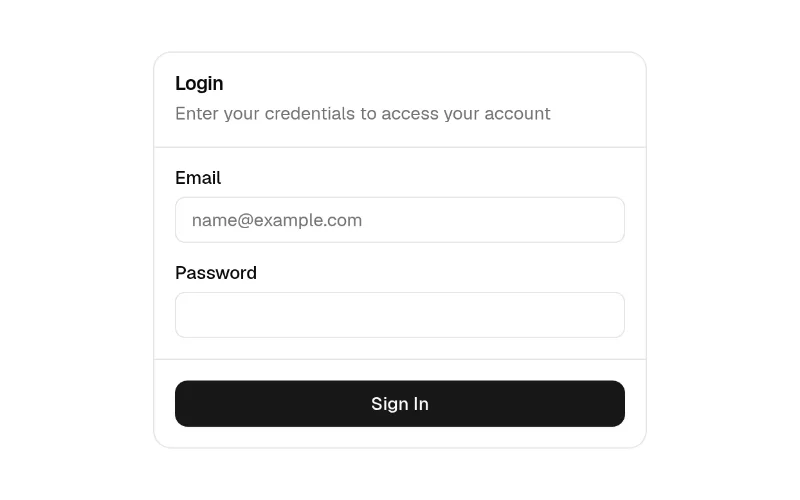
  • Border Beam previewloop — subtle
    Border Beam

    Light travelling around a card's border; subtle way to highlight one pricing tier or the hero screenshot. colorFrom/colorTo default orange/purple — pass var(--primary). Parent needs `relative overflow-hidden rounded-*`.
    magicuiFuturisticRefinedPlayfulSource
  • Magic Card previewcursor · hover — subtle
    Magic Card

    Spotlight-follows-cursor card (bg-background surface). Gradient defaults are purple/pink hex and it imports next-themes — pass gradientFrom/To from the theme; drop next-themes if you don't use it.

    magicuiFuturisticRefinedPlayfulSource
  • Aurora previewloop — expressive
    Aurora

    WebGL aurora backdrop (ogl, ~small). colorStops default to React Bits purple/green — pass your --primary hexes. Lazy-load; one per page.

    react-bitsFuturisticOrganicExperimentalSource
  • Beams previewloop — expressive
    Beams

    three.js light beams backdrop — striking but heavy (three + @react-three/fiber + drei). Use only for a hero, lazy-loaded.

    react-bitsExperimentalFuturisticPlayfulSource
  • 3d Card previewhover · cursor — medium
    3d Card

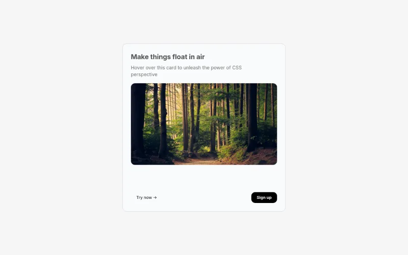
    3d-card

    aceternityPremiumFuturisticSource
  • 3D Globe previewloop — expressive
    3D Globe

    A realistic globe component with tooltips and avatar tips

    aceternityFuturisticPremiumSource
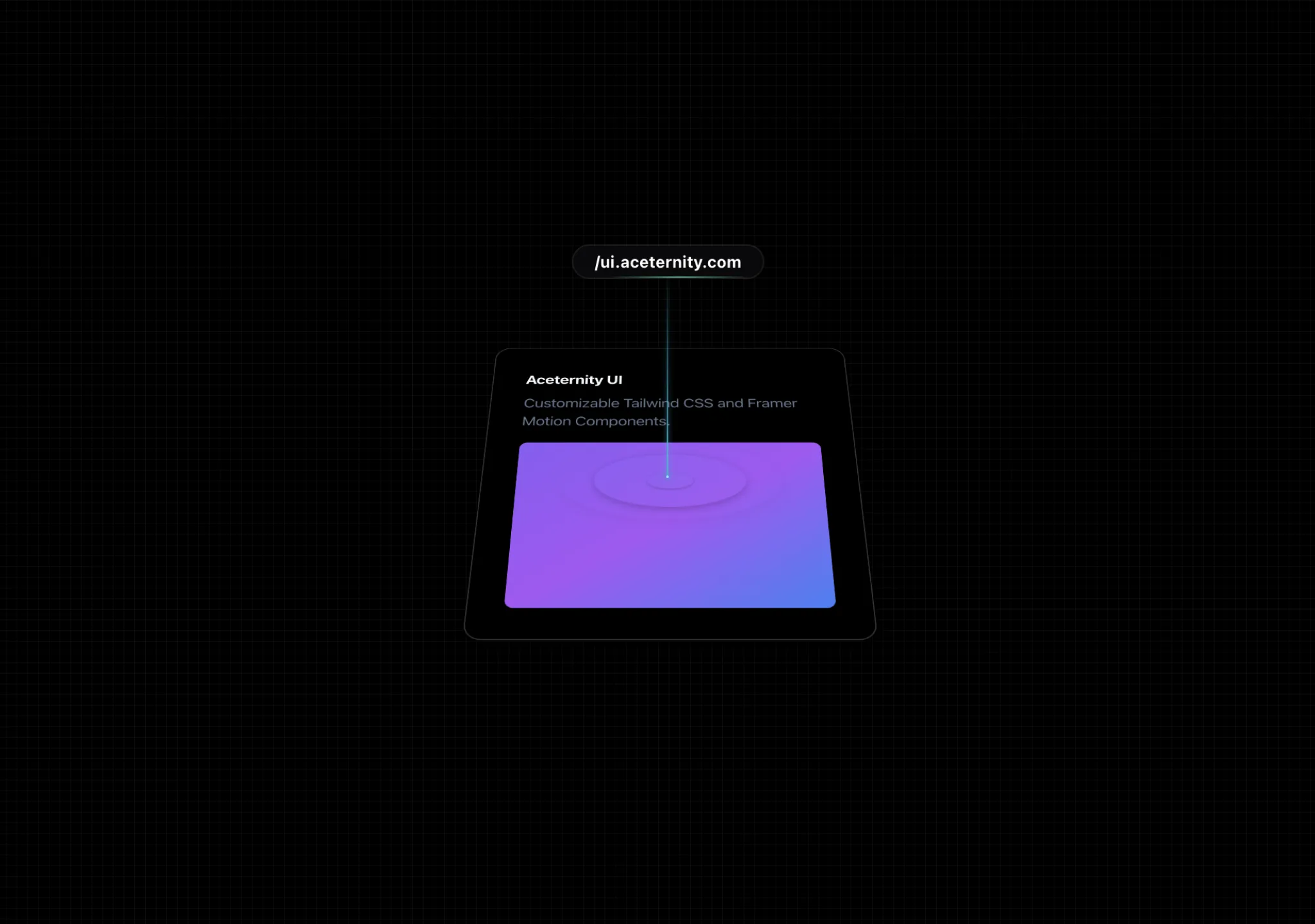
  • 3D Marquee previewloop — expressive
    3D Marquee

    A 3D Marquee effect with grid, good for showcasing testimonials and hero sections
    aceternityPremiumFuturisticSource
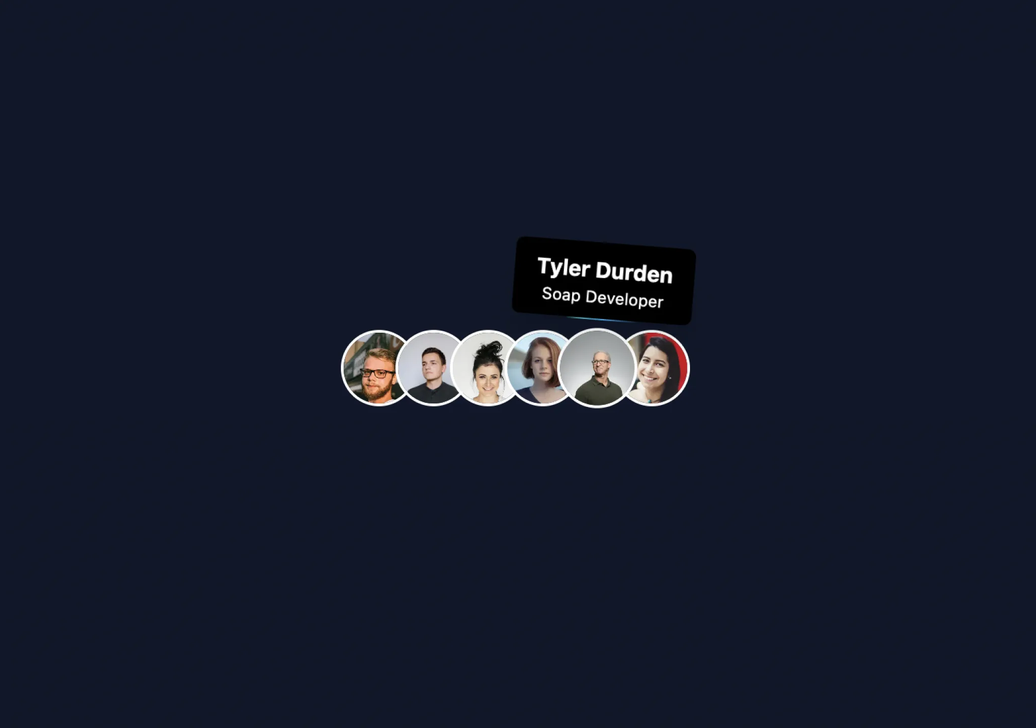
  • 3D Animated Pin previewhover · cursor — expressive

    A gradient pin that animates on hover, perfect for product links.
    aceternityOrganicPremiumFuturisticSource
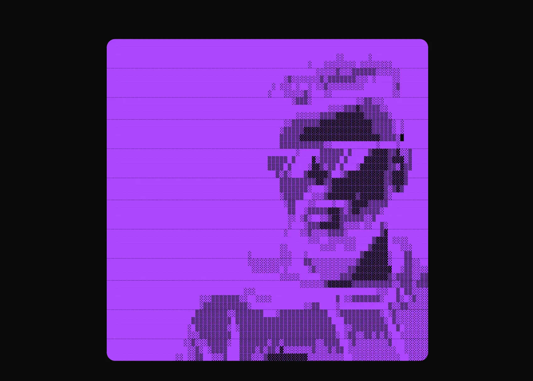
  • Animated Tooltip previewhover · enter · cursor — subtle

    A cool tooltip that reveals on hover, follows mouse pointer
    aceternityRefinedPremiumFuturisticSource
  • ASCII Art previewenter — expressive
    ASCII Art

    Convert any image to ASCII art with customizable charsets, colors, and animations.

    aceternityRetroPremiumFuturisticSource
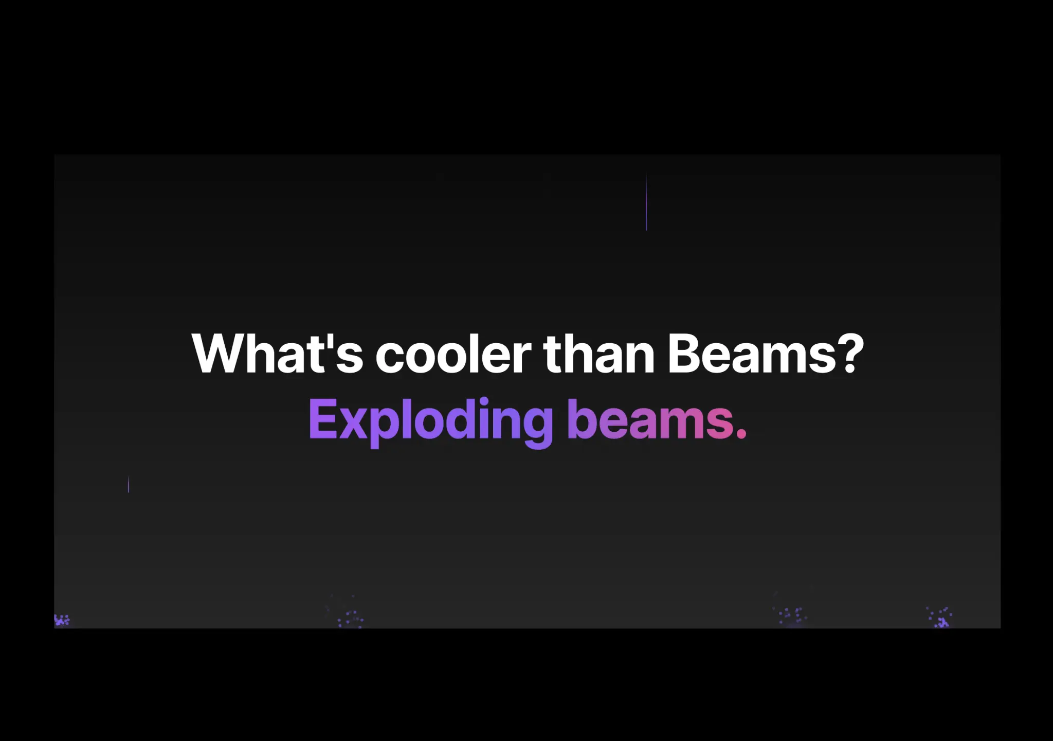
  • Background Beams With Collision previewloop — expressive

    Exploding beams in the background

    aceternityFuturisticPremiumSource
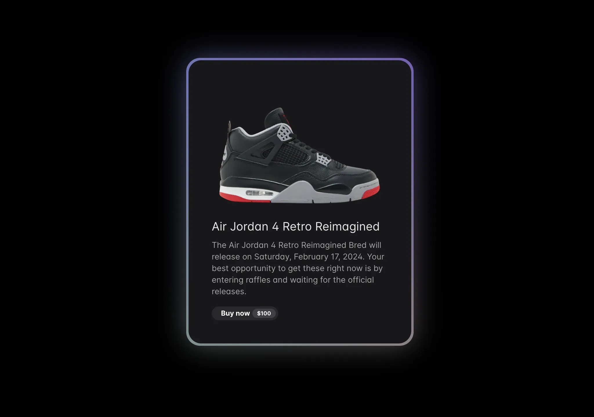
  • Background Boxes previewhover — medium

    A full width background box container that highlights on hover
    aceternityPremiumFuturisticSource
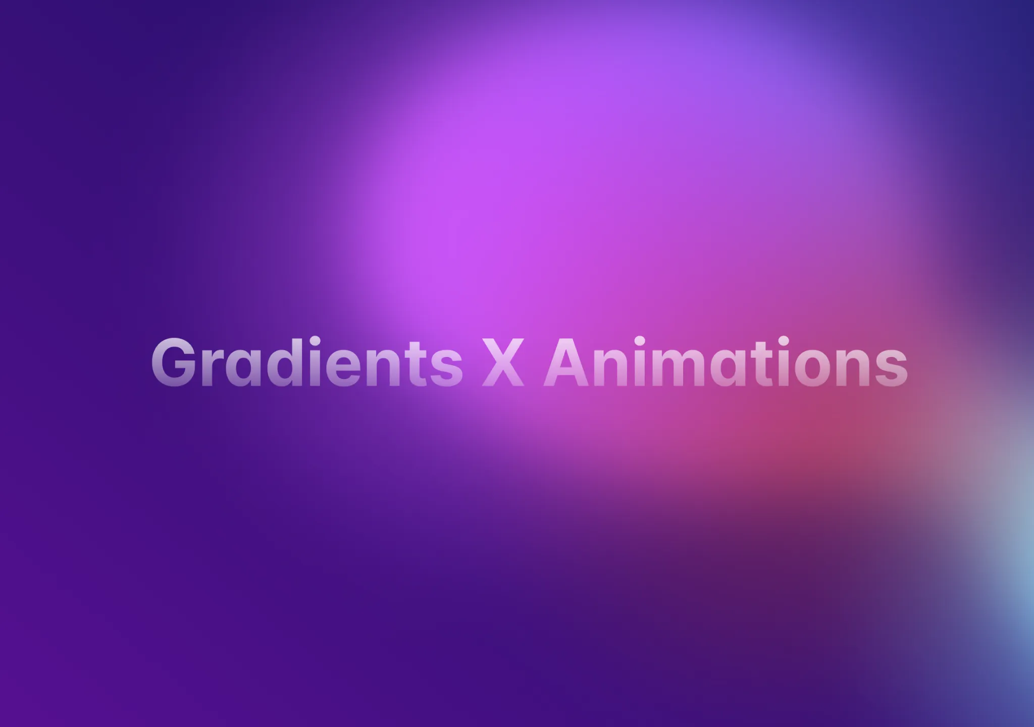
  • Background Gradient previewloop — medium

    An animated gradient that sits at the background of a card, button or anything.
    aceternityPremiumFuturisticSource
  • Background Gradient Animation previewloop · cursor — medium

    A smooth and elegant background gradient animation that changes the gradient position over time.

    aceternityPremiumFuturisticSource
  • Background Lines previewloop — medium

    Background Lines

    aceternityPremiumFuturisticSource
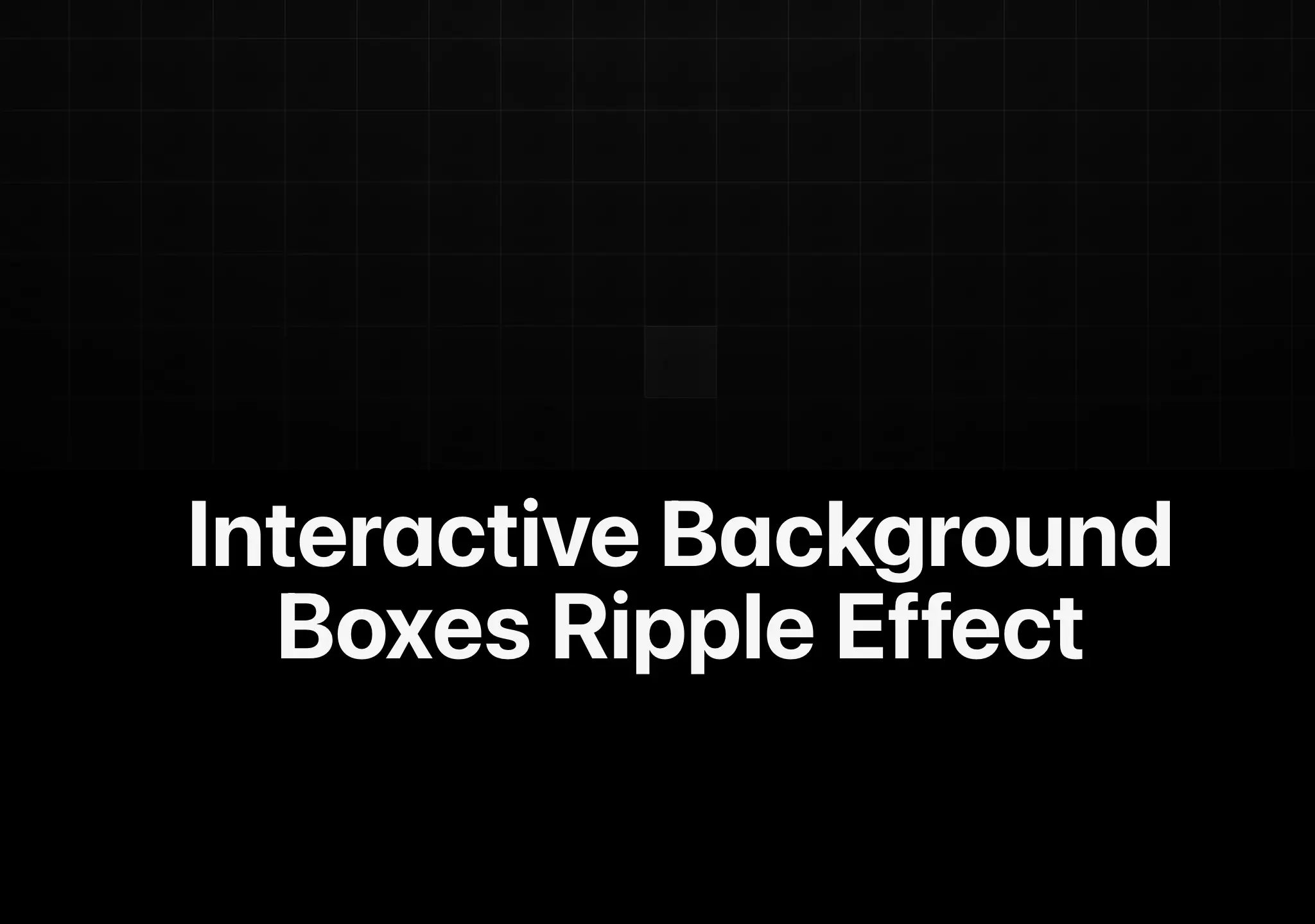
  • Background Ripple Effect previewpress — medium

    A grid of cells that ripple when clicked.
    aceternityTechnicalPremiumFuturisticSource
  • Canvas Reveal Effect previewloop · enter · state — expressive

    A dot background that expands on hover, as seen on Clerk's website
    aceternityRefinedPremiumFuturisticSource
  • Hover Effect previewhover — medium
    Hover Effect

    Hover over the cards and the effect slides to the currently hovered card.

    aceternityPremiumFuturisticSource
  • Card Spotlight previewhover · cursor — expressive

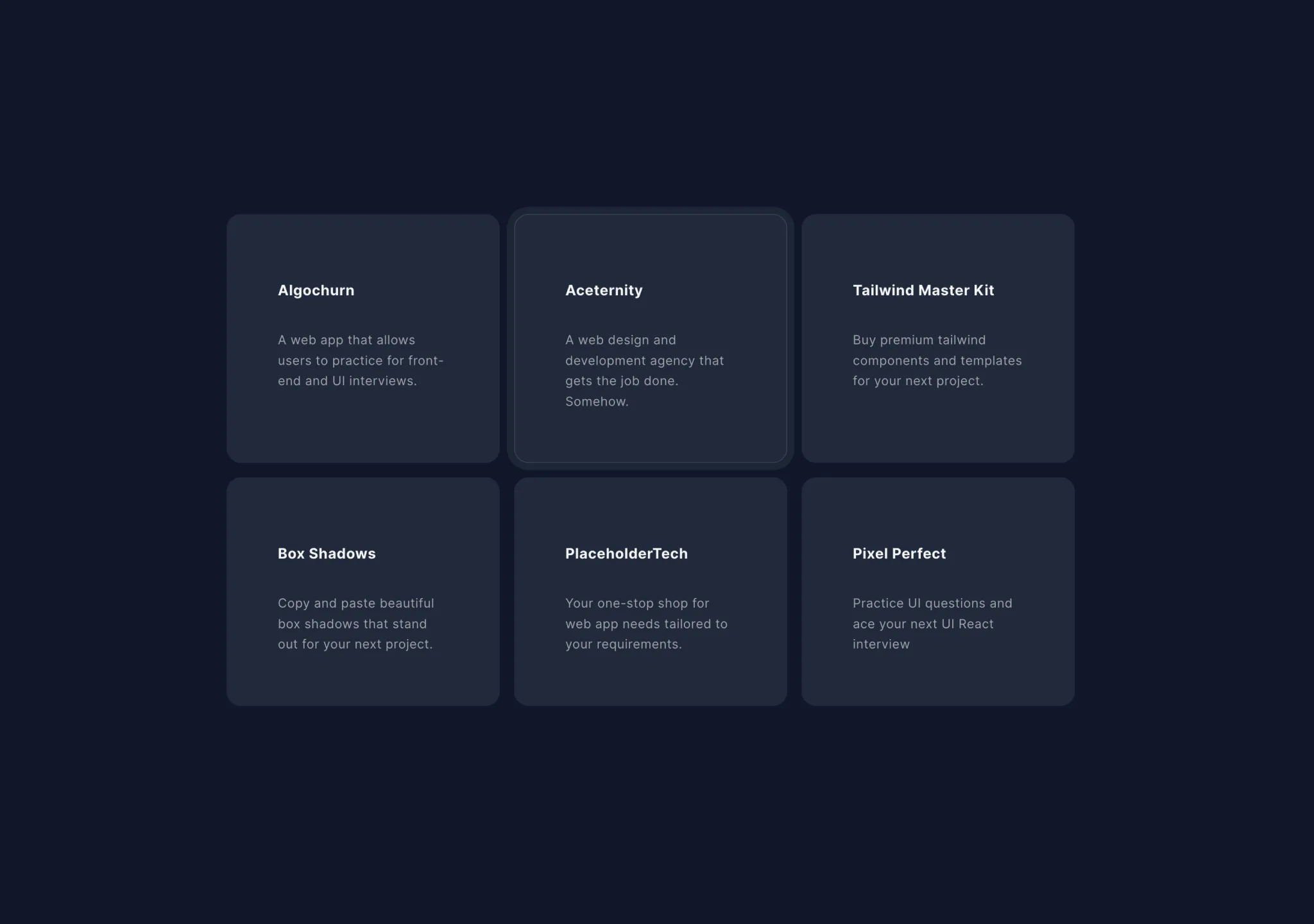
    A card component with a spotlight effect revealing a radial gradient background
    aceternityFuturisticRefinedPremiumSource
  • Card Stack previewloop — medium
    Card Stack

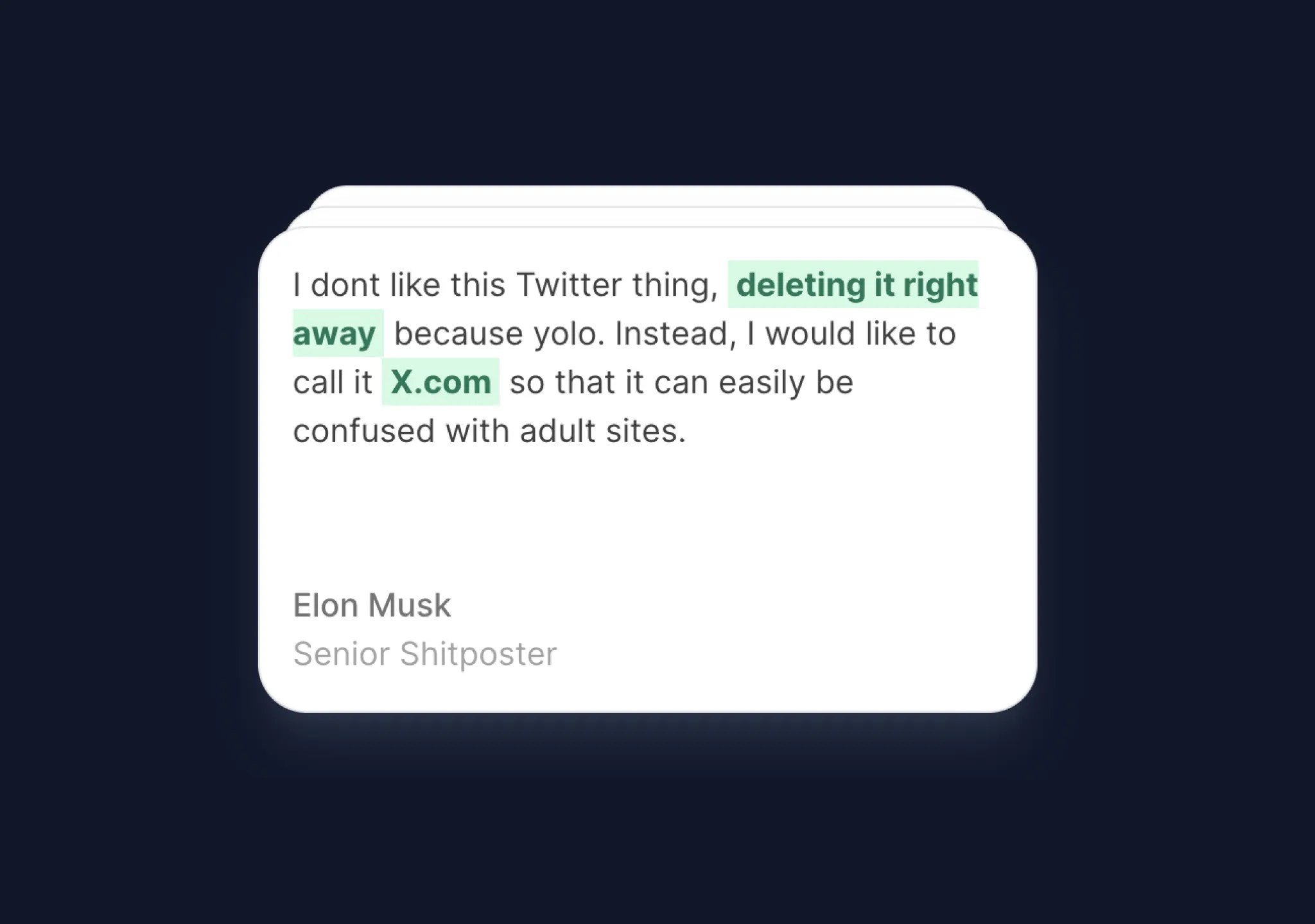
    Cards stack on top of each other after some interval. Perfect for showing testimonials.
    aceternityPremiumFuturisticSource
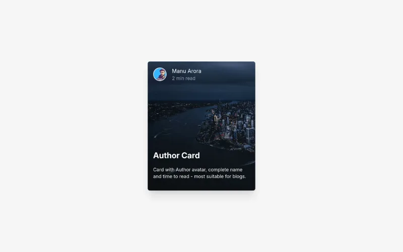
  • Background Overlay Card preview

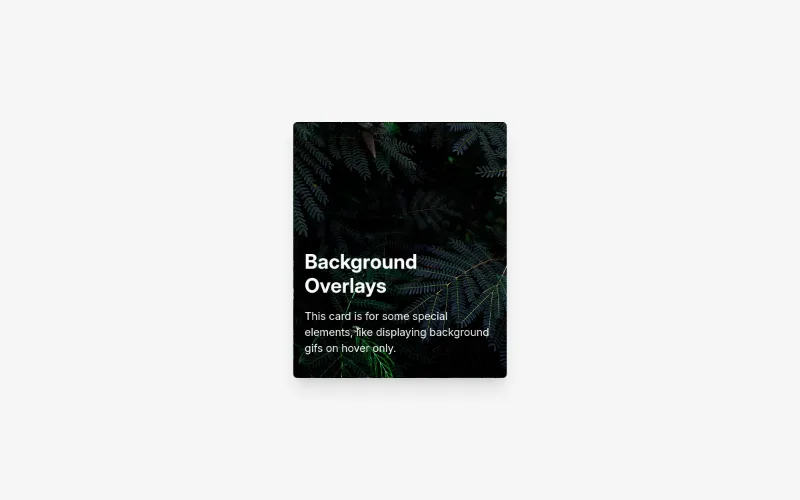
    Background Overlay Card

    aceternityPremiumFuturisticSource
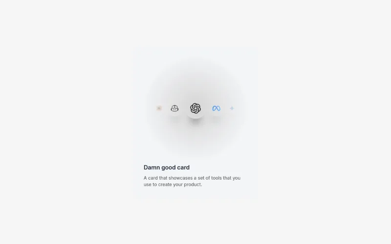
  • Content Card preview
    Content Card

    Content Card

    aceternityPremiumFuturisticSource
  • Feature Block Animated Card previewenter — medium

    Feature Block Animated Card

    aceternityPremiumFuturisticSource
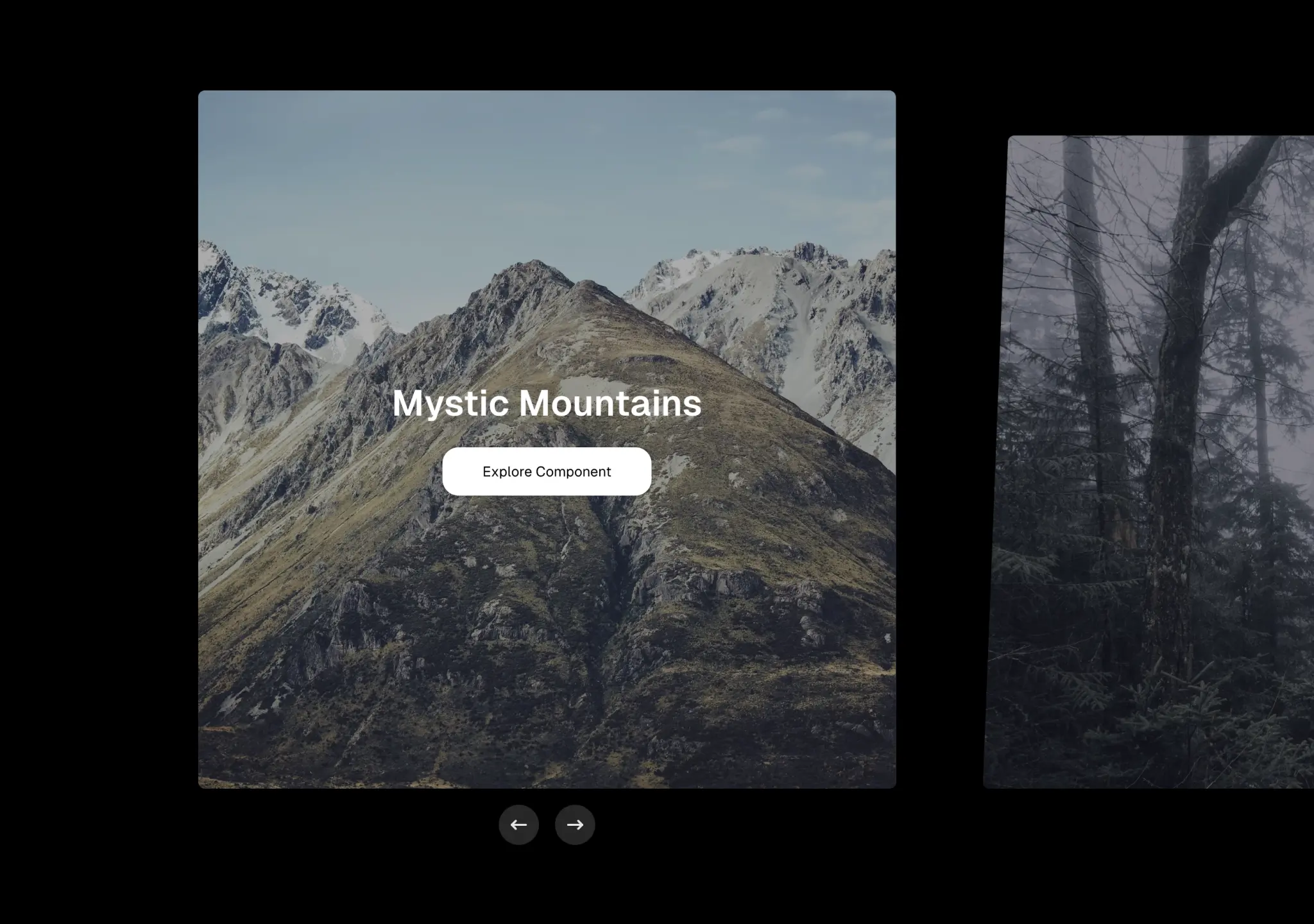
  • Carousel previewcursor · press — medium
    Carousel

    A customizable carousel with microinteractions and slider.

    aceternityPremiumFuturisticSource
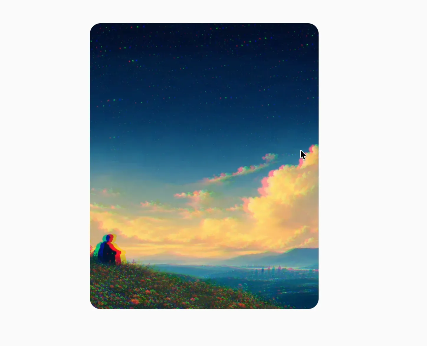
  • Chromatic Image previewloop · hover · cursor — expressive

    An interactive image with responsive color separation, displacement, and tilt.
    aceternityExperimentalPremiumFuturisticSource
  • Colourful Text previewloop · enter — medium

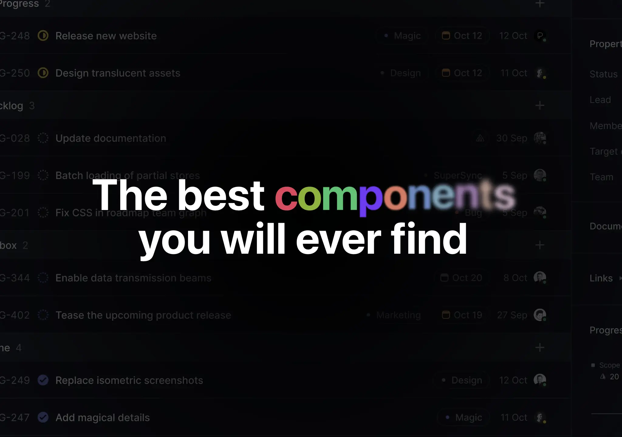
    A text component with various colours, filter and scale effects.

    aceternityPlayfulPremiumFuturisticSource