design-infra
Component catalog
Find components by type and feeling. Explore live examples, shortlist your options, and copy your picks to your agent.
Filter by feeling, motion, usage or library · 1 active
875 total results · 804 with visual previews · 71 on source sites
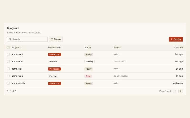
shadcn table in a card with toolbar: search, faceted filter, actions slot, sortable columns, row selection and pagination. Badge columns are server-safe; `cell` renderers need a client page.
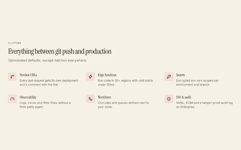
Icon + title + text feature rows in a 2- or 3-column grid, or heading-left/list-right with columns={1}. Calmer alternative to feature-bento.
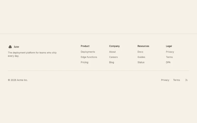
Site footer: brand + blurb, 2-5 link columns, bottom bar with copyright, legal links and social icons.
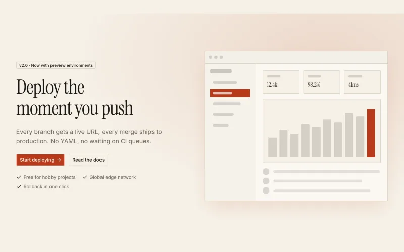
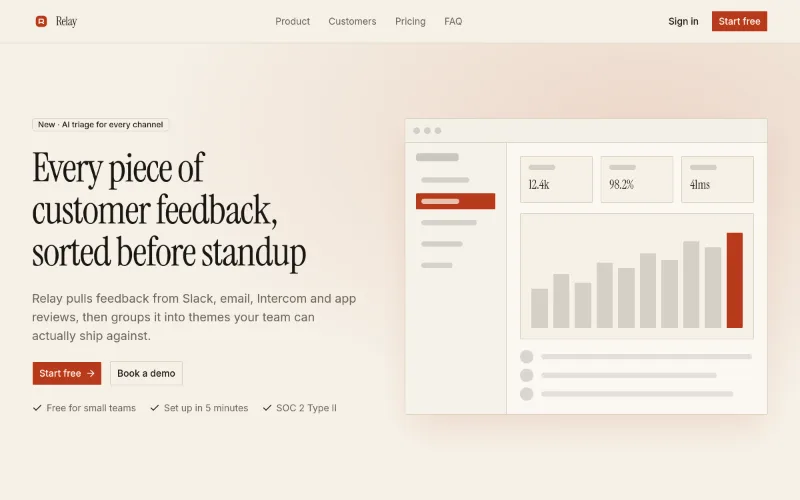
Two-column hero: headline, copy, actions and proof bullets on the left; framed product media on the right (themed mock by default). `reverse` flips sides.
 loop · hover — subtle
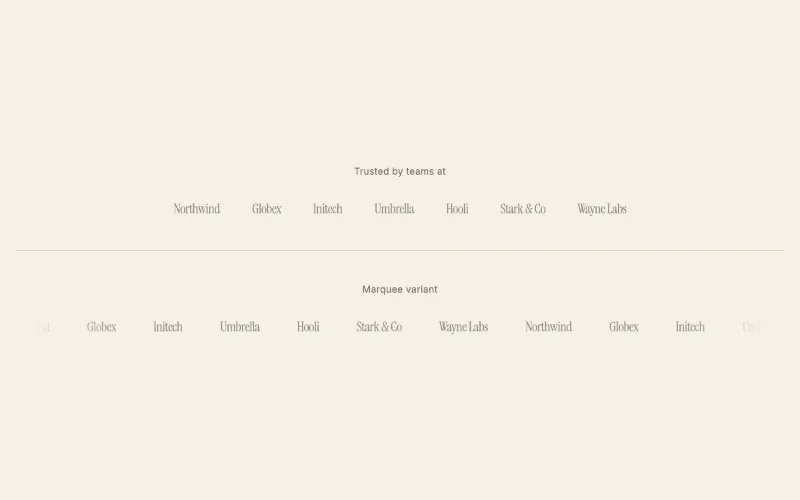
'Trusted by' strip. Static wrapping row or infinite marquee with faded edges (pauses on hover, respects reduced motion). Text wordmarks when no SVG is given.
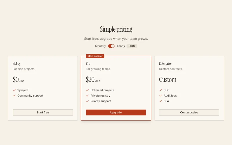
2–3 tier pricing with monthly/yearly switch and a featured tier. Pure shadcn primitives + tokens.
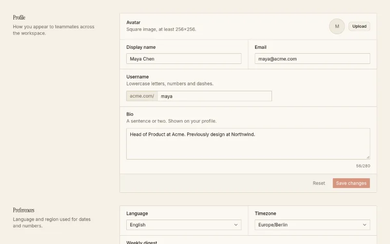
Account settings page (profile, preferences, notifications, danger zone) plus the SettingsSection / SettingsRow primitives to compose your own.
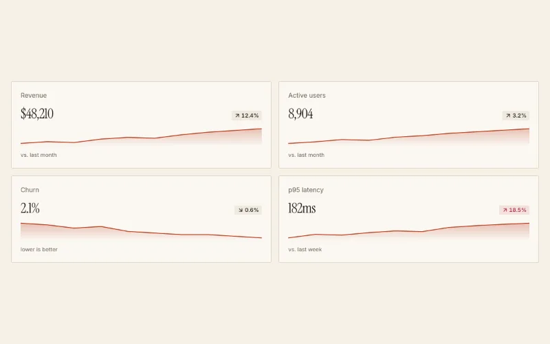
Dashboard KPI tiles: label, big value, delta chip (invertible for churn/latency) and an SVG sparkline in --chart-1.
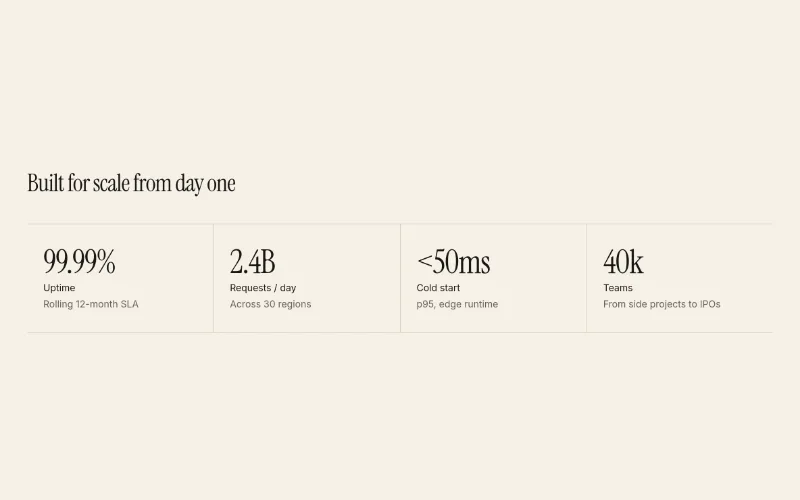
 loop — subtle
Starter page → app/page.tsx. Use existing compatible tokens, or install a theme only when requested; it pulls in 10 @oc blocks. Preview: /templates/template-landing.
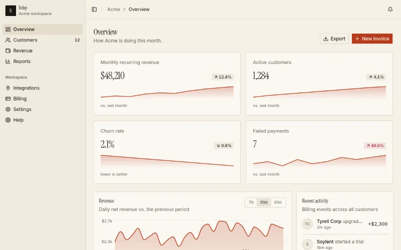
Starter page → app/dashboard/page.tsx. Use existing compatible tokens, or install a theme only when requested; it pulls in 3 @oc blocks. Preview: /templates/template-saas-dashboard.
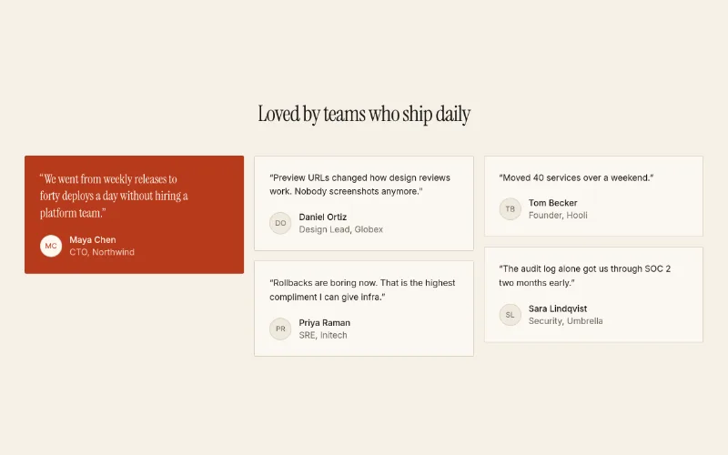
Masonry grid of customer quotes with avatars; one `featured` quote renders on a --primary fill in larger heading type.
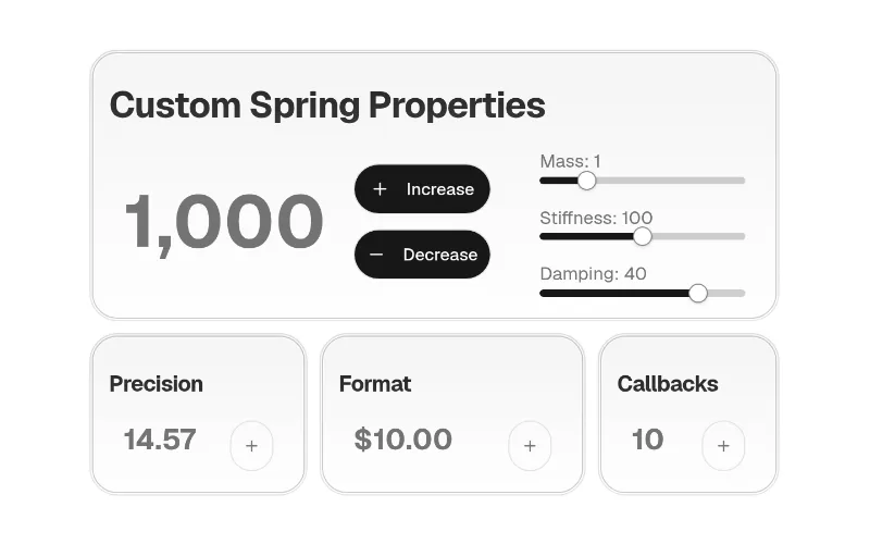 state — subtle
Small rolling-digit number (motion). Inherits colour.
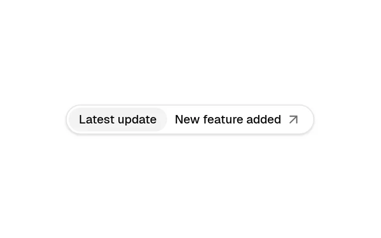
'New feature →' pill above a hero headline (compound badge). Token-based.
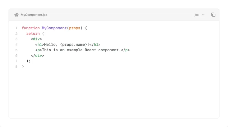
Shiki code block with tabs, line numbers, highlight/diff/focus transformers and copy. Theme-aware chrome; diff colours are semantic emerald/rose. Heavy: shiki + react-icons.
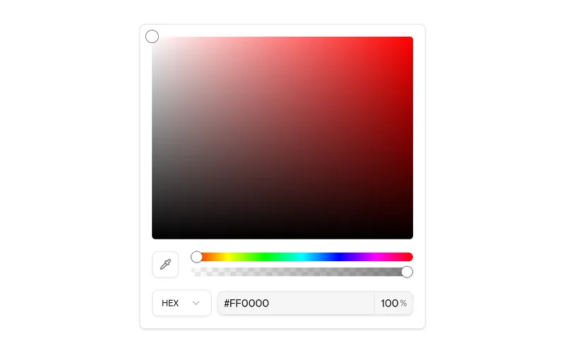
Figma-style colour picker (saturation/hue/alpha/eyedropper/format). Surfaces use tokens; the colour gradients are intrinsic.
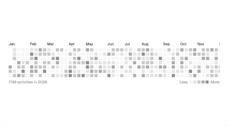
GitHub-style contribution heatmap; levels use fill-muted-foreground/N, so it inherits the theme.
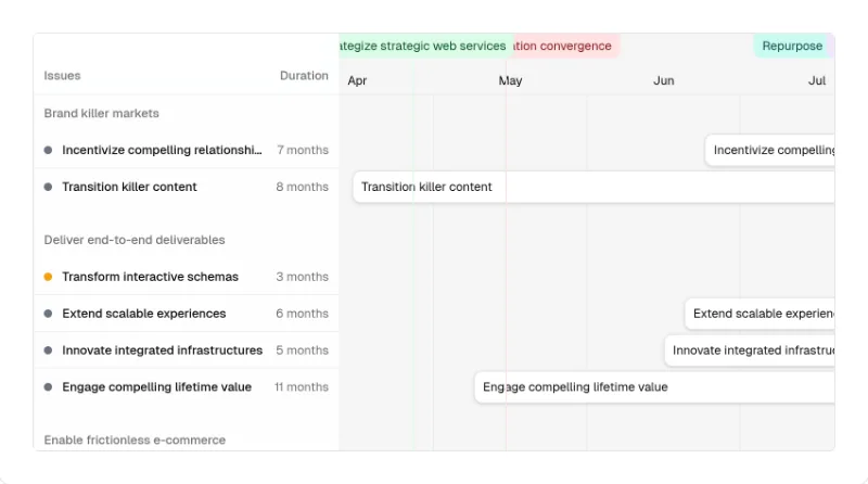 drag — subtle
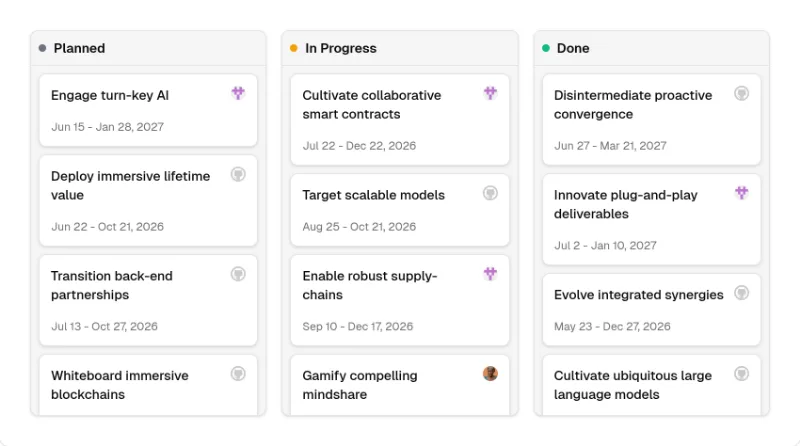 drag — subtle
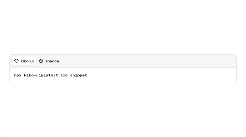
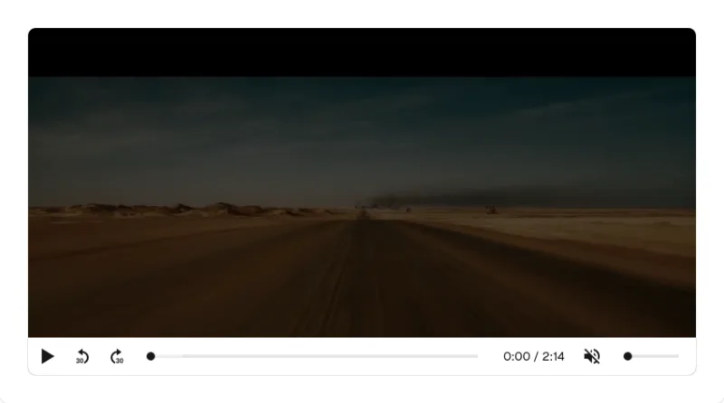
media-chrome video player styled with Tailwind. Colourless controls inherit theme.
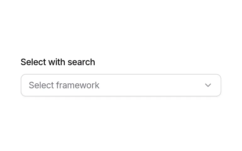
Searchable combobox (popover + command) with label — drop-in for long select lists.
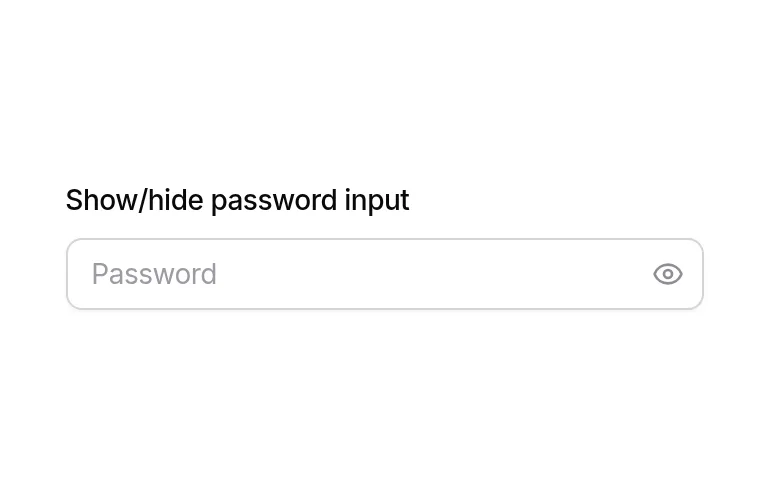
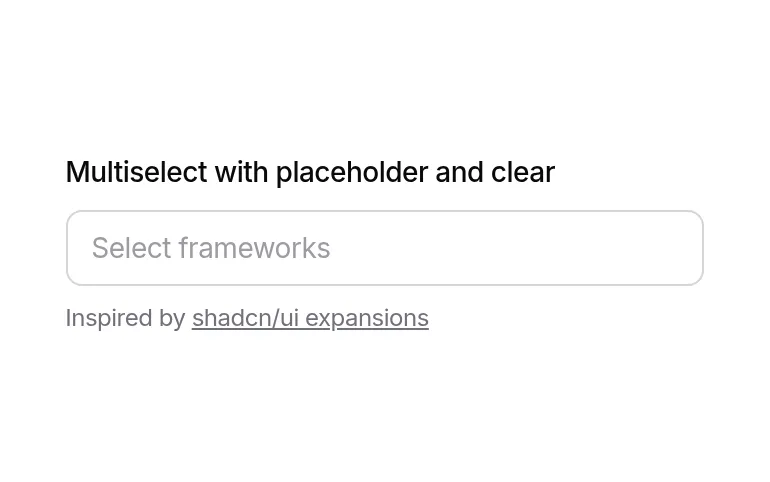
Multiselect with removable tag chips + search. Uses Origin's `multiselect` primitive (not in stock shadcn).
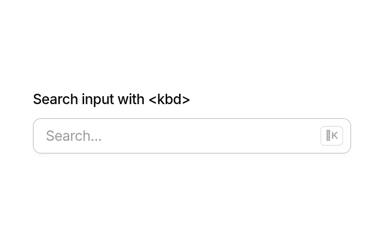
Search input with ⌘K kbd hint — standard app header search field.
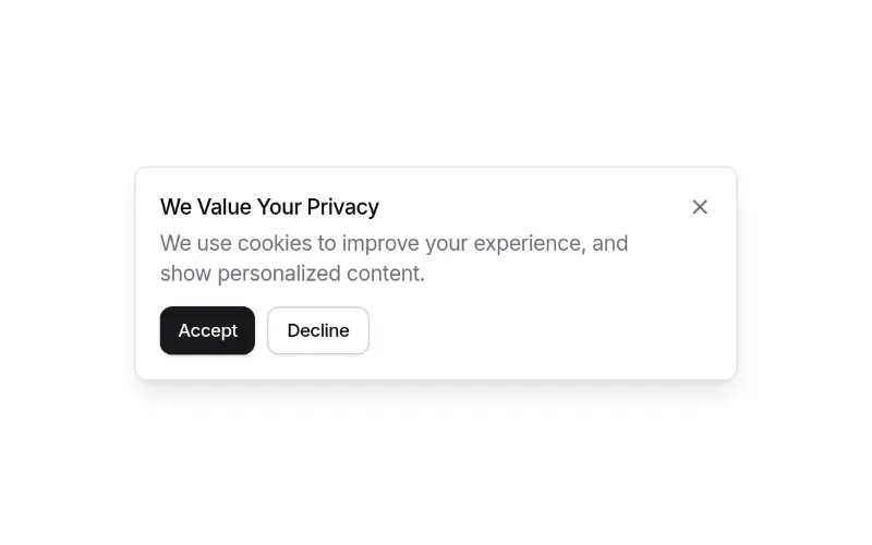
Cookie/GDPR consent notification with buttons. Small and token-based; wire up persistence yourself.
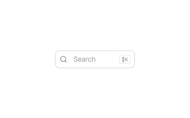
Command palette (command + dialog) with search — pair with comp-25 as the trigger and bind ⌘K yourself.
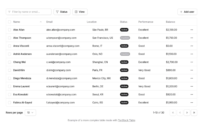
Full TanStack data table: search, column filters, visibility toggles, row selection, delete, pagination. Best free 'admin table' starting point. Pulls Origin's own table/button/select primitives (see gotchas).
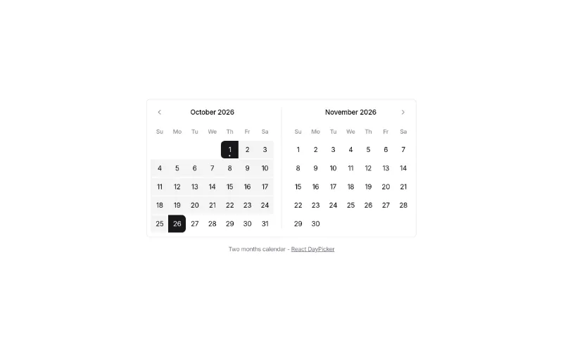
Range calendar (react-day-picker) for date-range filters.
Stepper for multi-step forms / onboarding (Origin's stepper primitive, not in stock shadcn).
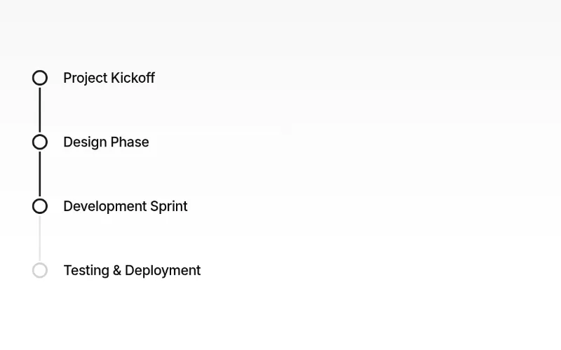
Timeline (Origin's timeline primitive) — changelogs, order history, activity.
 drag — medium
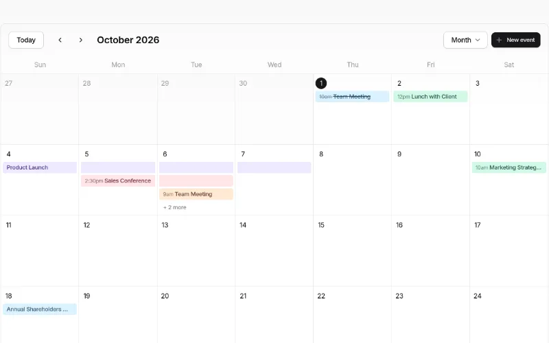
Event calendar (month/week/day/agenda, drag-and-drop, event dialog) — a whole feature for free. Heavy: dnd-kit, date-fns, @remixicon/react, ~12 primitives. Event colours are a fixed palette (sky/amber/violet/rose/emerald/orange).
Avatar upload with crop dialog + zoom slider. Uses Origin's cropper primitive and use-file-upload hook.
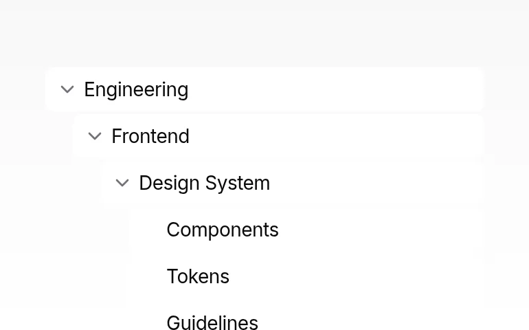
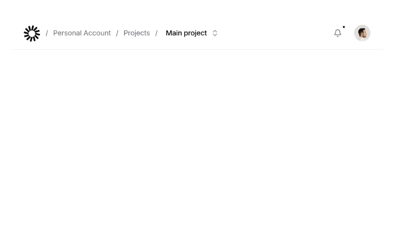
App navbar with breadcrumb, notification popover and user menu — complete product header. Logo is a placeholder SVG.
 enter · state — subtle
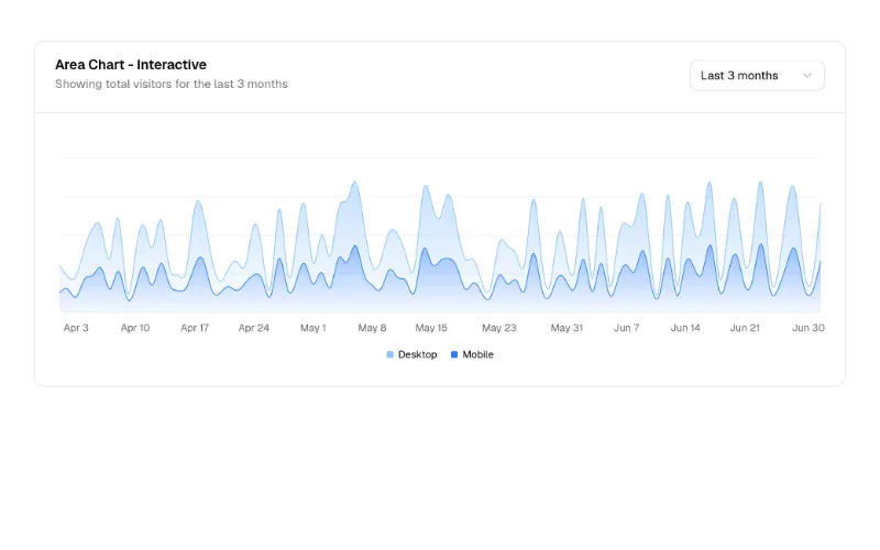
Area chart with time-range select — the dashboard hero chart. Colours come from --chart-1..5 (all our design systems define them).
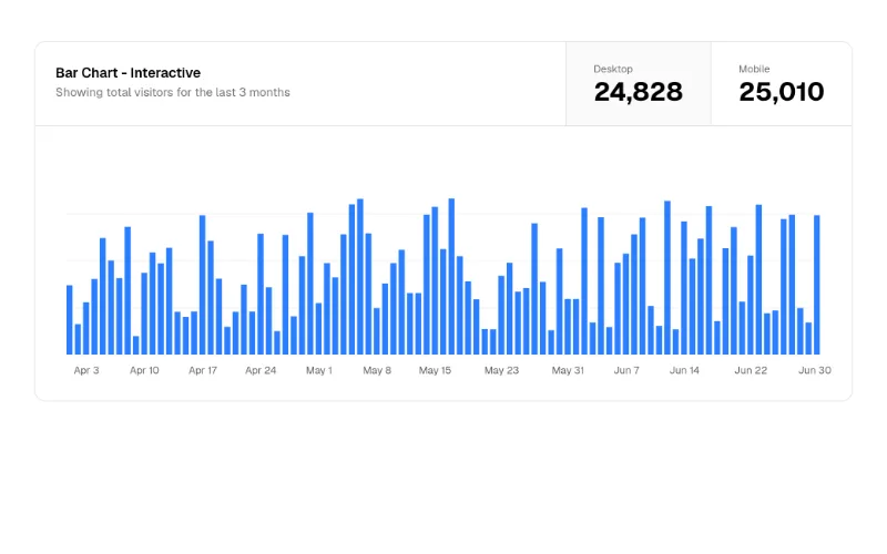
Bar chart with metric toggle in the card header. Recharts via the shadcn chart component.
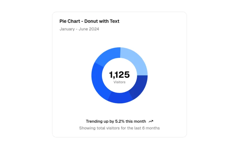
Donut with total in the centre — compact KPI breakdown.
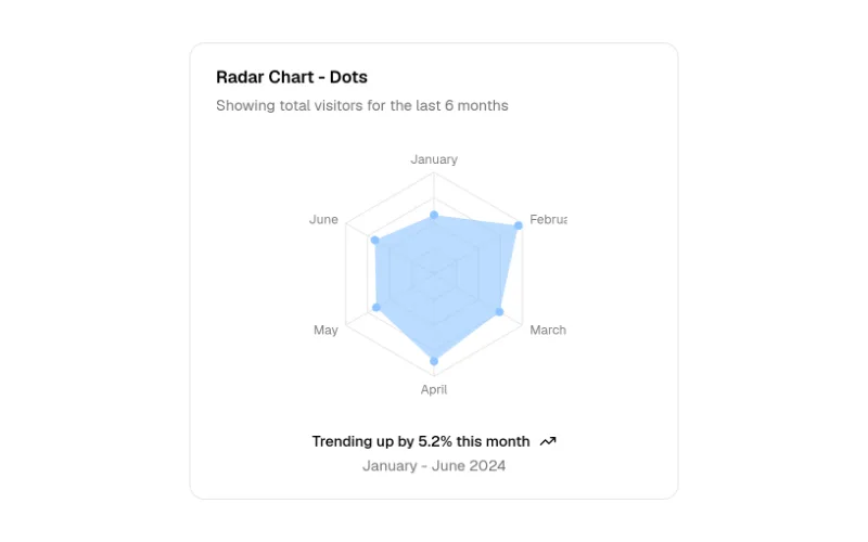
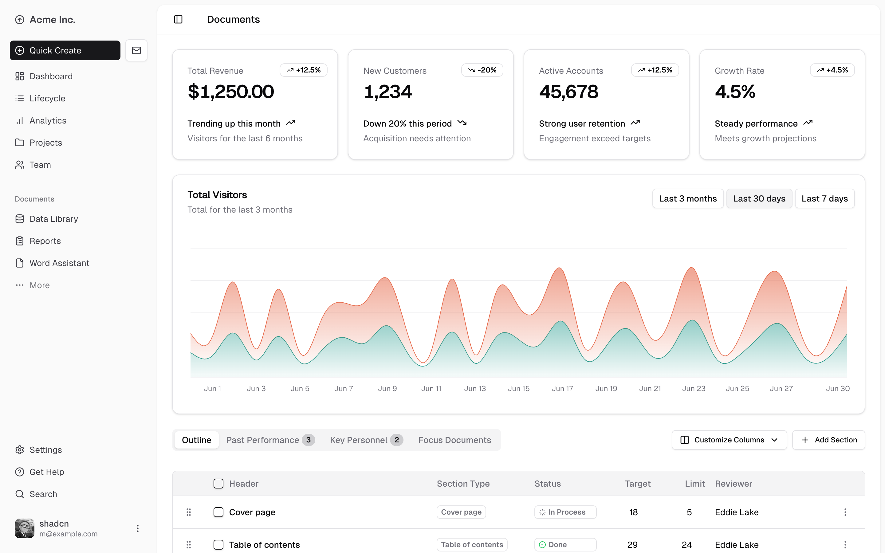
The reference SaaS dashboard: inset sidebar, KPI cards, interactive area chart, dnd-sortable data table. Writes app/dashboard/page.tsx + data.json and many components/* files. Uses @tabler/icons-react (swap for lucide if you like).
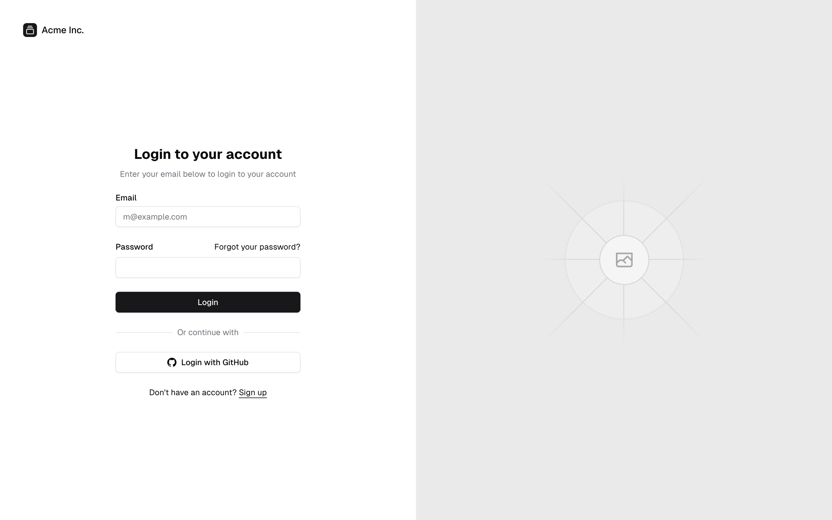
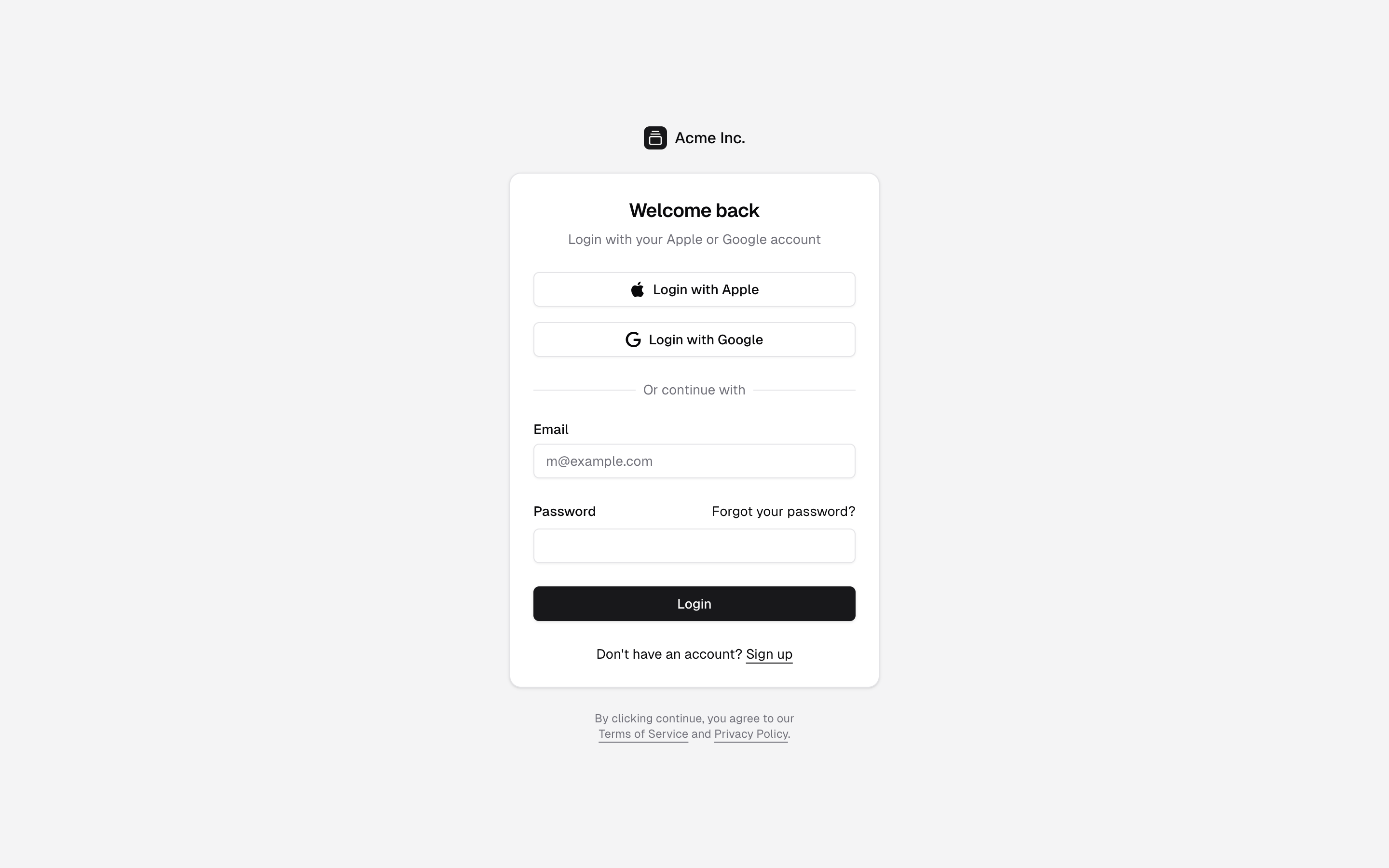
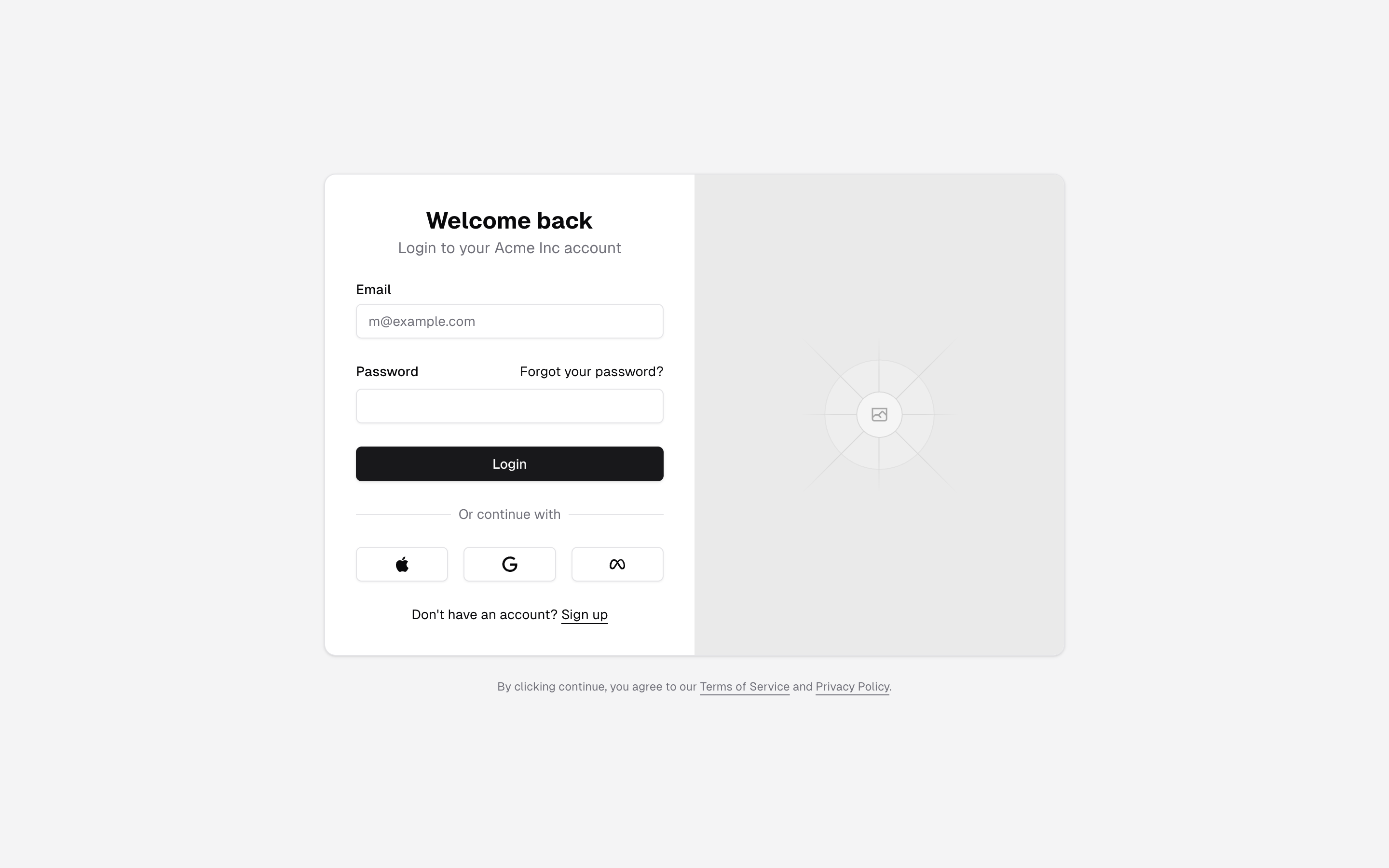
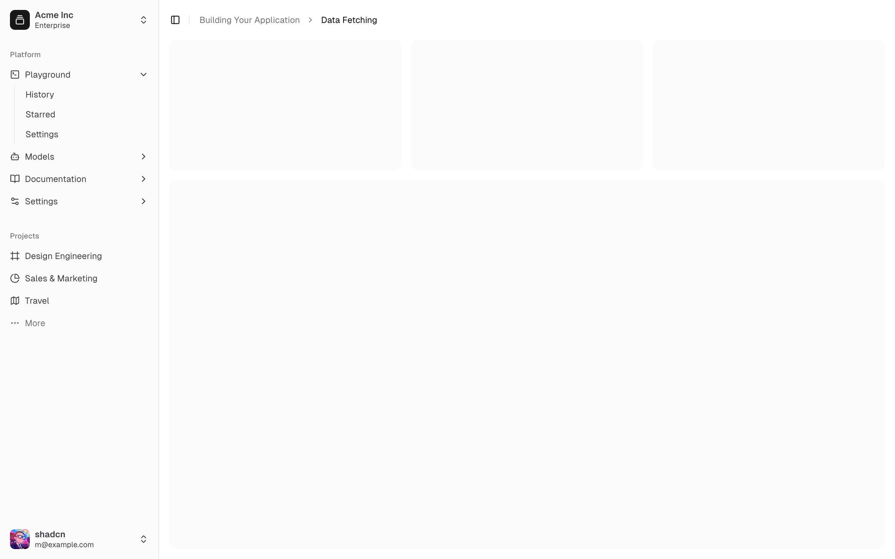
Sidebar that collapses to icons, with team switcher + user menu — the best default app shell. Writes app/dashboard/page.tsx and components/app-sidebar.tsx (installing another sidebar-NN overwrites it).
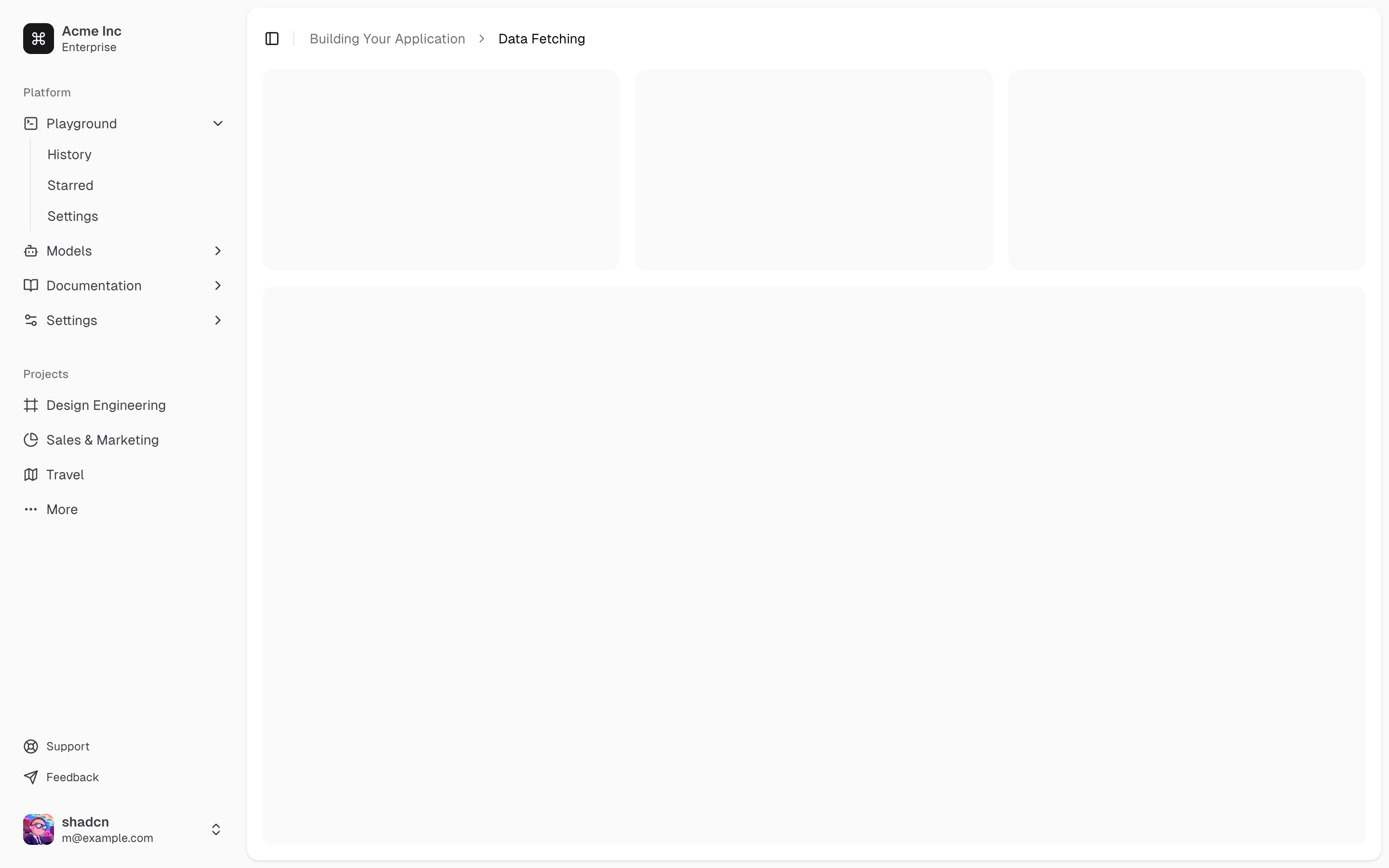
Inset sidebar with secondary nav — Linear/Vercel-style shell.
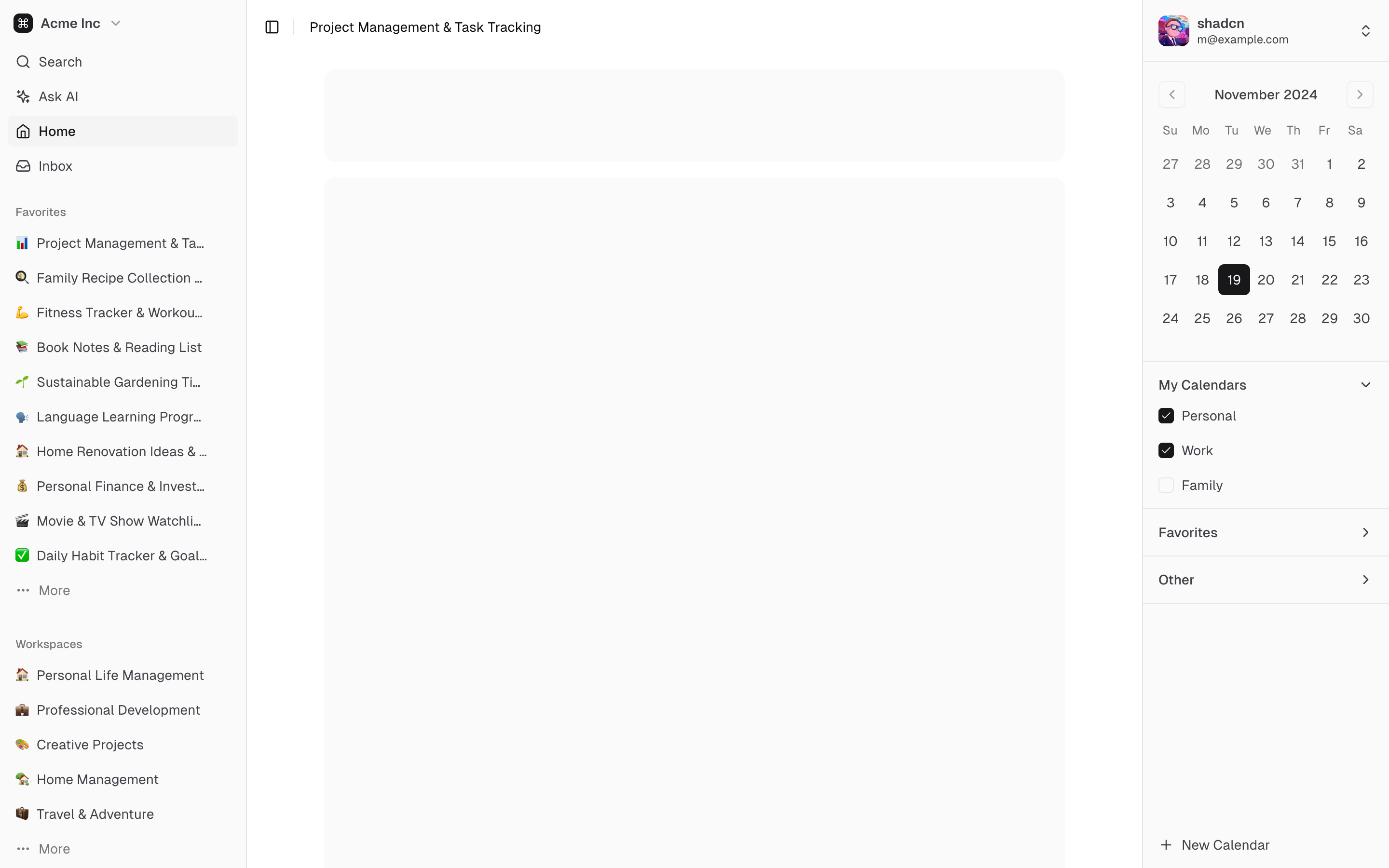
Left nav + right sidebar (calendar) — three-column layouts like mail/calendar apps.
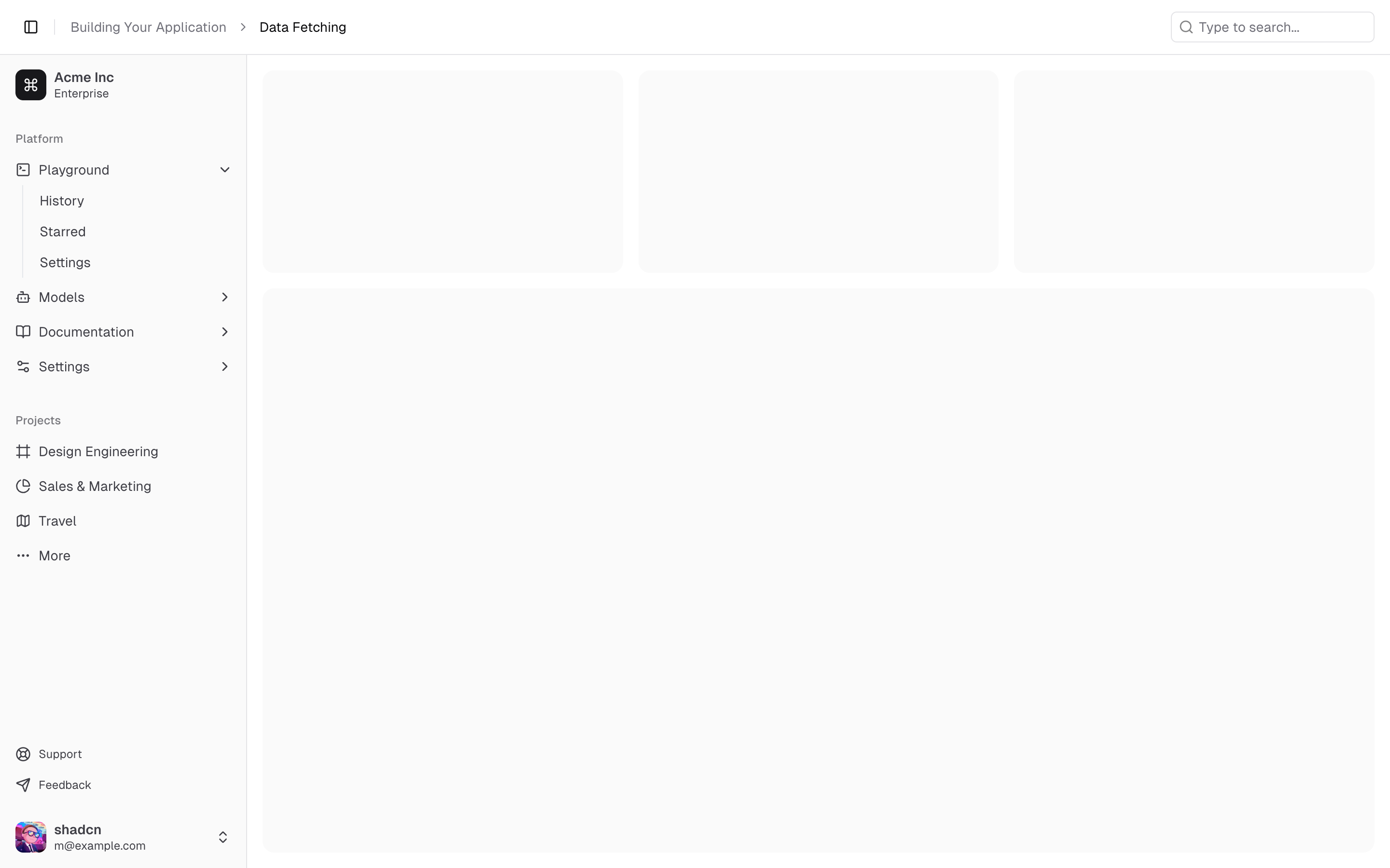
Sidebar under a sticky site header (search + breadcrumb) — for apps with a global top bar.
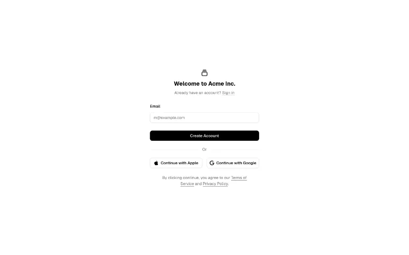
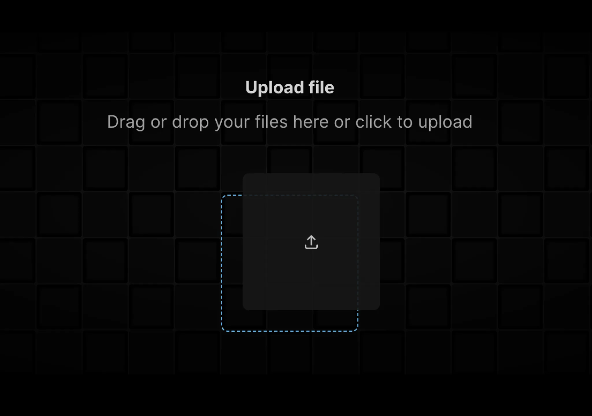 drag · hover · state — subtle
Drag-and-drop upload with grid background and micro-interactions.
 press · state — subtle
Button with loading → success states built in.
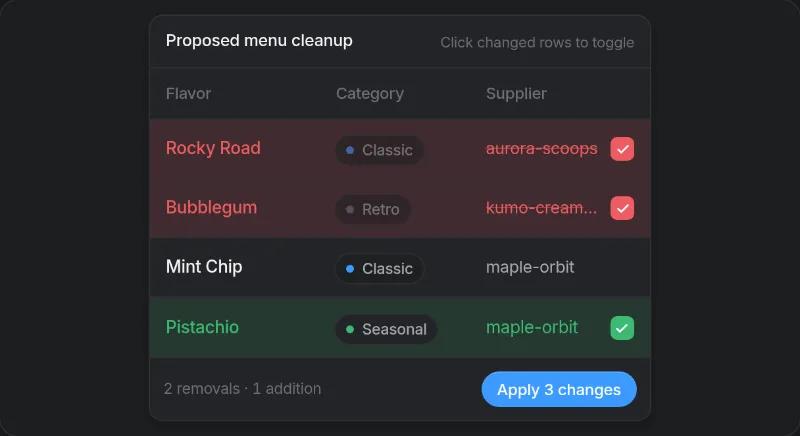 enter · state — subtle
Row-level diff table for agent-proposed data changes. Requires the Beautiful UI foundation.css, which redefines --accent (collides with shadcn).
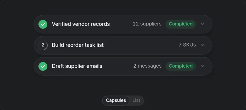 state · loop — subtle
 state · loop — subtle
 press · state — medium
Button that morphs into a small inline form (feedback, waitlist). Text uses tokens but surfaces are bg-white / dark:bg-[#121212] plus blue accents — swap to bg-popover.