 design-infra
Product-led SaaS homepage — near-black canvas, huge tight Inter headline, and the real product UI as the hero, followed by numbered capability chapters that each show a slice of the app.
Why it is here
The benchmark for "refined dark SaaS" — restraint, density, and letting the product itself be the illustration. Seed example for the inspiration layer.Reproduce it with
Catalog pieces that rebuild its patterns.
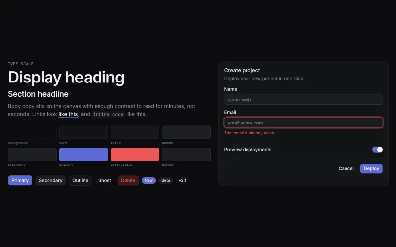 Linear Dark (design system)oc/theme-linear-dark
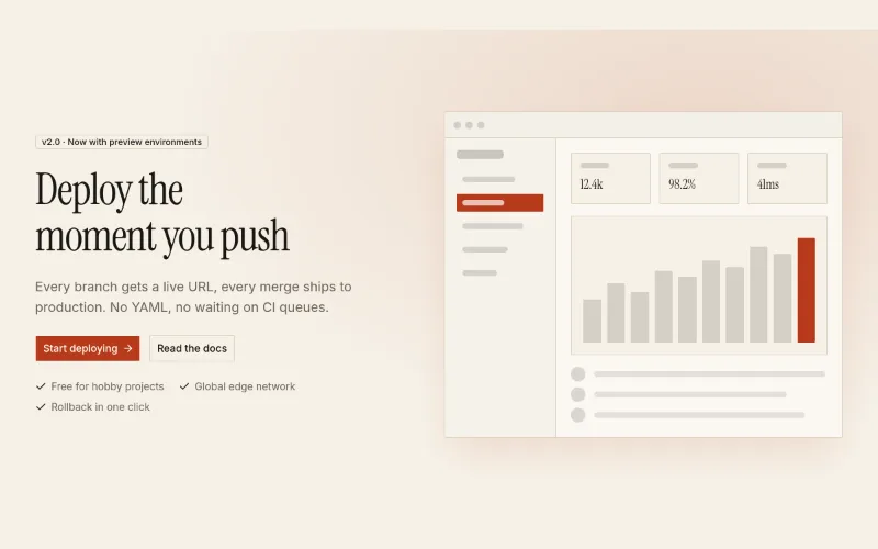 Hero · Splitoc/hero-split
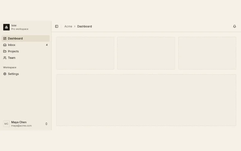 App shelloc/app-shell
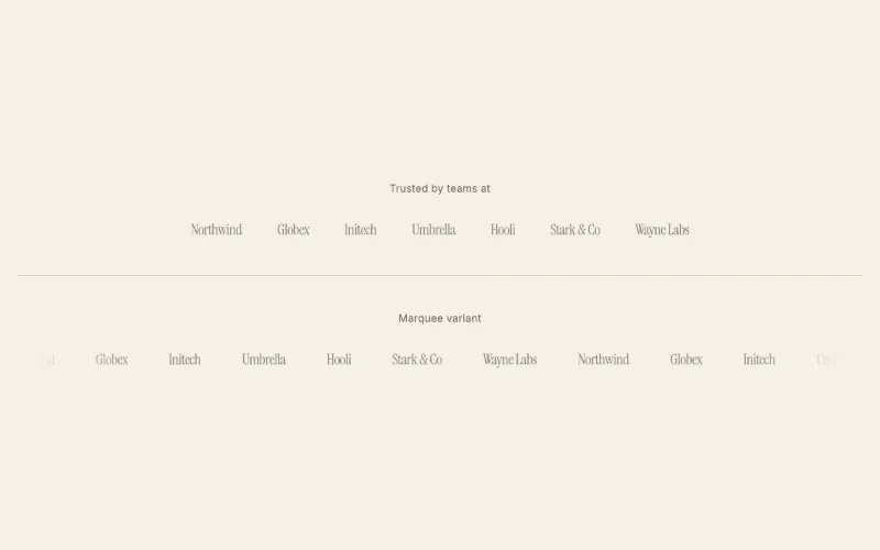 loop · hover — subtleLogo cloudoc/logo-cloud
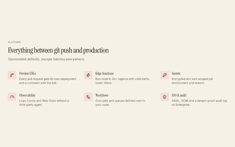 Features · Listoc/feature-list
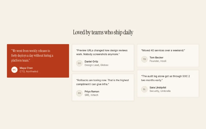 Testimonials · Gridoc/testimonials-grid
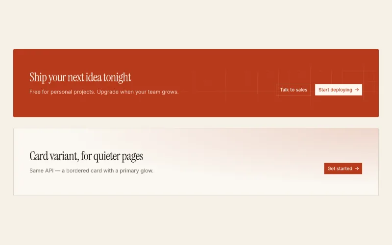 CTA banneroc/cta-banner
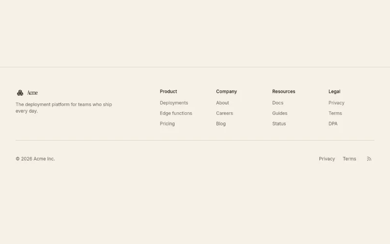 Footer · Columnsoc/footer-columns
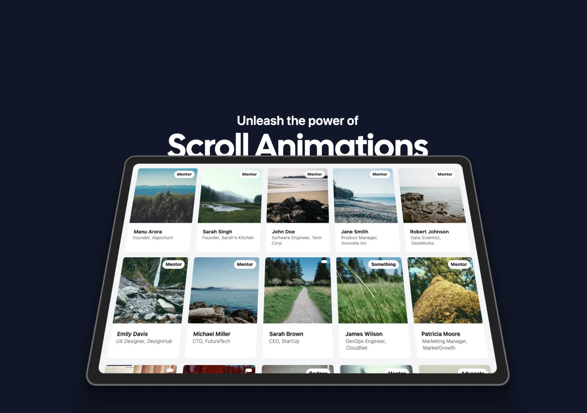 scroll — expressiveContainer Scroll Animationaceternity/container-scroll-animation
 enter — subtleText Effectmotion-primitives/text-effect
 enter — subtleBlur Fademagicui/blur-fade
[Visit the original site for visual reference; screenshots are not redistributed.]
Captured with pnpm capture https://linear.app → capture.json, full page:
/inspiration/linear/full.webp, mobile: /inspiration/linear/mobile.webp.
Feel
Quiet confidence. Everything is near-black and grey; the only "colour" is the product screenshots and one
acid-yellow testimonial card. It feels fast and engineered because it shows the product doing work
(issues, agents, code review) instead of illustrating abstractions. Motion is present (850+ animated
elements) but subtle — fades and reveals, never bouncing. Respects prefers-reduced-motion.
Palette & type (extracted)
- Canvas
#08090a→ raised surfaces#0f1011/#161718; hairline borders#23252a. - Text primary
#f7f8f8, body#d0d6e0, muted#8a8f98, faint#62666d. - Accent used once: acid yellow
#e4f222(a single testimonial card) + a white pill CTA. - Type: Inter Variable everywhere (weights 300 / 400 / 510), Berkeley Mono for code. Headline ~64px, tight tracking; body 13–15px — small and dense. Section headings ~48px/510.
- Radius: pills (
9999px) for buttons, 8–12px for panels.
Layout & patterns worth taking
| pattern | what they do | reproduce with |
|---|---|---|
| Product-as-hero | Left-aligned 2-line headline + one-line sub, then a full-width framed app screenshot with a soft glow floor | oc/hero-split (media slot) or headline + oc/app-shell screenshot; aceternity/container-scroll-animation for a tilt-in |
| Logo strip | Monochrome logos, single row, right under the hero | oc/logo-cloud (static) |
| Statement block | Big two-tone paragraph ("A new species of product tool. Purpose-built…") with 3 abstract wireframe icons | oc/feature-list columns + two-tone heading (foreground + muted span) |
| Chapters | Numbered sections ("1.0 Intake", "2.0 Planning"…) each = title left, copy right, then a wide product slice with sub-feature links underneath | oc/feature-levels (scroll-spy variant) or repeated oc/feature-list + product screenshot |
| Changelog teaser | 4 dated cards in a row | oc/feature-list with dates as eyebrows |
| Testimonials | Two large quote cards, one inverted to the accent colour | oc/testimonials-grid (featured card) |
| Closing CTA | Centered 2-line headline, white pill + ghost button | oc/cta-banner |
Motion
Headline and sections fade/blur in on scroll (magicui/blur-fade, motion-primitives/text-effect); product
panels animate state changes (typing, list updates). Keep durations short (150–300ms) and easing calm.
How to apply
Use @oc/theme-linear-dark. Compose: navbar → hero (headline + product screenshot) → logo strip → statement
→ 3–4 numbered chapters each showing a real product slice → testimonials → CTA → footer. Use real UI
(screenshots or live oc/app-shell/oc/chat-thread renders), not illustrations. Body copy 14–15px,
headings weight ~500 not bold, one accent used at most once per page.