 design-infra
Mistral AI
mistral.aiAI-lab homepage on a blueprint grid — off-white canvas framed by visible 1px rails, a huge centered medium-weight headline with an inline pixel-art icon, and a warm sunset palette (yellow → orange → red) of pixel blocks and sprites as the only illustration.
Why it is here
Seeded as the reference for "technical / refined AI". It is serious and engineered (visible grid, plain type, no gradients or glow), with a playful pixel-art brand layer that gives it a personality without being cute.Reproduce it with
Catalog pieces that rebuild its patterns.
 Navbaroc/navbar
 loop · hover — subtleLogo cloudoc/logo-cloud
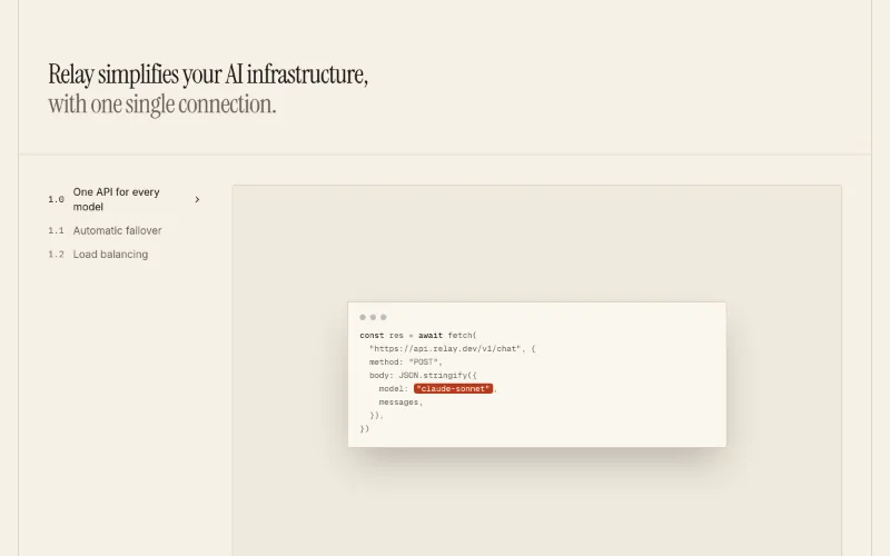 scroll — subtleFeatures · Levels (scroll-spy)oc/feature-levels
 hover — subtleFeatures · Bentooc/feature-bento
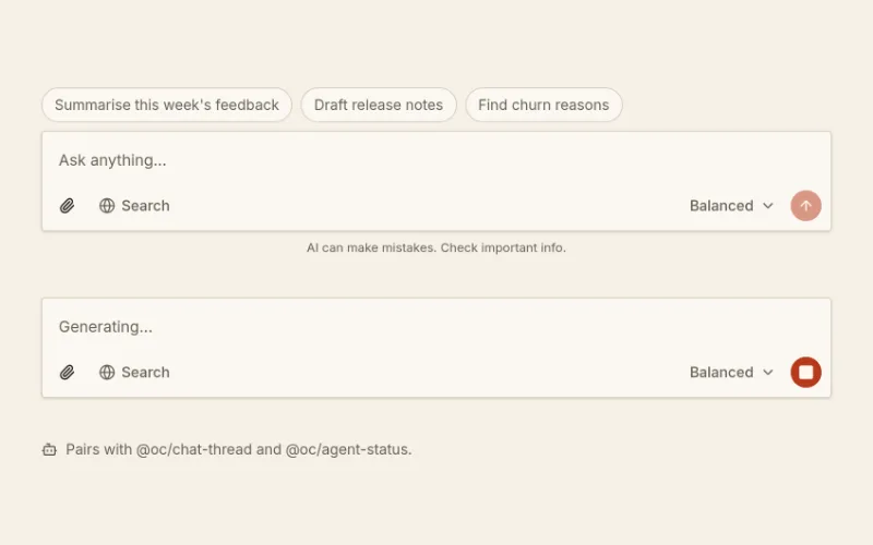 Prompt composeroc/prompt-composer
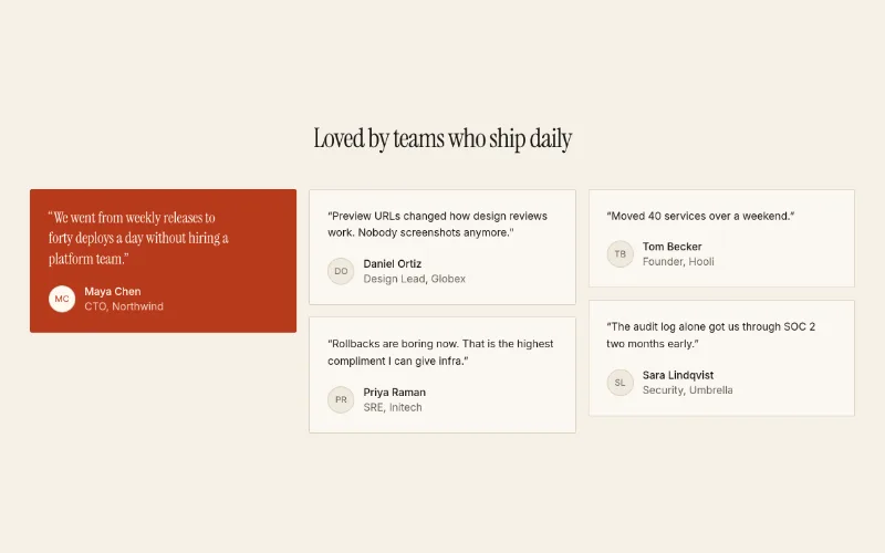 Testimonials · Gridoc/testimonials-grid
 Footer · Columnsoc/footer-columns
 loop · state — mediumStripe Bg Guidescult-ui/stripe-bg-guides
 Grid Patternmagicui/grid-pattern
 Pixel Imagemagicui/pixel-image
 loop — expressiveFlickering Gridmagicui/flickering-grid
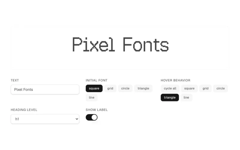 hover — subtlePixel Heading Wordcult-ui/pixel-heading-word
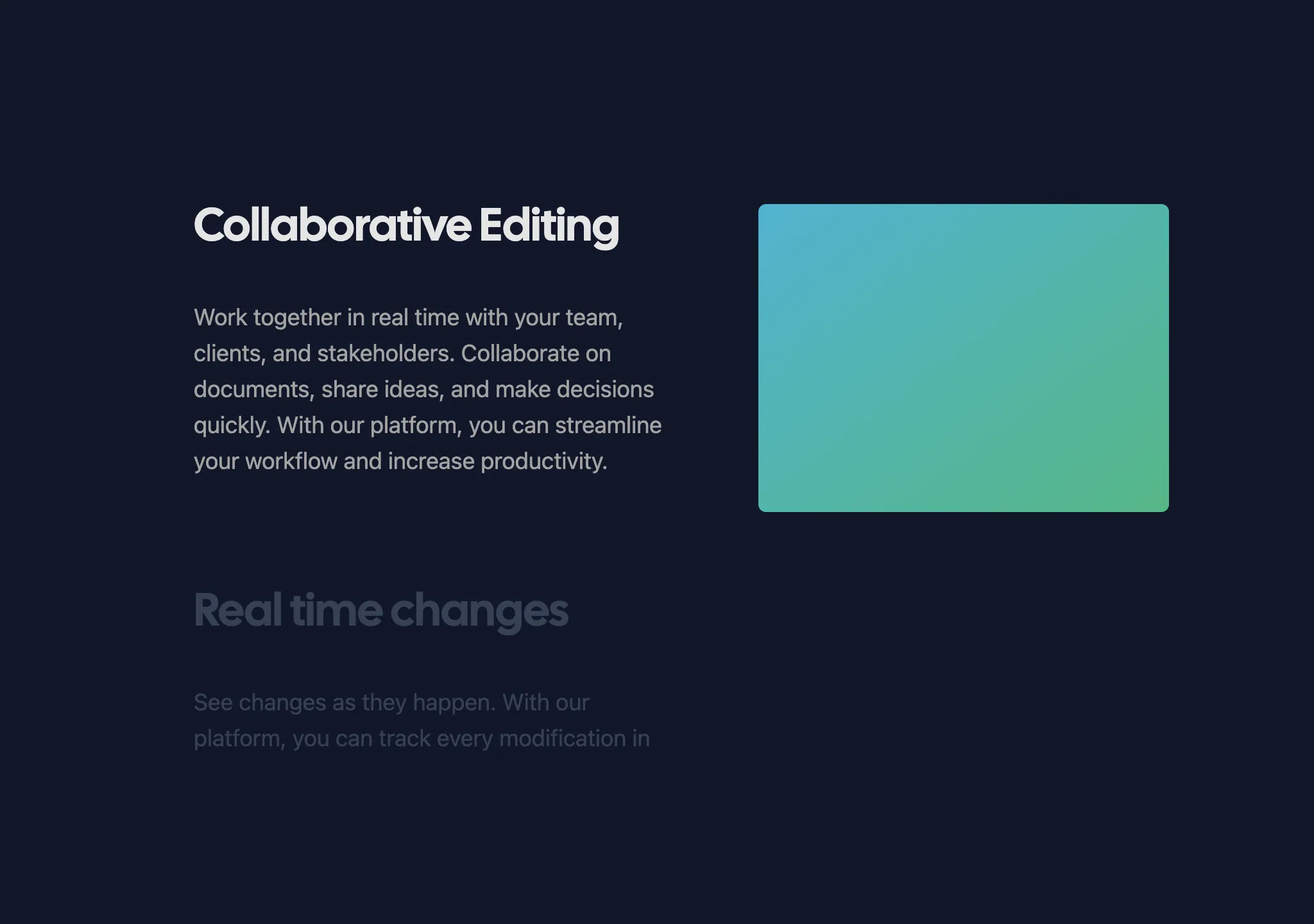 scroll — mediumSticky Scroll Revealaceternity/sticky-scroll-reveal
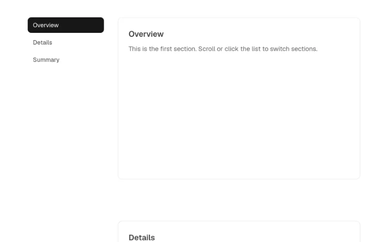 scroll — mediumFeature Sticky Sectioncult-ui/feature-sticky-section
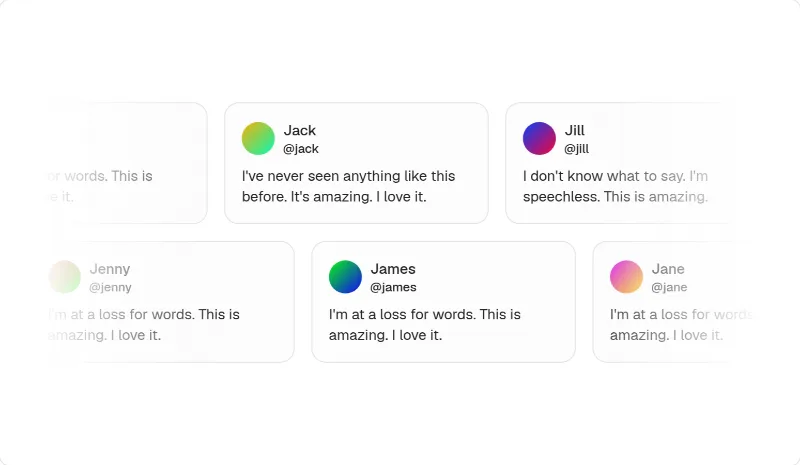 loop — mediumMarqueemagicui/marquee
[Visit the original site for visual reference; screenshots are not redistributed.]
Captured with pnpm capture https://mistral.ai → capture.json. Full page:
/inspiration/mistral/full.webp, mobile: /inspiration/mistral/mobile.webp. A cookie dialog covers part of the
full-page shot; the hero shot is clean.
Feel
Engineered and confident, with a wink. The page is laid out on a visible blueprint grid: the navbar is a row of bordered cells, vertical rails run down both sides of the content, and the logos sit in bordered cells too. Everything is off-white and near-black in a plain medium-weight grotesk. Warmth comes from Mistral's sunset palette, used as pixel art: square blocks stacked like terrain at the hero's edges, rotated diamonds, 8-bit sprites (a cat, a factory, a castle, a flag inline in the headline), pixel-tile illustration panels, and a closing band of orange-to-red stripes. It reads "frontier lab, European, open" rather than "AI magic". It has no gradients, glow or purple. Motion is busy but small: 188 animated elements, mostly sprites and tiles stepping, plus a SCROLL cue.
Palette & type (extracted)
- Canvas
#fbfbf8; surface#f5f4ef(statement band, side tabs); inverse#151524(deep navy, "Go deeper"). Rules/borders#e4e3de(the visible grid). - Brand ramp, used as blocks and never as text: yellow
#ffaf01→ tangerine#ff8204→ orange#ff5229/#fa500f→ red#e51300→ crimson#c4001d. Secondary pixel tiles use mint, sky blue (#55b3fb) and lemon. Quote cards are solid red. - Type: ALTMistral (custom grotesk) at weight 500, with an Inter fallback for body. Hero 96px, section h2 56px, 32px titles, 16px body. Space Mono for small caps UI ("SCROLL", eyebrows). Google equivalents: Inter Tight 500 for headings, Inter for body, Space Mono for labels.
- Radius: small, 4–6px on buttons and chips. Cards are square-cornered cells. No shadows.
Layout & patterns worth taking
| pattern | what they do | reproduce with |
|---|---|---|
| Grid navbar | Logo + links each in their own bordered cell; "Get in touch" cell + solid black "Login" cell at the right | oc/navbar with divide-x border-b cells instead of floating links |
| Blueprint frame | Vertical 1px rails left/right of the content column, crosshair dots at intersections, a faint arc | cult-ui/stripe-bg-guides or magicui/grid-pattern (very low opacity) + a bordered container |
| Pixel-terrain hero | Centered 2-line headline ("Mistral 🚩 is #1 / in Sovereign AI."), inline pixel icon, block "staircases" and diamonds at the edges, SCROLL chip | Centered hero + absolutely positioned blocks in brand-ramp tokens; magicui/pixel-image for sprites |
| Logo cells | Logos centered in equal bordered cells, sliding horizontally | oc/logo-cloud (marquee) with divide-x cells |
| Statement with strings | "No one else should hold the strings to your…" over a field of thin crossing lines | Large centered heading over an SVG line field (magicui/grid-pattern variant) |
| Chapters with side index | Left sticky list (Frontier open models / Proprietary intelligence / AI operations / Flexible compute), right column: short title ("We make the models. You keep them.") + copy + "Discover →" links + a colourful pixel-tile illustration | oc/feature-levels (sticky scroll-spy) or aceternity/sticky-scroll-reveal / cult-ui/feature-sticky-section |
| Product-in-illustration | Code window, prompt box and GPU grid placed inside the pixel-tile panels | oc/prompt-composer / magicui/terminal framed on a coloured tile background (magicui/flickering-grid) |
| Industry proof | Left vertical tabs (Energy, Manufacturing, Financial services, Public sector) + right bento: stat card, logo card, solid-red quote card | Tabs + oc/testimonials-grid featured card in a brand fill |
| Dark "Go deeper" | Navy band, three bordered columns, each title + copy + ghost buttons | oc/feature-list on bg-foreground-style inverse section |
| Footer + sunset | 3 link columns in cells, socials, app badges, theme switcher; then a giant pixel "M" and full-width orange→red stripes with a sprite | oc/footer-columns + a decorative stripe band (--chart-*/brand tokens) |
Motion
Small and stepped, like a sprite engine rather than CSS easing: sprites hop, tiles flicker, and blocks shift by whole
cells. The SCROLL chip invites the user down. Section reveals are plain. prefers-reduced-motion is respected. Matching
catalog: magicui/flickering-grid (tile shimmer), cult-ui/pixel-heading-word (pixel-font headline swap) and
magicui/pixel-image. Keep it to the decorative layer, and keep content static.
How to apply
Closest system: @oc/theme-linear-dark is too dark. Use a light neutral theme with an orange --primary, or
derive a mistral-like DESIGN.md (off-white #fbfbf8, rules #e4e3de, orange ramp, Inter Tight 500, Space Mono).
Compose the page as: grid navbar → centered headline hero with pixel accents → logo cells → statement → 4 chapters with a sticky side
index → industry proof → dark "go deeper" → footer + stripe band. Rules:
- Make the grid visible (1px rails); it is the brand.
- Brand colours are for blocks and illustration only, never text or buttons. Buttons are black or ghost.
- Headlines use weight 500, not bold.
- Keep one decorative system (pixels) and don't mix it with gradients or glow.