 design-infra
Component catalog
Find components by type and feeling. Explore live examples, shortlist your options, and copy your picks to your agent.
Filter by feeling, motion, usage or library · 1 active
600 total results · 240 with visual previews · 360 on source sites
 enter · state — subtle
 hover · enter — medium
Scramble → reveal text on hover or in view (motion). Dev-tool/brutalist brands.
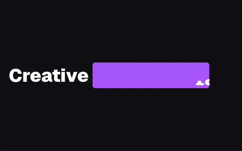 loop — medium
Rotating keyword in a headline with staggered letter transitions (motion). Unstyled — put bg-primary/text-primary-foreground on the pill yourself.
 scroll — medium
Paragraph that un-blurs and fades in word by word as you scroll — manifesto/about sections. GSAP ScrollTrigger.
 enter · scroll — medium
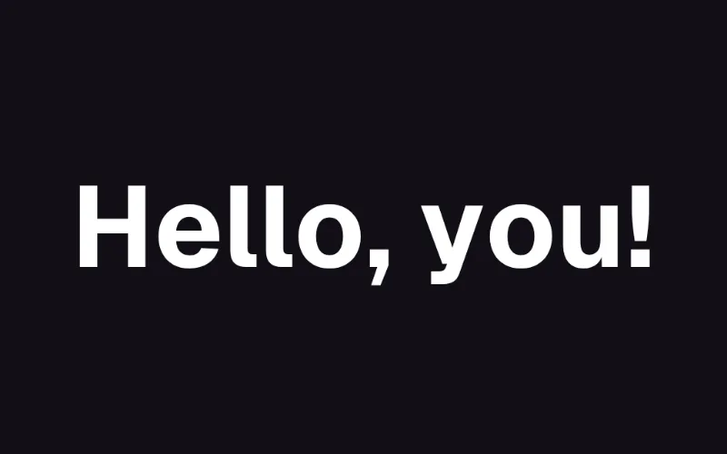
Char/word staggered entrance on scroll (GSAP SplitText + ScrollTrigger). Inherits colour. The React Bits headline effect; needs gsap + @gsap/react.
 loop · state — subtle
 loop — expressive
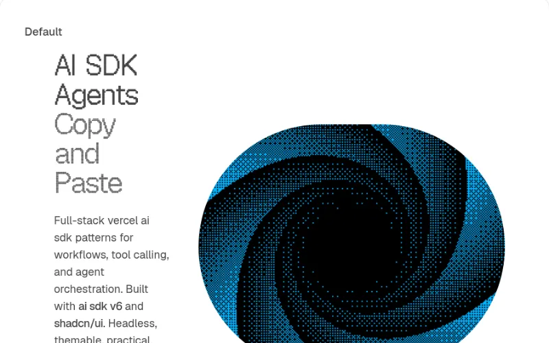
Hero with animated dithering shader backdrop (@paper-design/shaders-react); text/card layer uses tokens, shader colour is a hex prop.
 state · loop — medium
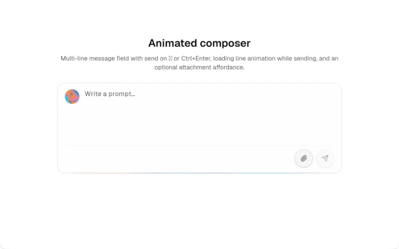
AI prompt composer with attachments/actions and a shader glow. Mostly tokens, but teal/blue hex accents and @paper-design/shaders-react + @base-ui/react are heavy deps.
 loop · state — expressive
 state · hover — medium
Playful merges for FABs, tab pills, menus. Too much for enterprise UIs.
 loop · cursor — expressive
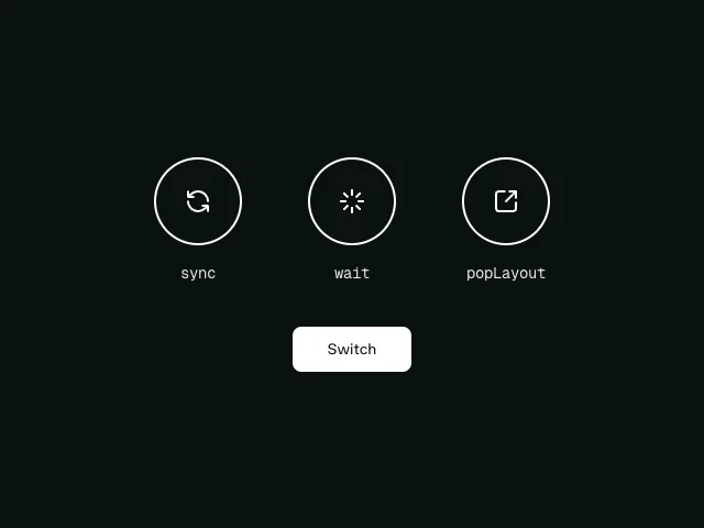 state — subtle
AnimatePresence `mode` (sync / wait / popLayout): how to swap one view for another — tab panels, carousel slides, step wizards — without overlap jank. Free example (motion is MIT); copy and adapt the source from the example page.
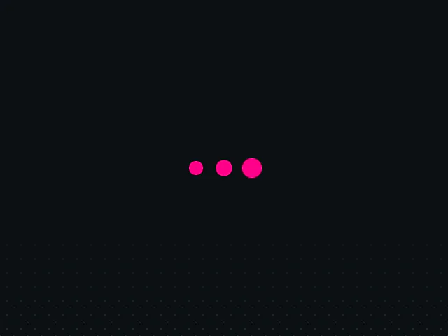 loop — subtle
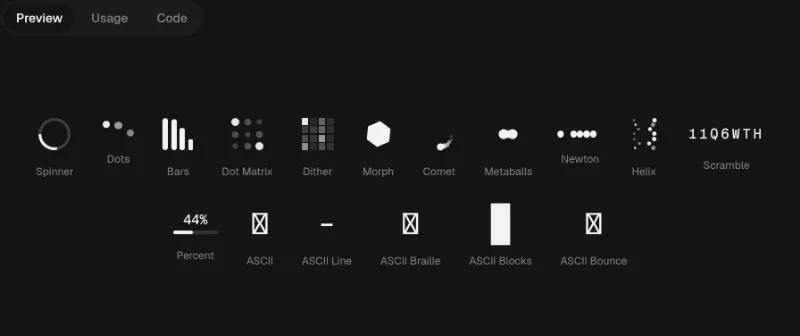
Minimal three-dot pulse loader (variants + repeat). Free example (motion is MIT); copy and adapt the source from the example page.
 loop — expressive
 loop — expressive
 cursor · press — medium
 cursor · drag — expressive
A range slider with elastic overshoot at the ends (not a carousel).
 loop — medium
Animated gradient text/border. Default palette is React Bits purple/pink — always pass colors from your theme.
 loop · hover — medium
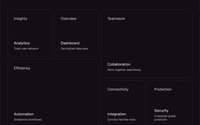 hover · cursor — expressive
Bento grid with spotlight, border glow, particles and tilt (GSAP). Hard-coded dark palette (#120F17 cards, #2F293A borders, text-white) — only for dark sites, or rework colours.
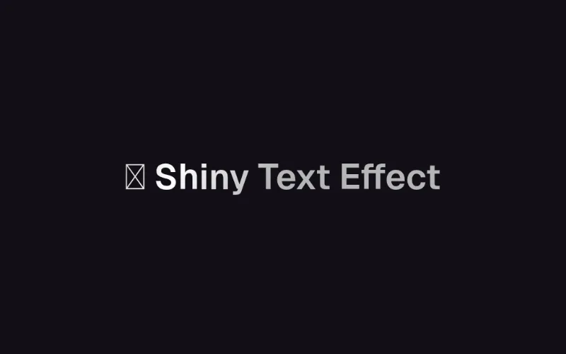 loop — subtle
Shimmer sweep across text, e.g. a hero eyebrow. Default colours #b5b5b5/#fff are props — set from your muted/foreground tokens.
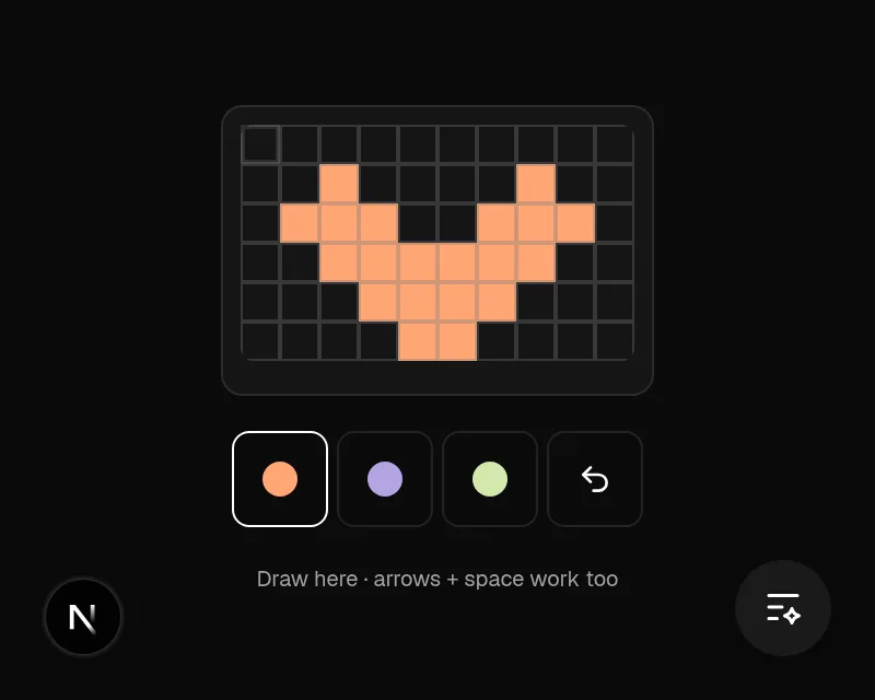 cursor · state — subtle
Keyboard-operable pixel art editor with drawing, color selection and undo. Hosted demo uses original small artwork; useful for creative tools and playful interactions.
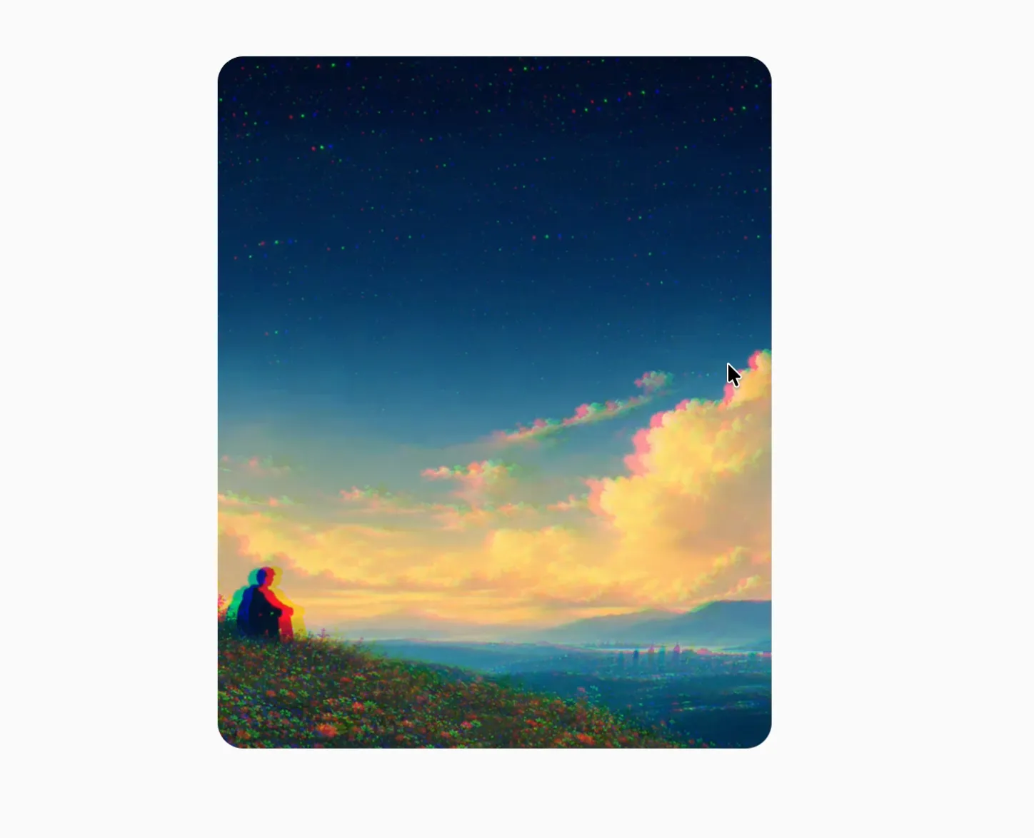 loop · hover · cursor — expressive
An interactive image with responsive color separation, displacement, and tilt.
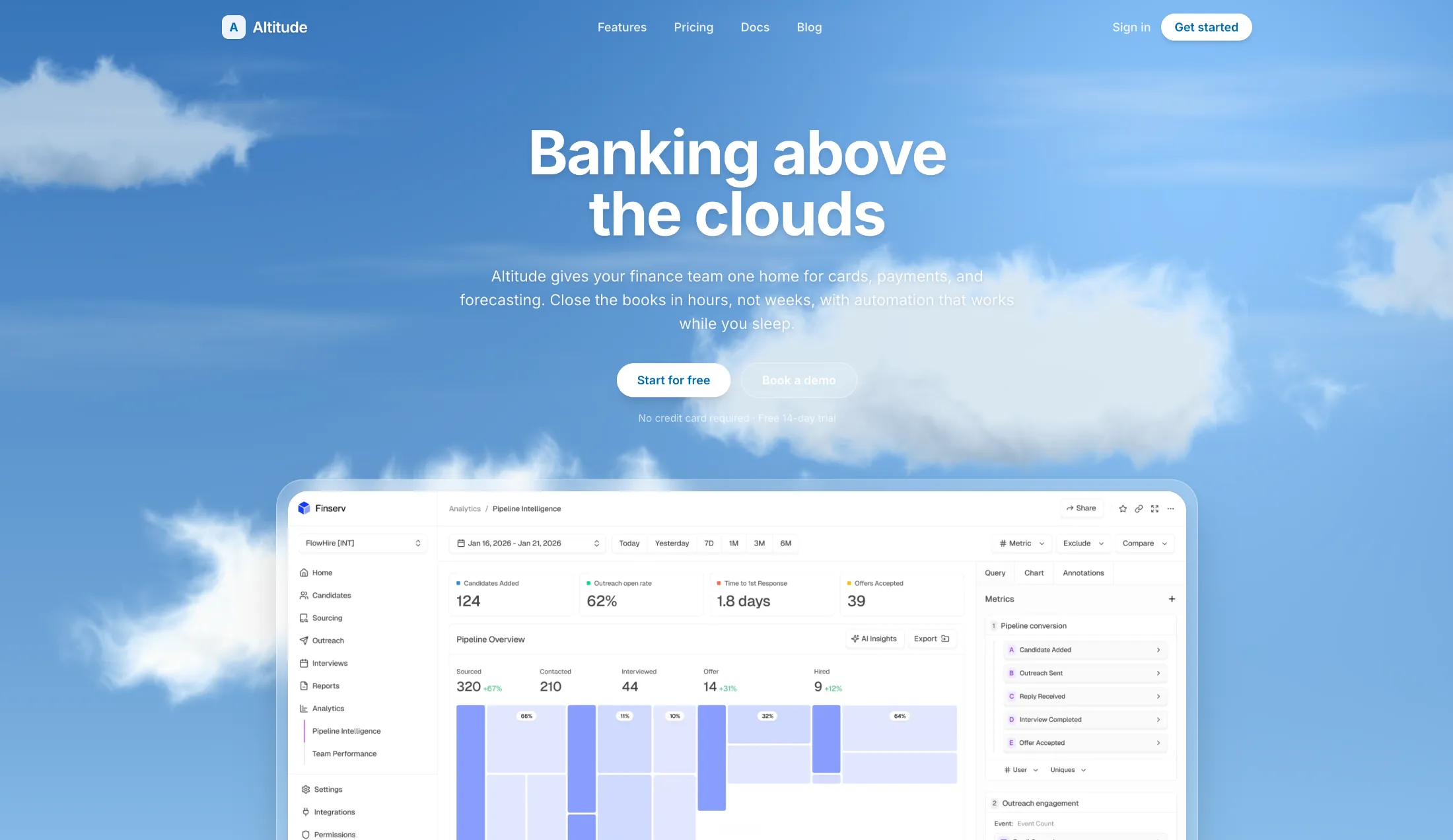 loop — expressive
Soft procedural clouds that drift across the sky. Tune speed, count, and colors with props.
 loop — expressive
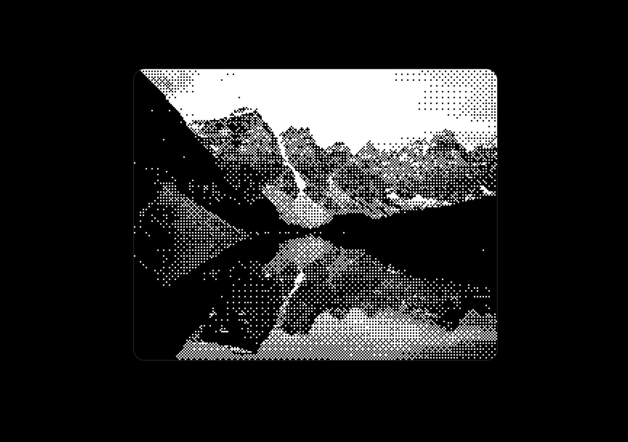
A real-time ordered dithering effect for images, perfect for pixel art and retro aesthetics.
 hover · cursor — expressive
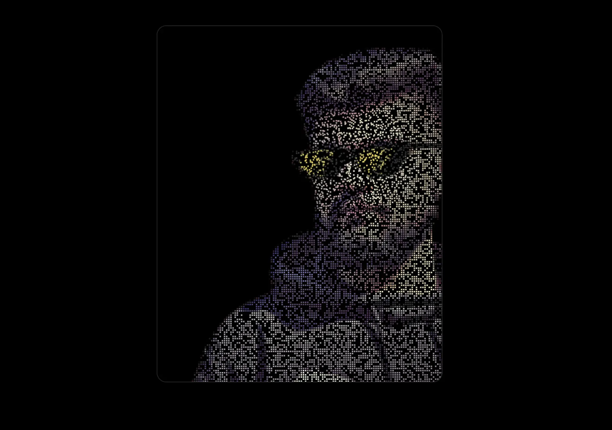
Convert any image to a pixelated canvas mouse distortion effects, as seen on Tailwind CSS Website.
 loop · state — medium
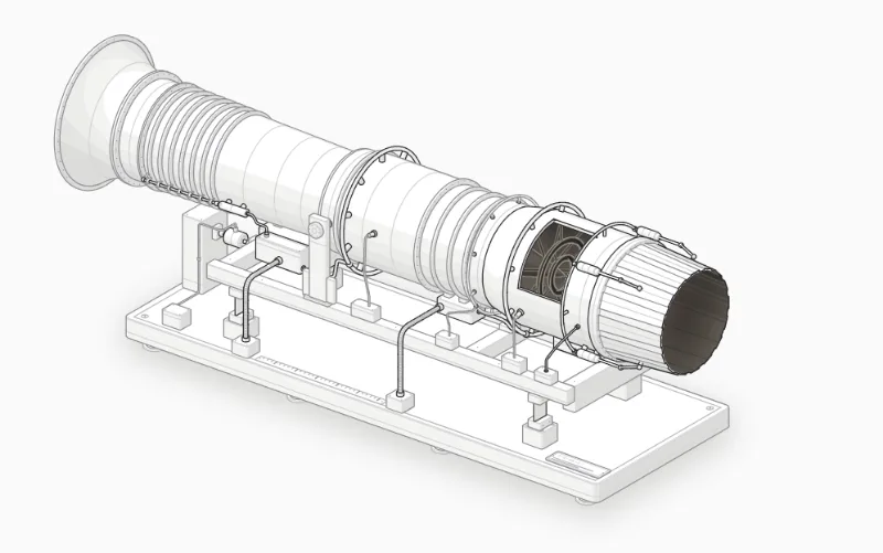
Import Afterburner from "anatomy-figures/afterburner" (default export). MIT; React 18+. Its --anatomy-* tokens need mapping to your project's theme. Isometric does not imply freely rotating 3D. Live interaction is on the source site; our thumbnail is a still screenshot.
 loop · state — medium
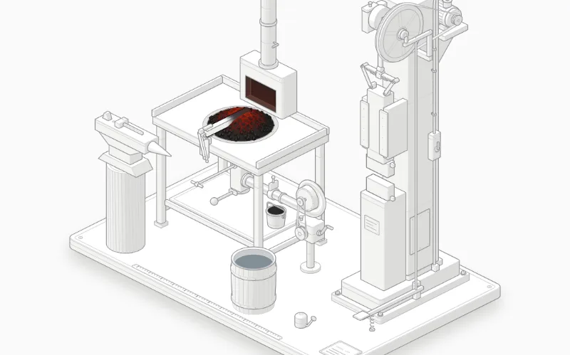
Import Forge from "anatomy-figures/forge" (default export). MIT; React 18+. Its --anatomy-* tokens need mapping to your project's theme. Isometric does not imply freely rotating 3D. Live interaction is on the source site; our thumbnail is a still screenshot.
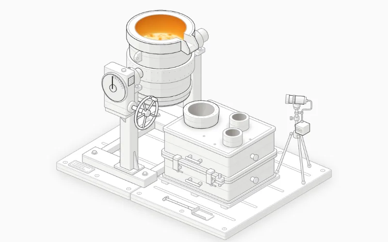 loop · state — medium
Import Foundry from "anatomy-figures/foundry" (default export). MIT; React 18+. Its --anatomy-* tokens need mapping to your project's theme. Isometric does not imply freely rotating 3D. Live interaction is on the source site; our thumbnail is a still screenshot.
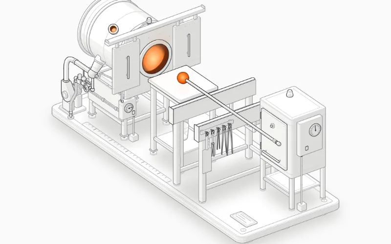 loop · state — medium
Import GlassFurnace from "anatomy-figures/glass-furnace" (default export). MIT; React 18+. Its --anatomy-* tokens need mapping to your project's theme. Isometric does not imply freely rotating 3D. Live interaction is on the source site; our thumbnail is a still screenshot.
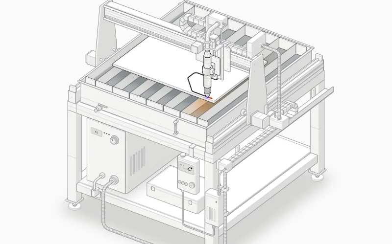 loop · state — medium
Import PlasmaCutter from "anatomy-figures/plasma-cutter" (default export). MIT; React 18+. Its --anatomy-* tokens need mapping to your project's theme. Isometric does not imply freely rotating 3D. Live interaction is on the source site; our thumbnail is a still screenshot.
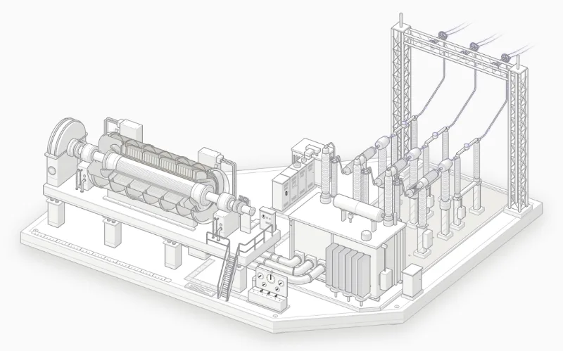 loop · state — medium
Import PowerStation from "anatomy-figures/power-station" (default export). MIT; React 18+. Its --anatomy-* tokens need mapping to your project's theme. Isometric does not imply freely rotating 3D. Live interaction is on the source site; our thumbnail is a still screenshot.
 loop · state — medium
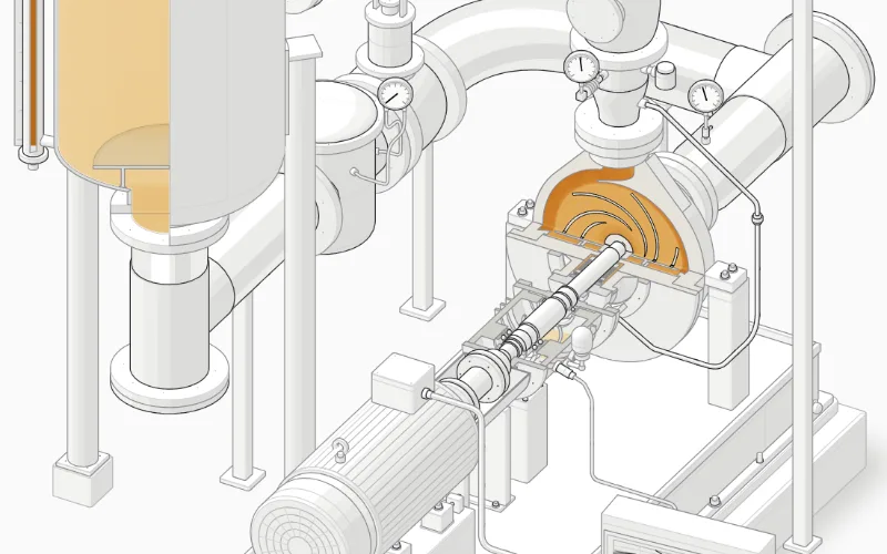
Import ProcessPump from "anatomy-figures/process-pump" (default export). MIT; React 18+. Its --anatomy-* tokens need mapping to your project's theme. Isometric does not imply freely rotating 3D. Live interaction is on the source site; our thumbnail is a still screenshot.
 loop · state — medium
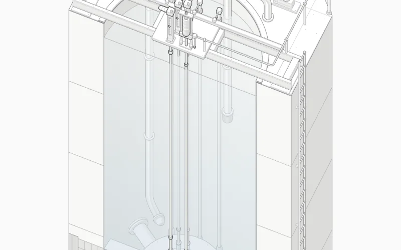
Import Reactor from "anatomy-figures/reactor" (default export). MIT; React 18+. Its --anatomy-* tokens need mapping to your project's theme. Isometric does not imply freely rotating 3D. Live interaction is on the source site; our thumbnail is a still screenshot.
 loop · state — medium
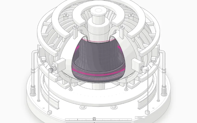
Import Tokamak from "anatomy-figures/tokamak" (default export). MIT; React 18+. Its --anatomy-* tokens need mapping to your project's theme. Isometric does not imply freely rotating 3D. Live interaction is on the source site; our thumbnail is a still screenshot.
 loop · state — medium
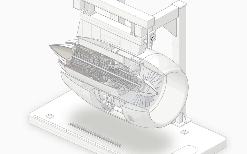
Import Turbofan from "anatomy-figures/turbofan" (default export). MIT; React 18+. Its --anatomy-* tokens need mapping to your project's theme. Isometric does not imply freely rotating 3D. Live interaction is on the source site; our thumbnail is a still screenshot.
 loop — expressive
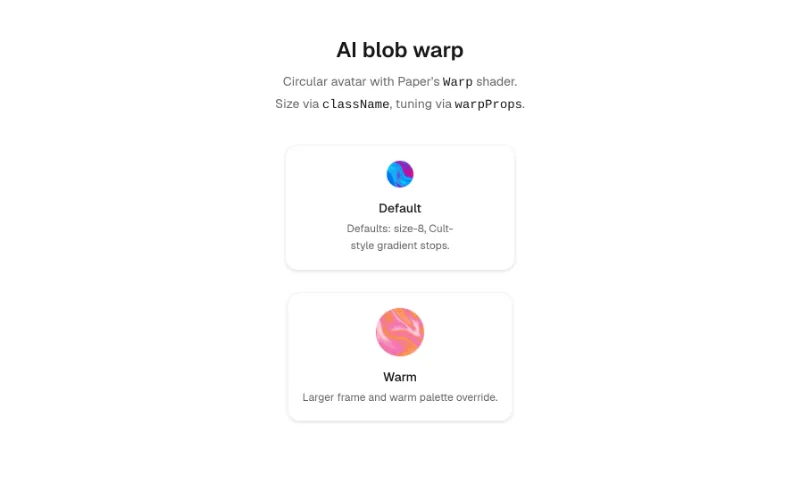
Circular avatar with Paper Design Warp shader; motion-safe pulse, pauses off-screen and when reduced motion is preferred
 loop — subtle
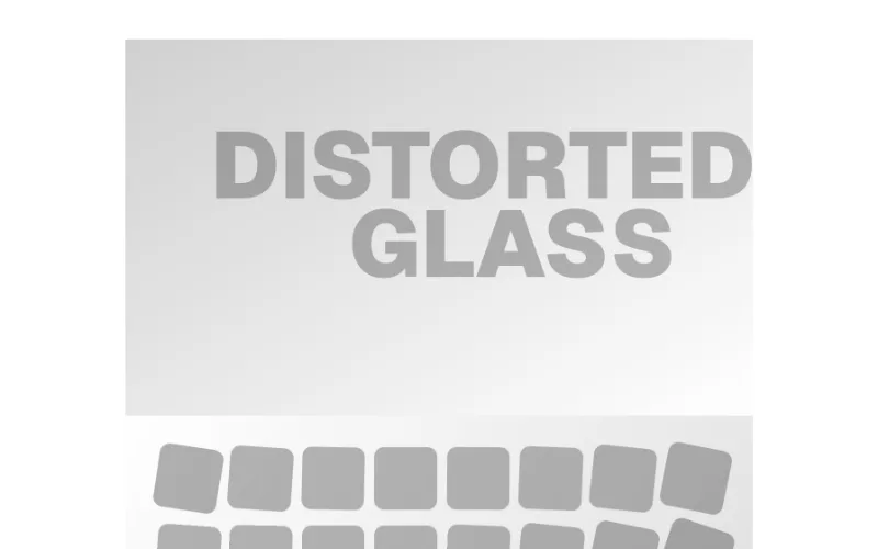
A glass morphism effect component using SVG filters with fractal noise to create visual transitions between sections
 enter — expressive
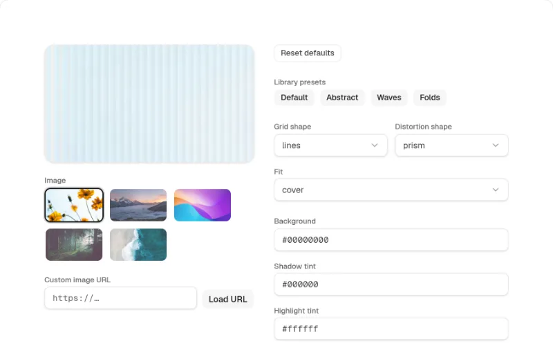
Paper Design fluted-glass image shader with sensible defaults — ribbed, streaked distortions over a source image
 loop · enter · state — expressive
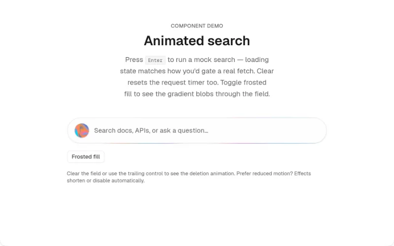
Search input with animated gradient border, staggered placeholder, blur deletion on clear, loading line, and Warp shader avatar
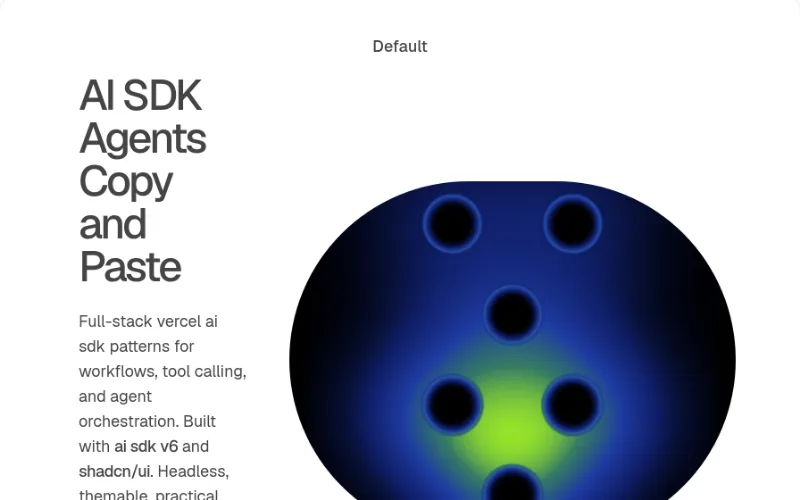 loop — expressive
Split-layout hero section with responsive Heatmap shader visuals, CTA, and tech stack badges
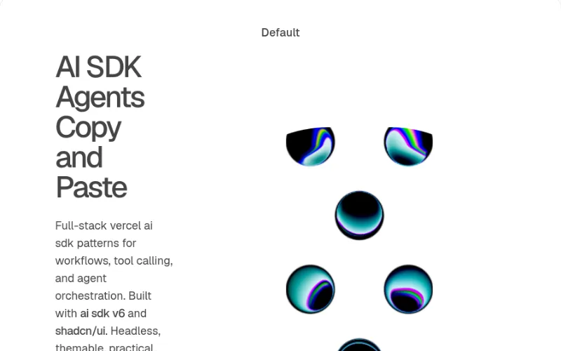 loop — expressive
Split-layout hero section with responsive LiquidMetal shader visuals, CTA, and tech stack badges
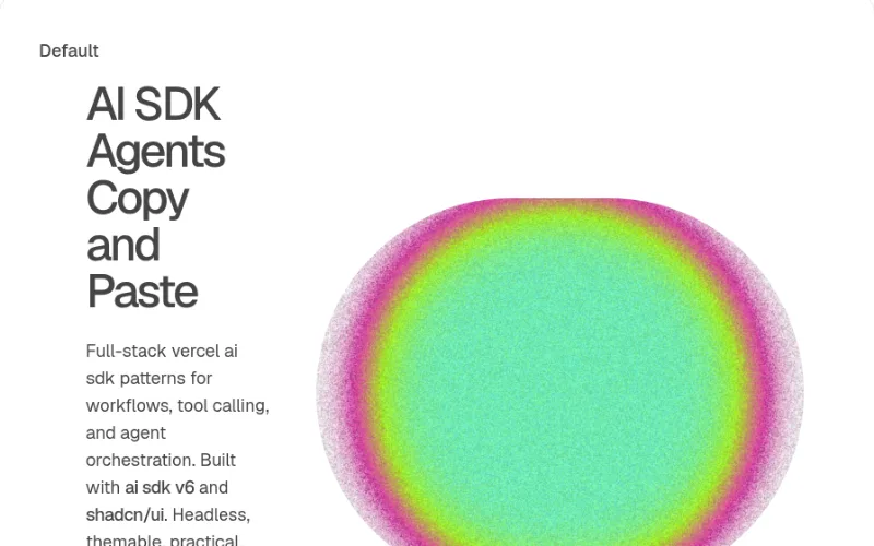 loop — expressive
Split-layout hero section with responsive StaticRadialGradient shader visuals, CTA, and tech stack badges
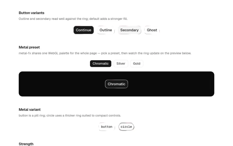 hover — expressive
Shadcn Button wrapped in MetalFx: animated liquid metal ring with text and icon variants
 hover · cursor — expressive
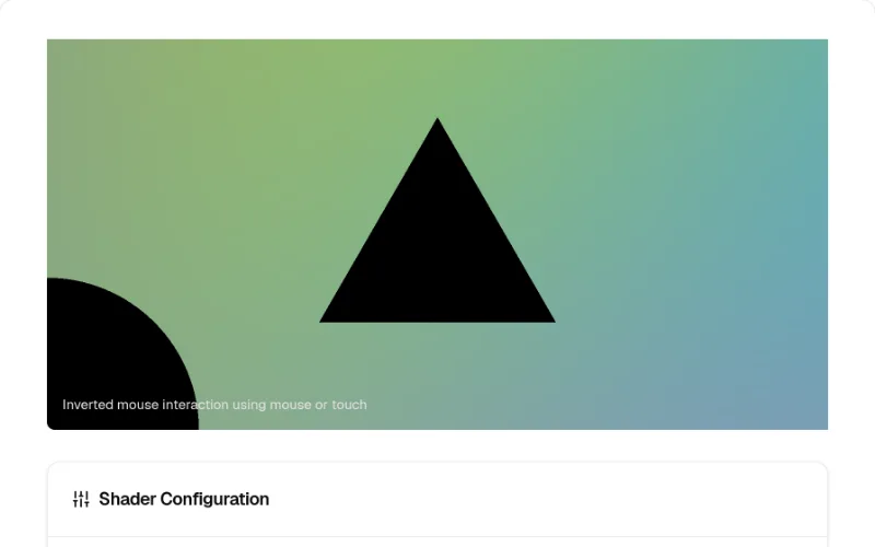
WebGL shader component with lens blur effects and mouse interaction
 drag · state — medium
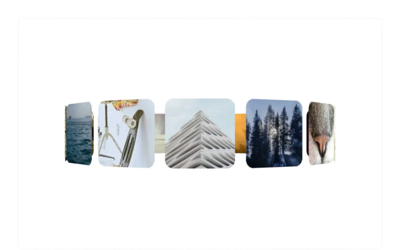
3D carousel component with perspective effects and smooth item transitions
 loop — expressive
 state · hover · scroll — subtle
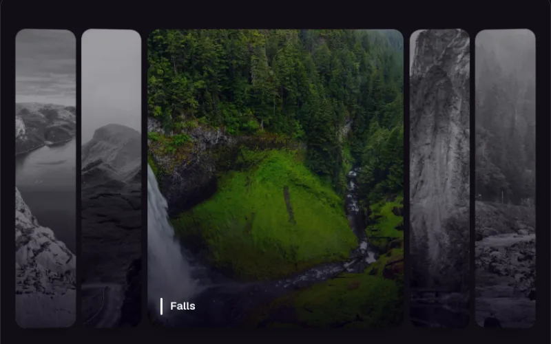
Panels expand on hover or focus, revealing parallax imagery and captions.
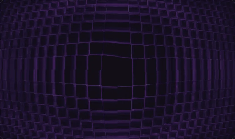 loop · cursor — expressive
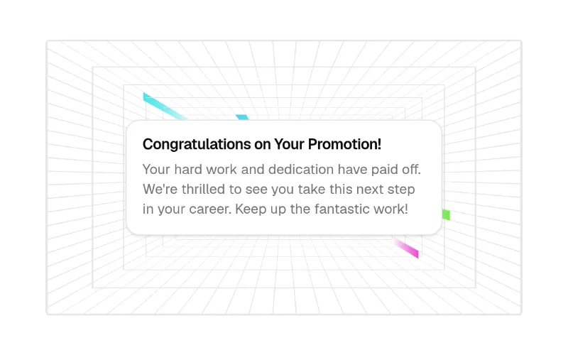
A crystalline corridor of stacked squares receding into depth.
 enter · scroll — medium
Wrapper that animates any children on scroll or mount with configurable direction, distance, duration, easing and disappear options.
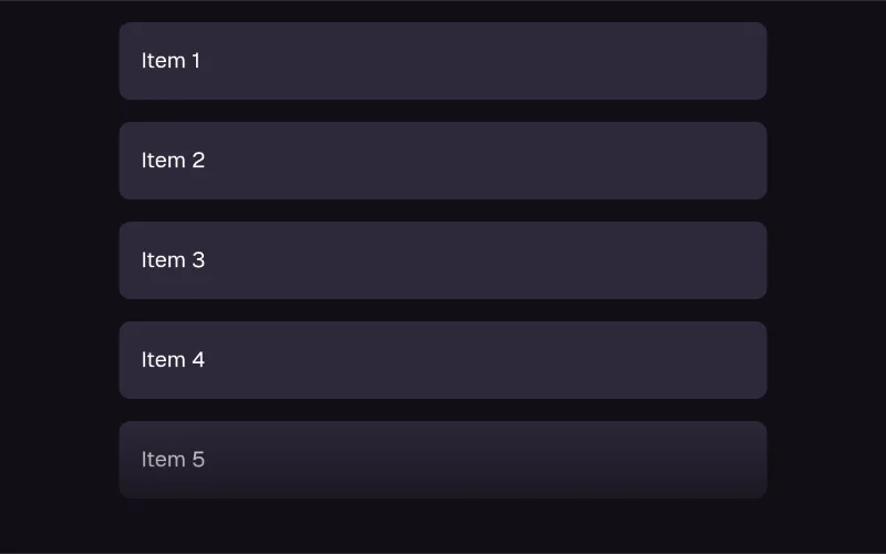 enter — medium
List items enter with staggered motion variants for polished reveals.
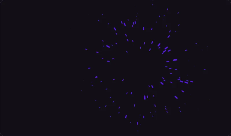 loop · cursor — expressive
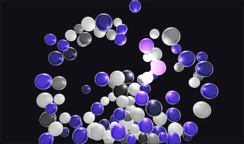
3D antigravity particle field that repels from the cursor with smooth motion.
 loop — expressive
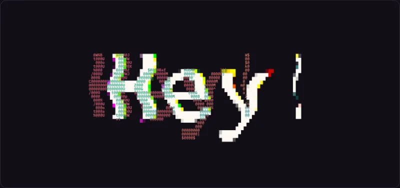
Renders text with an animated ASCII background for a retro feel.
 loop · cursor — expressive
 loop · cursor — expressive
 state · press — subtle
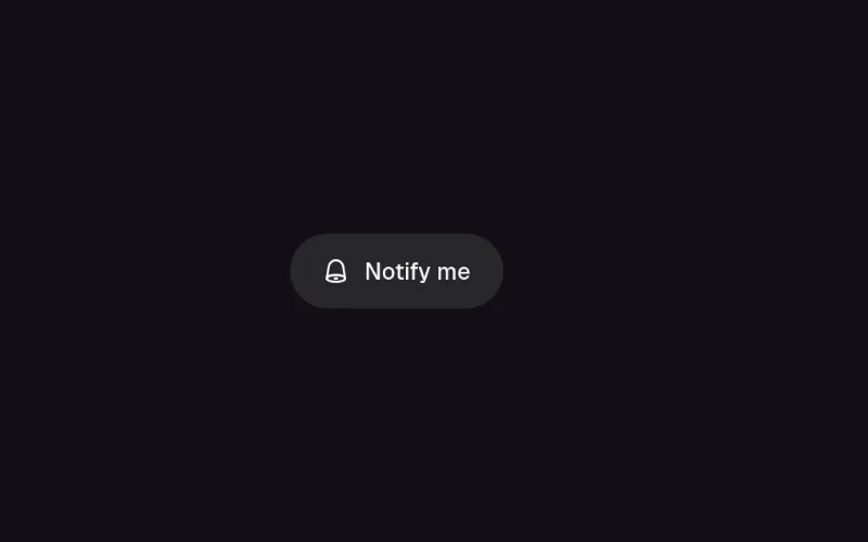
Pill toggle that answers a press at three tempos: the bell rings on damped keyframes, the label blur-crossfades, and the pill unfurls to the longer label through a clip-path on a critically damped spring. The pressed state is the receipt.
 cursor · state — expressive
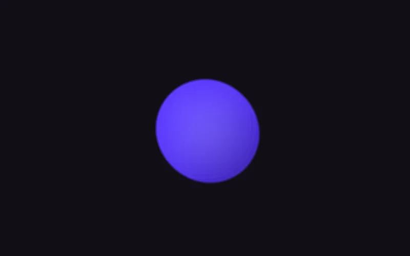
Organic blob cursor that smoothly follows the pointer with inertia and elastic morphing.
 cursor — medium
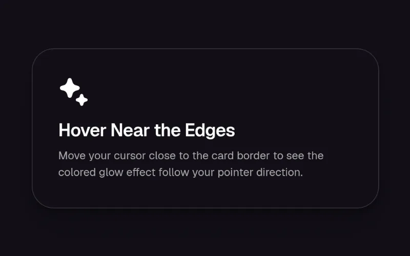
Glowing mesh-gradient border that follows cursor direction and intensifies near edges.
 enter — medium
 state · enter — medium
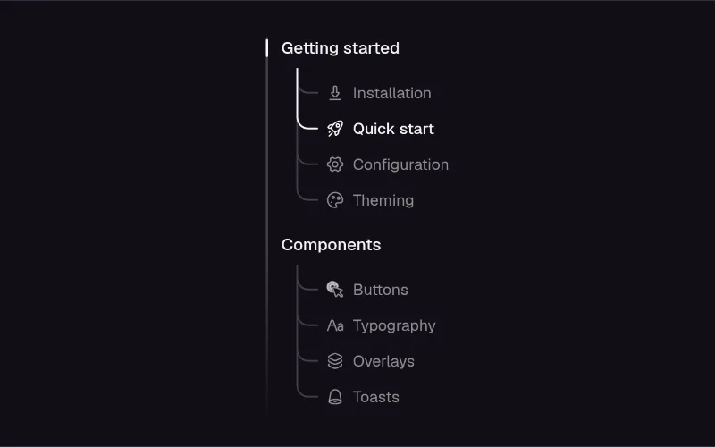
Collapsible menu whose sections unfold into a trunk with a curved branch to each child, and an accent line that travels down the trunk and around the curve to whatever you pick, while a marker glides to the open section.