 design-infra
Geometric identity studies
github.com/OwenCoonahan/design-infra/blob/main/inspiration/geometric-identity/README.mdA study of ten user-supplied geometric marks, comparing bold silhouettes with layered line art for favicons, social previews and motion illustrations.
Why it is here
The user shared ten screenshots as favicon candidates and asked, "thoughts on any of these?" They also want an interesting image when sharing the site. They rejected the generated Loop/Echo/Spring proposals, saying "nah i dont like these" and asking for a cool, simple logo that can be sourced online. They selected option B, Phosphor Diamonds Four Fill, for now, asking for a sharp, design-focused museum/gallery feel and possible thin-line treatments.Reproduce it with
Catalog pieces that rebuild its patterns.
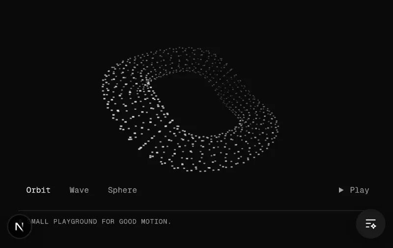
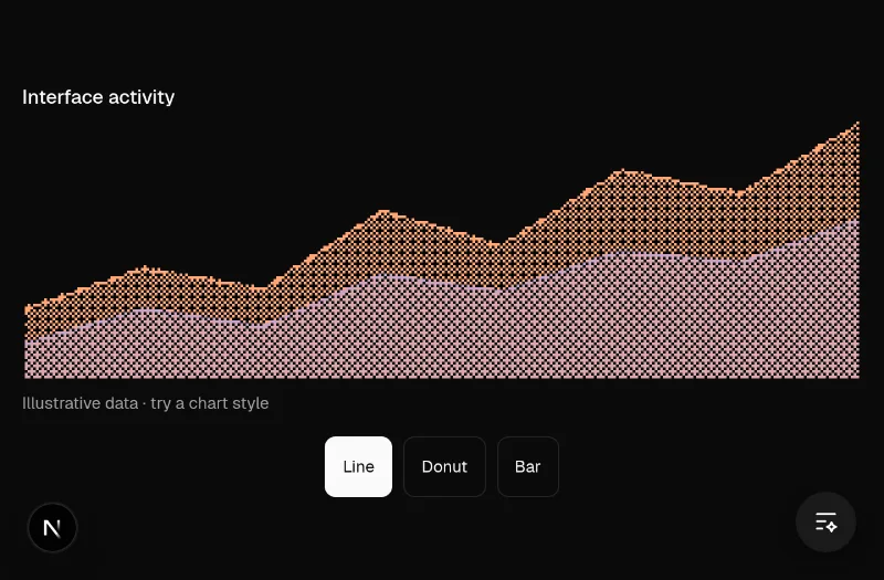
This is an analysis of user-supplied screenshots, rather than a captured website. The URL above points to these notes; the original artists and source URLs are unknown. Source images remain private under .context/inspiration/geometric-identity/ and are not distributed with the site. Generated proposals use original vector geometry.
What was shared
| Reference time | Visible form | Useful qualities | Small-size considerations |
|---|---|---|---|
| 3:14:05 | Bold, rounded intersecting strokes | Strong silhouette and unusual negative space | Robust at small sizes, but the letter/symbol identity is ambiguous |
| 3:16:57 | Upright ellipses compressing into a baseline | Spring, settling and physical motion | Overlapping thin strokes become dense at 16px |
| 3:17:10 | Tilted, compressed ellipse stack | Direction and implied movement | Simplify to a few broad curves for a favicon |
| 3:17:56 | Warm, densely layered twisted loop | Depth, tension and a strong central opening | Particularly useful for a large social preview; many fine lines merge at favicon scale |
| 3:18:06 | Symmetrical hourglass-like wireframe | Mathematical precision and structure | Fine intersections need a larger canvas |
| 3:18:29 | Offset circular contours | An asymmetrical focal point and optical depth | A simplified ring can preserve the silhouette |
| 3:18:57 | Three bold curved bands on orange | The strongest small-size structure among the references | Develop original geometry rather than adopting the pictured mark |
| 3:19:08 | Dense concentric rings with offset weighting | Optical shading without gradients | Much of the detail reads as a tonal mass when reduced |
| 3:19:16 | Elliptical slices suggesting a rounded D | Useful relationship between an initial and volume | Use fewer curves and a clear outer silhouette |
| 3:20:10 | Tilted hollow loop made from contours | Motion, dimensionality and a readable central opening | Strong basis for a detailed share illustration and a simplified favicon |
Reusable rules
The user rejected our generated Loop, Echo and Spring identity treatments after reviewing them. Those are not approved directions for the Design Infra logo or sharing card. Their current request is a simpler, cool mark, including a suitable licensed icon sourced online. The original screenshots remain references rather than selected brand assets; do not infer a global dislike of geometry or motion components from this site-specific rejection.
Use one geometric idea at multiple levels of detail. A favicon needs a clear silhouette, broad strokes and generous gaps. A 1200×630 sharing card has room for fine contours, dimensional projection and a prominent product headline. The larger illustration can imply motion while remaining a useful static image.
Retain Design Infra's dark neutral surface, readable sans-serif type and warm peach accent. The references establish geometry and composition; they do not establish font families, exact colors, animation timings or a complete design system. The selected site mark is Phosphor Diamonds Four Fill (option B), with high-contrast monochrome presentation and restrained thin-line geometry for larger artwork. Keep the original MIT notice; this selection concerns the site identity, not consumer project defaults.
For the share card, pair the selected geometric mark and original contour artwork with the site name, "Good UI starts with better components," and a short explanation that the catalog works with Claude Code and Codex. Keep the headline and identifying content away from the edges. Show favicons at actual 16px and 32px sizes on both dark and light tabs before selecting one.
Component and motion connections
| Pattern | Catalog starting point | Application |
|---|---|---|
| Geometric depth and changing forms | oc/kinetic-field | An interactive, bounded website illustration; preserve static and reduced-motion versions |
| Deliberate raster texture | smoothui/dither-chart | A reference for controlled pixel treatment when a geometric mark needs texture at larger sizes |
These are related techniques, not exact recreations of the supplied marks. A social image is static; its usefulness must not depend on animation. The favicon and image are one brand asset family, independent of the page structure or a consumer project's design system.
Selected implementation
The licensed mark comes from Phosphor Icons, under MIT. public/brand/mark.svg preserves the upstream path, third-party/phosphor-LICENSE.txt preserves the notice, and pnpm brand:build regenerates the favicon, touch icon and 1200×630 sharing image. The small symbol stays solid for legibility; the larger artwork adds precise thin diamond contours. Do not replace it with the rejected Loop/Echo/Spring studies.
