 design-infra
Fintech homepage that sells trust through restraint — white and warm-grey canvas, a calm regular-weight headline, an inline work-email capture, and LIVE ticking numbers ("agents at work today") that prove the product is running right now.
Why it is here
Seeded as the reference for "trustworthy / refined fintech". Calm, credible and current, with no gradients or illustration; proof comes from live numbers, real product UI and named customers.Reproduce it with
Catalog pieces that rebuild its patterns.
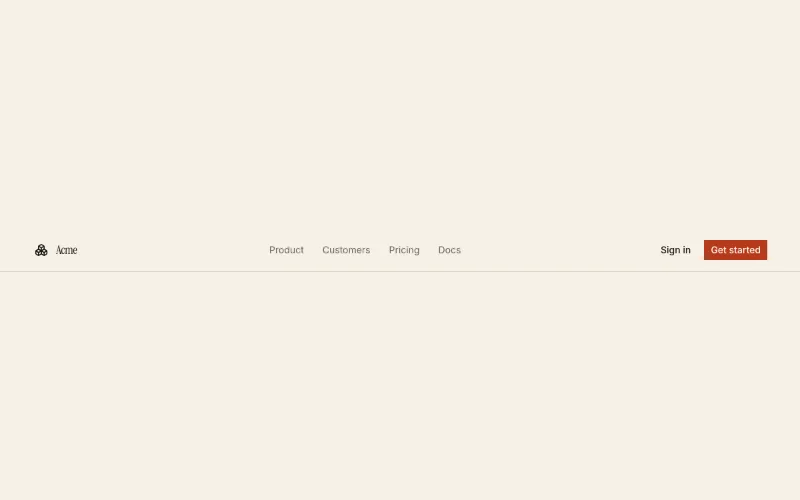 Navbaroc/navbar
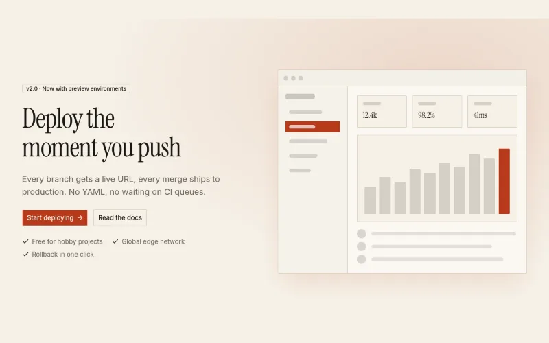 Hero · Splitoc/hero-split
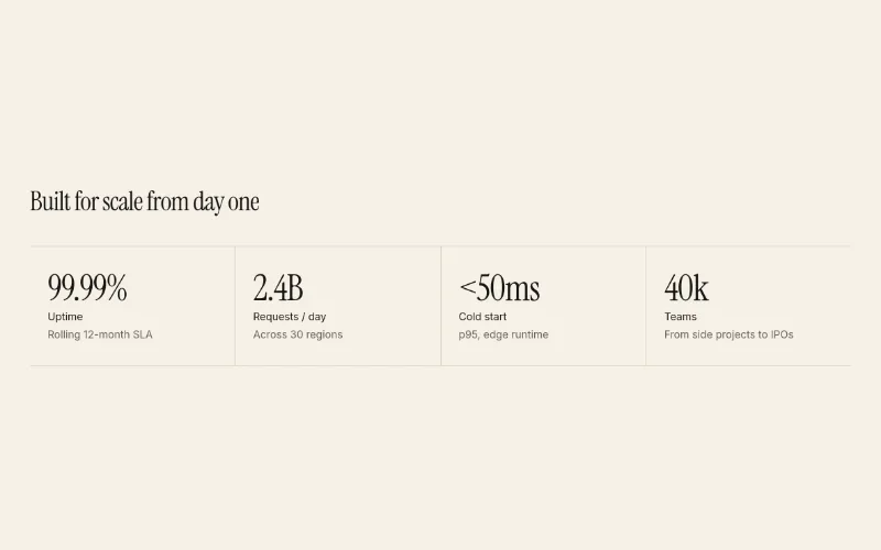 Stats rowoc/stats-row
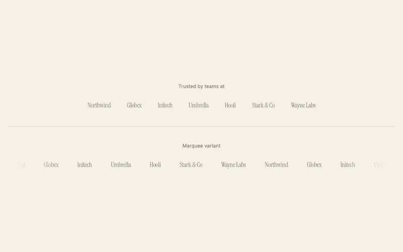 loop · hover — subtleLogo cloudoc/logo-cloud
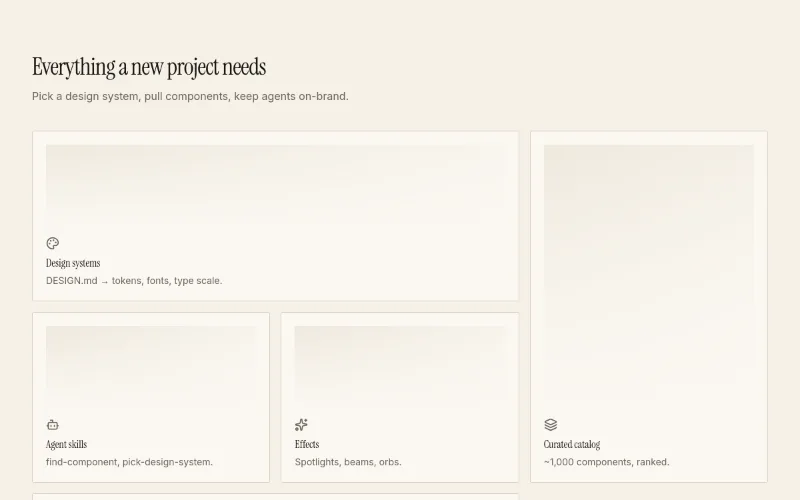 hover — subtleFeatures · Bentooc/feature-bento
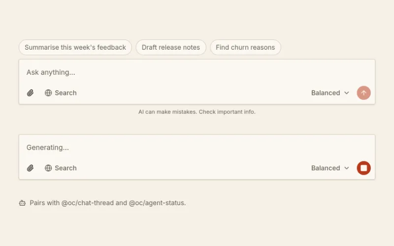 Prompt composeroc/prompt-composer
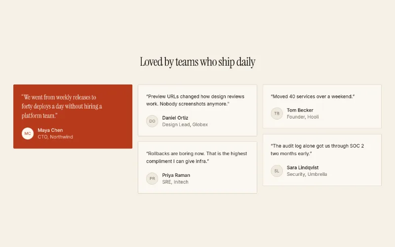 Testimonials · Gridoc/testimonials-grid
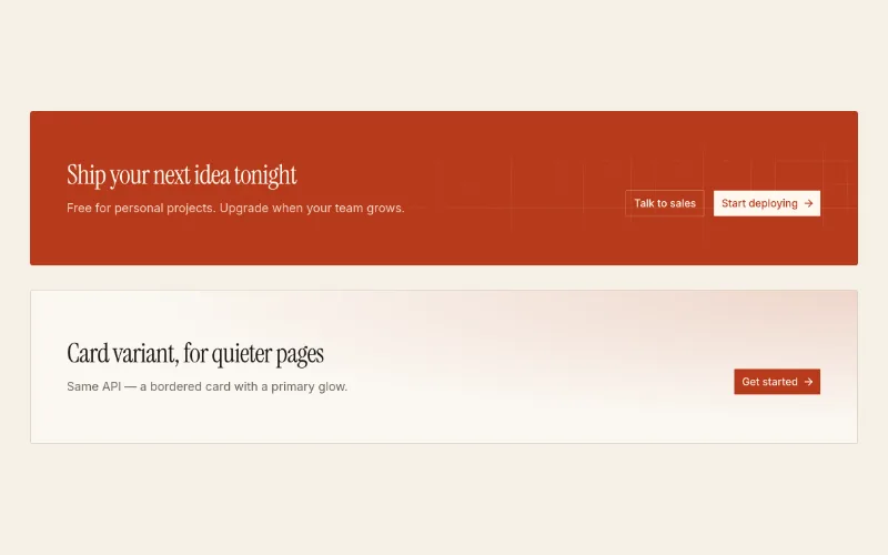 CTA banneroc/cta-banner
 state — subtleSliding Numbermotion-primitives/sliding-number
 state — subtleRolling Numbercult-ui/rolling-number
 enter · state — subtleNumber Tickermagicui/number-ticker
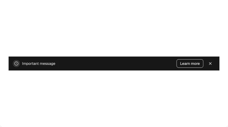 Bannerkibo-ui/banner
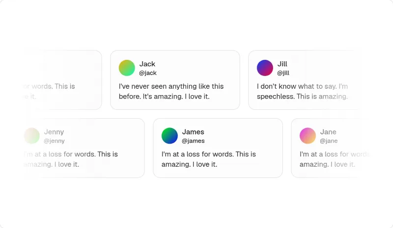 loop — mediumMarqueemagicui/marquee
 loop — subtleDot Patternmagicui/dot-pattern
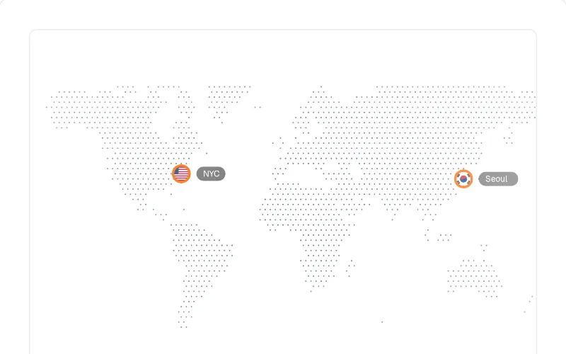 enter — mediumDotted Mapmagicui/dotted-map
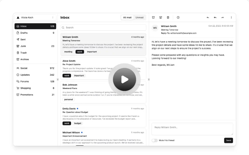 state — mediumHero Video Dialogmagicui/hero-video-dialog
[Visit the original site for visual reference; screenshots are not redistributed.]
Captured with pnpm capture https://ramp.com → capture.json. Full page:
/inspiration/ramp/full.webp, mobile: /inspiration/ramp/mobile.webp. Its pricing page is on
pricingpages.design/sites/ramp.
Feel
Quiet and in control, like a good finance team. Almost everything is black on white or warm grey, set in one
regular-weight grotesk with no bold headlines. Colour does one job: an acid-lime fill marks the action
("Get started for free", "See a demo"). The page earns trust in three ways. Numbers are alive: a corporate
payments counter ticks in the eyebrow, and a bottom bar of "agents at work today" counters rolls digit by digit.
The product appears as real, slightly abstracted UI fragments (invoices, policy docs, approval rules). Customers
appear by name, with video. Motion is plentiful (81 animated elements, prefers-reduced-motion respected) but
never decorative: it is either data changing or UI assembling.
Palette & type (extracted)
- Canvas
#ffffff; surface warm grey#f4f2ef(hero panel, cards); ink#1f1f1d(dark buttons, announcement bar). Muted text is ink at 60% (--text-hushed). Hairline borders are warm grey (--border-color-primary, ≈#d3d0cc). - Accent acid lime (
--background-color-solarLight, lab 97 / −16 / 62, ≈#e8f56a), used only on primary CTA fills with dark text. It is never used for text. A secondary blue (--spring) appears rarely. - Type: Lausanne (proprietary neo-grotesk) at weight 400 everywhere, including the 64px h1. The scale is 64 / 48 / 40 / 28 / 24 / 16 / 14 / 13 px, with body copy at 14px. Google equivalent: Inter Tight 400 for headings and Inter for body. Mono is IBM Plex Mono (in the token set) for the counters.
- Radius: 12px panels and cards, 8px buttons and inputs, 16px large media. No shadows: depth comes from the warm surface against white.
Layout & patterns worth taking
| pattern | what they do | reproduce with |
|---|---|---|
| Announcement bar | Ink bar above the nav: "New: AI Token Spend Management — Learn more" + close | kibo-ui/banner (pass tokens) or a slim bg-foreground text-background strip above oc/navbar |
| Nav | Logo, 4 dropdowns + 2 links, "Sign in" text, lime "See a demo", ink "Get started" | oc/navbar (two actions: accent fill + bg-foreground) |
| Live-metric eyebrow | Small caps label + a mono pill whose number ticks continuously ("0.9157162%") | motion-primitives/sliding-number or cult-ui/rolling-number in a font-mono badge |
| Email-capture hero | Left-aligned 2-word-rhythm headline ("Time is money. Save both."), one-line sub, an input + lime button fused in one bordered pill | oc/hero-split with an input action; keep the headline weight 400 |
| Product collage panel | Warm-grey panel with a faint dot grid and floating invoice/receipt fragments that assemble | magicui/dot-pattern behind cards; fragments fade/slide in (magicui/blur-fade) |
| "Agents at work" ticker | Sticky bottom bar of 6 live counters (fields coded, expenses reviewed…) rolling per digit | oc/stats-row (hairline variant) + motion-primitives/sliding-number, horizontally scrolling on mobile |
| Logo grid + proof card | 2×6 monochrome logo grid with a video testimonial card ("$1M+ saved on global spend") | oc/logo-cloud (static) + a media card; magicui/hero-video-dialog for the play-to-expand |
| Two-tone statement | "One platform for all of finance." in ink + continuation in muted grey | Heading with text-foreground + <span className="text-muted-foreground"> |
| Product bento | 2 + 3 warm-grey cards, each a title (two-tone) + ↗ corner link + a real UI slice | oc/feature-bento (tile spans 1/2) |
| AI recommendation box | "See recommendations for your business": one big textarea on a soft grey gradient | oc/prompt-composer (no model picker) |
| Story rows | Alternating text + large media (video with the customer's name in huge lime type), quote under the copy | oc/feature-list heading-left layout + media; magicui/hero-video-dialog |
| Workflow + globe cards | Rule-builder UI ("When a bill is created → If amount ≥ $5,000 → Require…") and a dotted globe with currency chips | Static UI card; magicui/dotted-map for the globe |
| Receipts wall | "We've got the receipts.": three rows of small quote cards drifting sideways with faded edges | magicui/marquee rows of cards, or oc/testimonials-grid |
| CTA strip | Grey band, left copy, ink "View Demo" button, a lime light-streak on the right edge | oc/cta-banner (muted variant) |
Motion
All of it is data or assembly: digits roll (number-flow style, per-digit slide), UI fragments fade and slide into
place, and testimonial rows drift slowly. Durations are short (the token default is 150ms with
cubic-bezier(.4,0,.2,1)), with no bounce and no parallax. For a fintech product the lesson is that a moving
number is the most trustworthy animation, because it proves the product is live. Use motion-primitives/sliding-number for counters and
magicui/blur-fade for reveals. Keep it inside the quiet motion language.
How to apply
There's no light fintech design system yet. Until there is, use stock shadcn neutrals with a warm-grey --muted, or
@oc/theme-editorial without the serif. Compose the page as: announcement bar → navbar → email-capture hero with live eyebrow →
product panel → live stats bar → logo grid + proof → two-tone statement + bento → story rows → testimonials marquee →
CTA. Rules:
- Use weight 400 for headlines and the same font throughout.
- Give the accent only to the primary action, as a fill.
- Every number you show should be real, and ideally live.
- Show real UI, never illustration.
- Candidate for a future
design-systems/ramp-like(warm-paper, lime accent).