 design-infra
The benchmark product homepage. A light-weight three-line headline that fades from navy to slate, a single sweeping ribbon gradient, a live "Global GDP running on Stripe" counter, and a bento of real product UI over hairline guide lines. Each section is a two-tone sentence followed by evidence.
Why it is here
Seeded as the benchmark for "refined / premium". The craft bar for type weight, spacing, guide-line grids, product UI as illustration and restrained gradient use. Compare every refined landing page against this.Reproduce it with
Catalog pieces that rebuild its patterns.
 Navbaroc/navbar
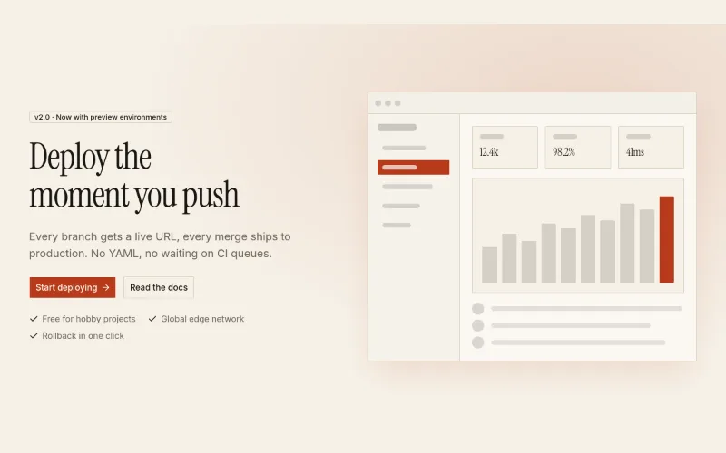 Hero · Splitoc/hero-split
 loop · hover — subtleLogo cloudoc/logo-cloud
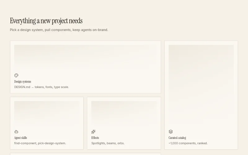 hover — subtleFeatures · Bentooc/feature-bento
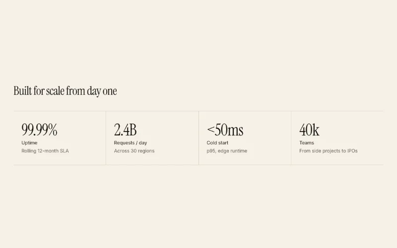 Stats rowoc/stats-row
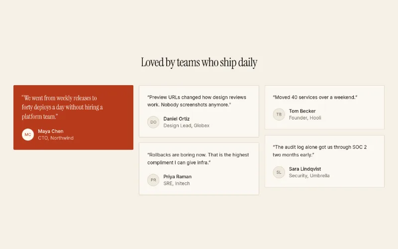 Testimonials · Gridoc/testimonials-grid
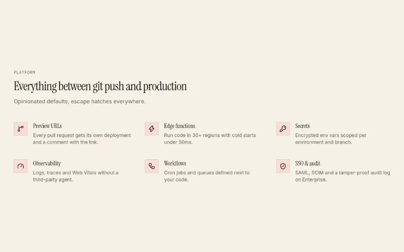 Features · Listoc/feature-list
 Footer · Columnsoc/footer-columns
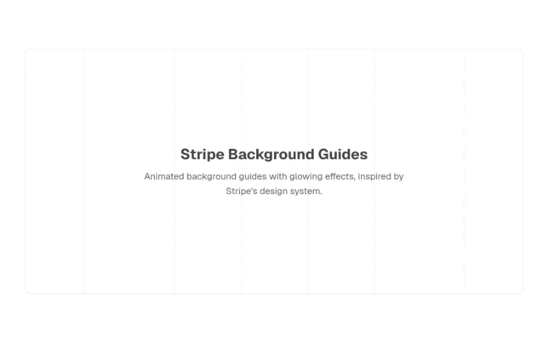 loop · state — mediumStripe Bg Guidescult-ui/stripe-bg-guides
- effectloop — mediumBg Animated Gradientcult-ui/bg-animated-gradient
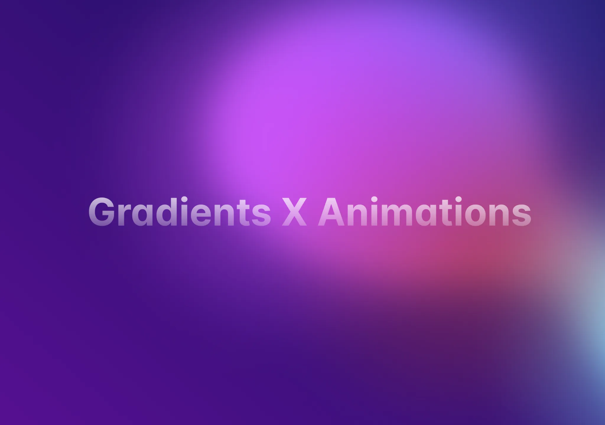 loop · cursor — mediumBackground Gradient Animationaceternity/background-gradient-animation
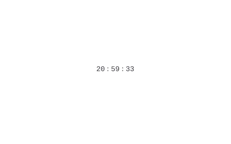 state — subtleSliding Numbermotion-primitives/sliding-number
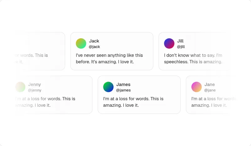 loop — mediumMarqueemagicui/marquee
- componentloop · drag — expressiveGlobemagicui/globe
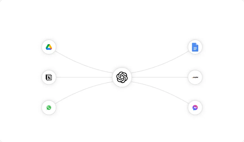 loop — mediumAnimated Beammagicui/animated-beam
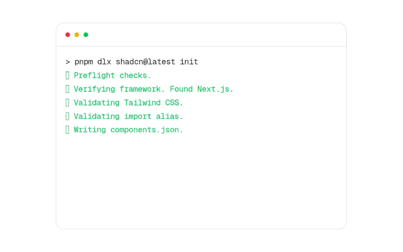 enter — subtleTerminalmagicui/terminal
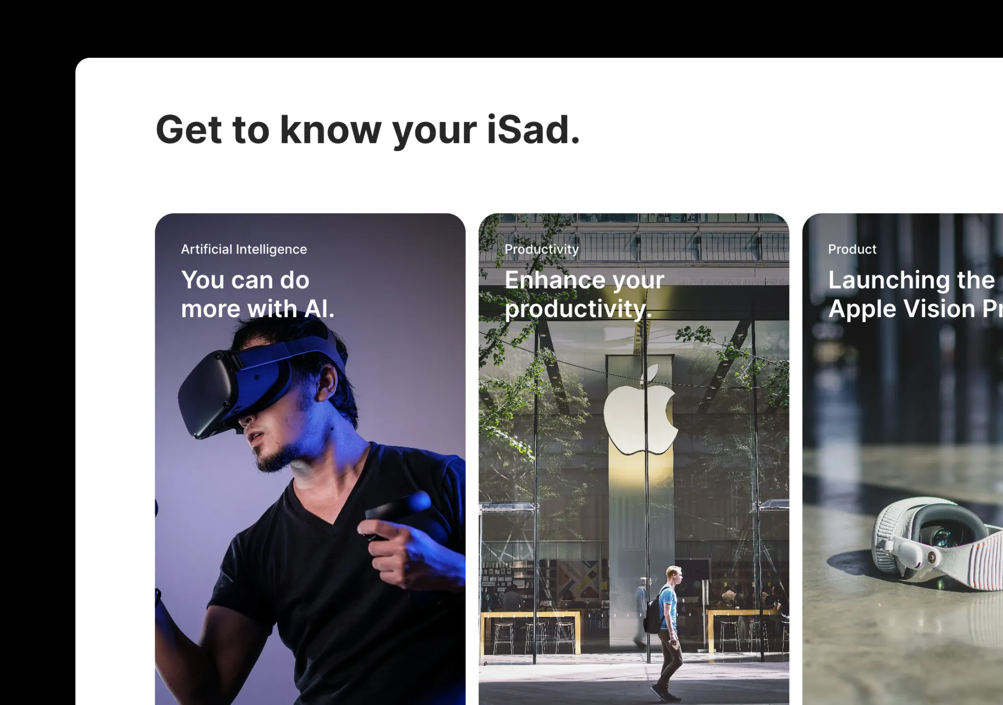 press · state — mediumApple Cards Carouselaceternity/apple-cards-carousel
[Visit the original site for visual reference; screenshots are not redistributed.]
Captured with pnpm capture https://stripe.com → capture.json. The full page (first 12,000 of
14,822px) is at /inspiration/stripe/full.webp, mobile at /inspiration/stripe/mobile.webp. A sales-chat widget sits
bottom-right in the shots.
Feel
Effortless competence. The type is light (300), large and tightly tracked, so the page reads like confident prose rather than marketing. One flourish carries the brand: a ribbon of iridescent colour (violet → orange → magenta) sweeping down the hero's right side. Everything else is white, cool-grey and navy. Faint vertical guide lines frame the content column, as on a technical drawing. Every claim is followed by proof: a live GDP counter, product UI fragments (checkout, terminal, card, usage meter), big stats, named enterprise stories, and code. The motion is the richest of the four sites (626 animated elements, 12 canvases), but each piece is tied to the product: the ribbon, the globe of stablecoin dots, an integration diagram with travelling pulses, and an animated stats band.
Palette & type (extracted)
- Canvas
#ffffff; subtle surfaces#f8fafd/#e5edf5(cards, borders); dark band navy#0d1738/#122054. - Text heading navy
#061b31, body slate#50617a, muted#64748d. Headlines use a two-tone pattern: the first sentence is navy and the continuation is slate. - Accent "blurple"
#533afd(--hds-color-button-primary-bg), used on primary buttons and link text. Secondary brand tints are#b9b9f9/#d6d9fc. Ribbon and accent modes add ruby#ea2261, magenta#f96bee, lemon#f9b900and orange, all inside the gradient art, never on UI. - Type: Söhne variable at weight 300 for nearly everything (16 / 18 / 22 / 26 / 32 / 48px, with large display around 56px), 400 for emphasis, and Source Code Pro for code. Letter-spacing is −0.01 to −0.02em on headings and line-height 1.03 at xl. Google equivalents: Inter 300 (tight tracking) or Geist 300, and Source Code Pro.
- Radius: small, 4–6px buttons and cards (16px only on big media). Shadows are long, soft and blue-tinted
(
rgba(50,50,93,.25) 0 30px 45px -30px, rgba(0,0,0,.1) 0 18px 36px -18px), the classic Stripe float.
Layout & patterns worth taking
| pattern | what they do | reproduce with |
|---|---|---|
| Nav | Logo, 4 dropdowns + Pricing; "Sign in" outlined in orange text, blurple "Contact sales ›" | oc/navbar |
| Guide-line frame | 1px vertical lines at the content edges running the whole page; sections sit inside | cult-ui/stripe-bg-guides (it's literally this) |
| Live-counter eyebrow | "Global GDP running on Stripe: 1.72770484%", a number that keeps ticking | motion-primitives/sliding-number in a muted eyebrow |
| Two-tone hero | Three-line 48–56px/300 headline, navy → slate mid-sentence; blurple primary + outlined "Sign up with Google" | oc/hero-split (no media column; the ribbon sits behind) |
| Ribbon gradient | One large animated iridescent sweep, cropped by the viewport edge, behind the hero only | cult-ui/bg-animated-gradient / aceternity/background-gradient-animation masked to a diagonal band; keep one per page |
| Logo marquee | Grey-free colour logos sliding in one row with hairline top/bottom borders | oc/logo-cloud (marquee) / magicui/marquee |
| Product bento | "Flexible solutions…" (two-tone) then cards: payments (terminal + checkout), billing (usage meter), agentic commerce (chat + products), card issuing, stablecoins (dot globe), Connect (accounts table); each card has a title and a small expand icon | oc/feature-bento; magicui/globe for the dot globe |
| Event banner | Full-width rounded photo banner: white title + "Watch now ›" | media card with overlay text |
| Stats band | Blurple-to-navy gradient section, "The backbone of global commerce", 4 big light-weight numbers (135+, $1.9T, 99.999%, 200M+) that light up in sequence | oc/stats-row on an inverse section + motion-primitives/sliding-number |
| Enterprise stories | Hertz: wide aerial photo with stat footer (160 countries · 11K+ locations · products used); then accordion rows (URBN, Instacart, Le Monde) | media card + shadcn accordion rows |
| Three-up services | Icon tile + bold lead-in sentence + "View … ›" link | oc/feature-list (3-column) |
| Startup carousel | Portrait story cards (Lovable, Gamma, Runway, Supabase) with logo overlay + prev/next arrows | aceternity/apple-cards-carousel |
| Platform screenshot | Dashboard UI inside a warm gradient panel with a code tooltip (stripeConnectInstance.create('payments')) | oc/app-shell screenshot on a gradient tile |
| Dark developer band | Navy; integration diagram (ERP/CRM → SDK → Stripe → PSPs) with animated dotted connectors; 3 stats; integration paths (no-code QR, app directory grid, code editor) | magicui/animated-beam (diagram), magicui/terminal / code block, oc/stats-row |
| News carousel + footer | "What's happening" big + small media cards, then a classic multi-column footer | aceternity/apple-cards-carousel, oc/footer-columns |
Motion
There is a lot of it, but it is disciplined. The ribbon shifts slowly. The counter ticks. Bento cards animate their
UI when scrolled into view (checkout fills, usage meter climbs). The stats band highlights each number in turn, and
the integration diagram sends pulses along its connectors. Hover states lift cards with the blue-tinted shadow. Each
viewport has one big moving thing; everything else is UI state. Note: no prefers-reduced-motion CSS was detected,
so do better than Stripe here. Catalog: cult-ui/bg-animated-gradient (ribbon, keep subtle),
magicui/animated-beam (diagram), motion-primitives/sliding-number (numbers), magicui/blur-fade (reveals).
How to apply
For a light product site, start from stock shadcn neutrals with a blurple --primary, cool-grey --muted and navy
--foreground, or derive a stripe-like DESIGN.md: Inter 300 headings with tight tracking, slate body, 4–6px radius,
blue-tinted float shadows, guide lines. Compose the page as: nav → live eyebrow + two-tone hero over one gradient → logo marquee
→ two-tone statement + product bento → stats band → stories → services → carousel → dark developer band → news →
footer. Rules:
- Use weight 300 for headlines with tight tracking and a two-tone first sentence.
- Use one gradient per page, in art only, never on buttons or text.
- Every section is a claim followed by proof (UI, number, customer, code).
- Use guide lines, not boxes, to structure the page.
- Use the accent colour only on actions and links.