 design-infra
Compliance-platform homepage that makes trust feel warm — a lavender hero with a light SERIF headline ("Trust is everything"), an inline email→demo pill, a llama mascot, and a framed product dashboard; then a bento of compliance modules on pale lavender cards.
Why it is here
Seeded as the reference for "trustworthy / technical B2B". A security product that feels approachable and confident rather than fearful. The serif-plus-mascot pairing makes it human, and the dense product UI makes it credible.Reproduce it with
Catalog pieces that rebuild its patterns.
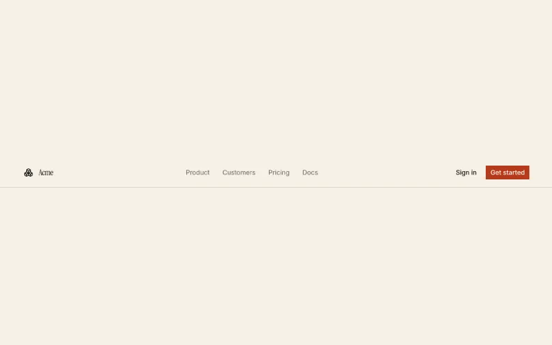 Navbaroc/navbar
 Bannerkibo-ui/banner
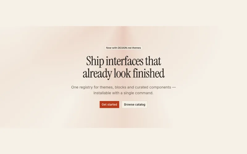 Hero · Spotlightoc/hero-spotlight
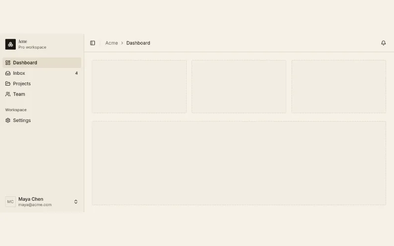 App shelloc/app-shell
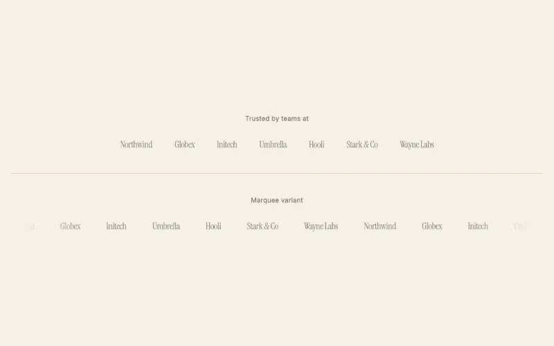 loop · hover — subtleLogo cloudoc/logo-cloud
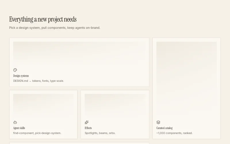 hover — subtleFeatures · Bentooc/feature-bento
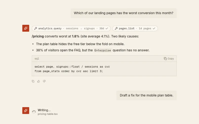 state — subtleChat threadoc/chat-thread
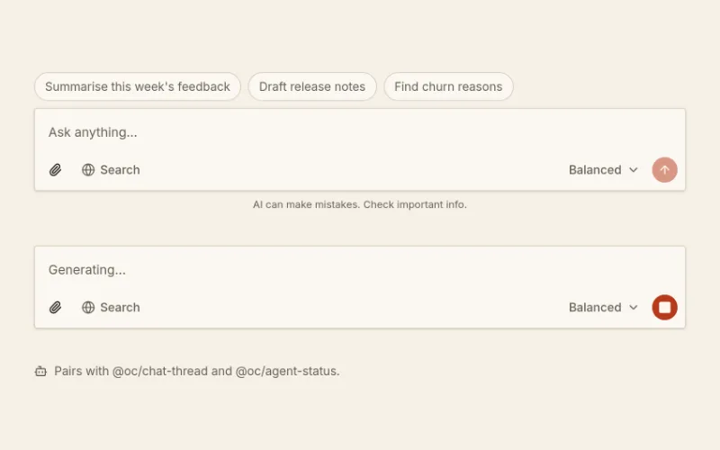 Prompt composeroc/prompt-composer
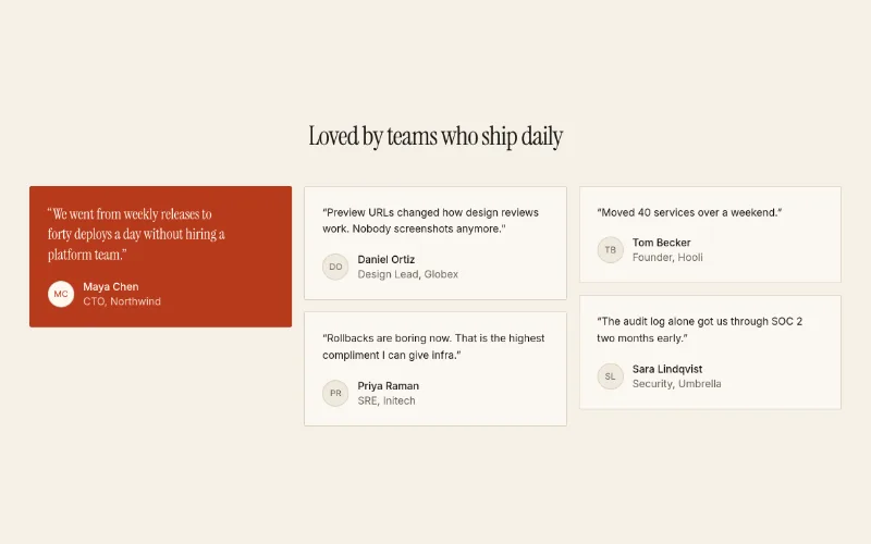 Testimonials · Gridoc/testimonials-grid
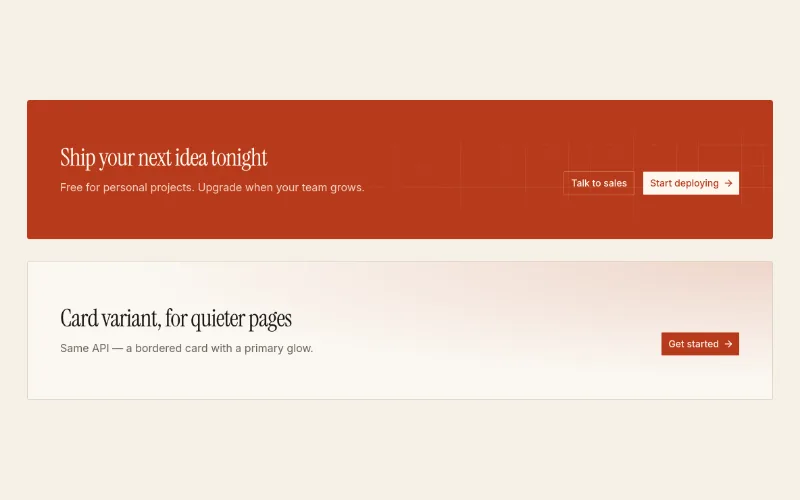 CTA banneroc/cta-banner
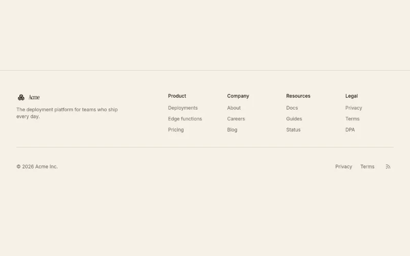 Footer · Columnsoc/footer-columns
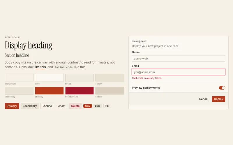 Editorial (design system)oc/theme-editorial
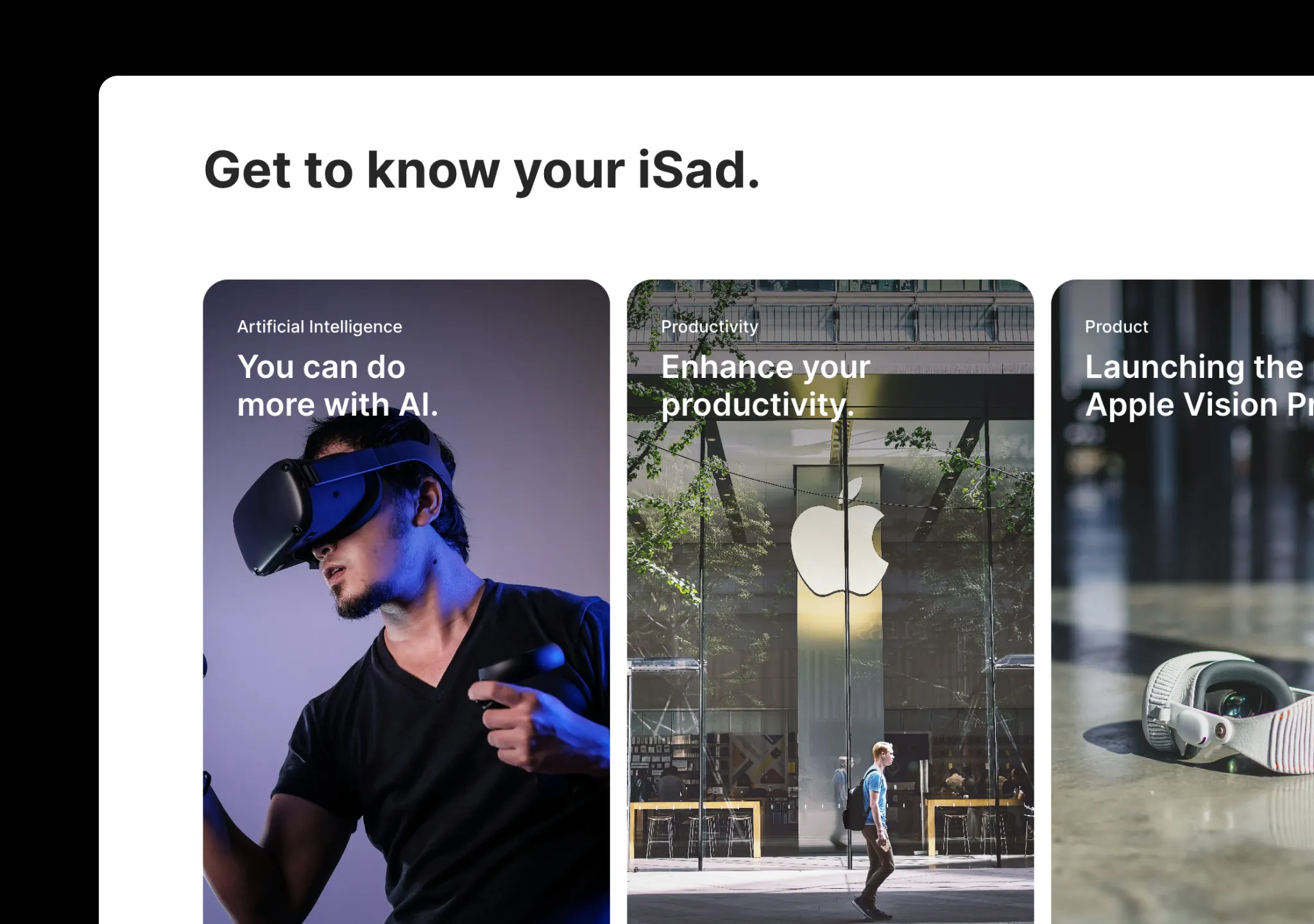 press · state — mediumApple Cards Carouselaceternity/apple-cards-carousel
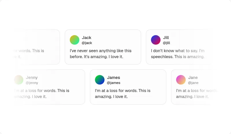 loop — mediumMarqueemagicui/marquee
 enter — subtleBlur Fademagicui/blur-fade
[Visit the original site for visual reference; screenshots are not redistributed.]
Captured with pnpm capture https://www.vanta.com → capture.json. Full page:
/inspiration/vanta/full.webp, mobile: /inspiration/vanta/mobile.webp. A cookie notice overlaps the lower-left of
the hero shot. Its pricing page is on pricingpages.design/sites/vanta.
Feel
Calm authority with a sense of humour. Compliance usually sells fear; Vanta sells relief. The hero is a soft lavender field with a light-weight serif headline that reads like a magazine cover, and a deadpan llama wearing SOC 2 / GDPR / HIPAA medals sits beside it. Below that the page turns serious: a real dashboard (an agent connecting AWS, an ISO 42001 progress checklist), a dense logo wall, then six module cards that each show actual UI (heatmap, vendor table, audit tiles, trust center). It alternates off-white → lavender → deep navy → off-white → lavender, which gives a long page a rhythm. Motion is moderate (141 animated elements, GSAP, Webflow) and limited to reveals and carousels.
Palette & type (extracted)
- Canvas
#fcfcfa; hero/CTA field lavender#c2beff/#d4baff; cards pale lavender-grey#efeff5/#e6e6f0; dark band navy#21222f; announcement + footer aubergine#260048. - Text ink
#181822, secondary#2b2c3f; on dark#ffffff/#dfdfe9. - Accent Vanta purple
#5e05c4, used for CTA pills (with a lighter circular arrow nub) and focus. Brand orange#ef8909and yellow#ffbe0fexist in the tokens but are barely used. Status colours appear only inside product UI (green progress, red/yellow heatmap). - Type: SC Ripley (light serif) for display (56px/300, also 42px/500); Söhne for body and UI (14/16/18px).
Google equivalents: Newsreader or Fraunces (300) for display and Inter for body. This is the
@oc/theme-editorialpairing, made cooler. - Radius: pills (
999px) for buttons and the email field, 16px cards, 8px inner UI. Shadows are nearly absent (one 3%-black soft glow on the dashboard frame).
Layout & patterns worth taking
| pattern | what they do | reproduce with |
|---|---|---|
| Nav + event bar | White nav (Platform / Solutions / Partners / Resources dropdowns, Plans), ghost "Log in" pill, purple "Get a demo" pill with arrow nub; aubergine announcement bar under it | oc/navbar + kibo-ui/banner (pass tokens) |
| Serif hero with email→demo | Centered light serif h1, 2-line serif sub, white pill input fused with a purple submit, mascot to the right | oc/hero-spotlight minus the spotlight, or a centered hero; serif via font-heading from @oc/theme-editorial |
| Framed product | Wide white "app window" overlapping the hero's bottom edge: agent progress list + chat input on the left, framework checklist on the right | oc/app-shell screenshot or oc/chat-thread + oc/prompt-composer inside a bordered frame |
| Logo wall | "Trusted by 16,000+ customers" eyebrow, 2×6 monochrome logos | oc/logo-cloud (static grid) |
| Module bento | "It's all here": six equal lavender cards (Compliance, Risk, Third Party Risk, Audit, Trust Center, Questionnaire Automation), each a title + one line + a real UI fragment bleeding off the bottom | oc/feature-bento (3×2, equal spans) |
| Agent section | Serif h2 + an assistant card ("Hello, Cathy — How can I help?") with suggestion chips and an input; copy + pill CTA right | oc/chat-thread empty state + oc/prompt-composer |
| Big serif quote | Logo, a 3-line serif pull quote, avatar + name | oc/testimonials-grid featured quote, or a single centered quote |
| Framework carousel | "All the frameworks you need": cards with badge seals, prev/next arrows top-right | aceternity/apple-cards-carousel (calmer) or shadcn carousel |
| Segments on dark | Navy band, three lavender illustration cards (Startups / Mid-market / Enterprise), logo row below | oc/feature-list 3-column with media on an inverse section |
| Video proof | "Proof? We've got proof." with four portrait customer cards that play video | portrait media cards; magicui/hero-video-dialog |
| Analyst badge | Forrester Wave chart on the right, copy + "Get the report" on the left | oc/hero-split layout reused mid-page |
| Resource cards | Four flat grey cards: title + "Read more →" | oc/feature-list cards |
| Closing CTA | Lavender band, huge 2-line serif "The new standard for trust", purple pill, llama tightrope illustration | oc/cta-banner (accent-tint variant, left-aligned) |
| Mega footer | Aubergine, 7 link columns, "HIRING" badge | oc/footer-columns (5 columns max; group the rest) |
Motion
Moderate and polite. Sections and cards reveal on scroll (magicui/blur-fade), the hero dashboard animates its agent
steps ("Connecting AWS… Google Workspace and 15 others"), the framework carousel slides, and CTA pills nudge their
arrow on hover. GSAP drives some of it, but nothing pins or scroll-jacks. Use the quiet language: an animated
progress list (magicui/animated-list) is the signature move.
How to apply
Start from @oc/theme-editorial (serif display + sans body). Swap its warm paper and vermilion for off-white
#fcfcfa, a lavender --accent/--muted and a purple --primary, and use pill radius on buttons. Compose the page as:
nav + event bar → serif hero + email pill → framed product → logo wall → module bento → agent → quote → framework
carousel → segments (dark) → proof → analyst → resources → lavender CTA → aubergine footer. Rules:
- Use a light serif only for display sizes and keep the UI in sans.
- Each bento card shows real UI, not icons.
- Alternate section backgrounds to pace a long page.
- Use one friendly brand device (mascot or illustration) at most twice per page.